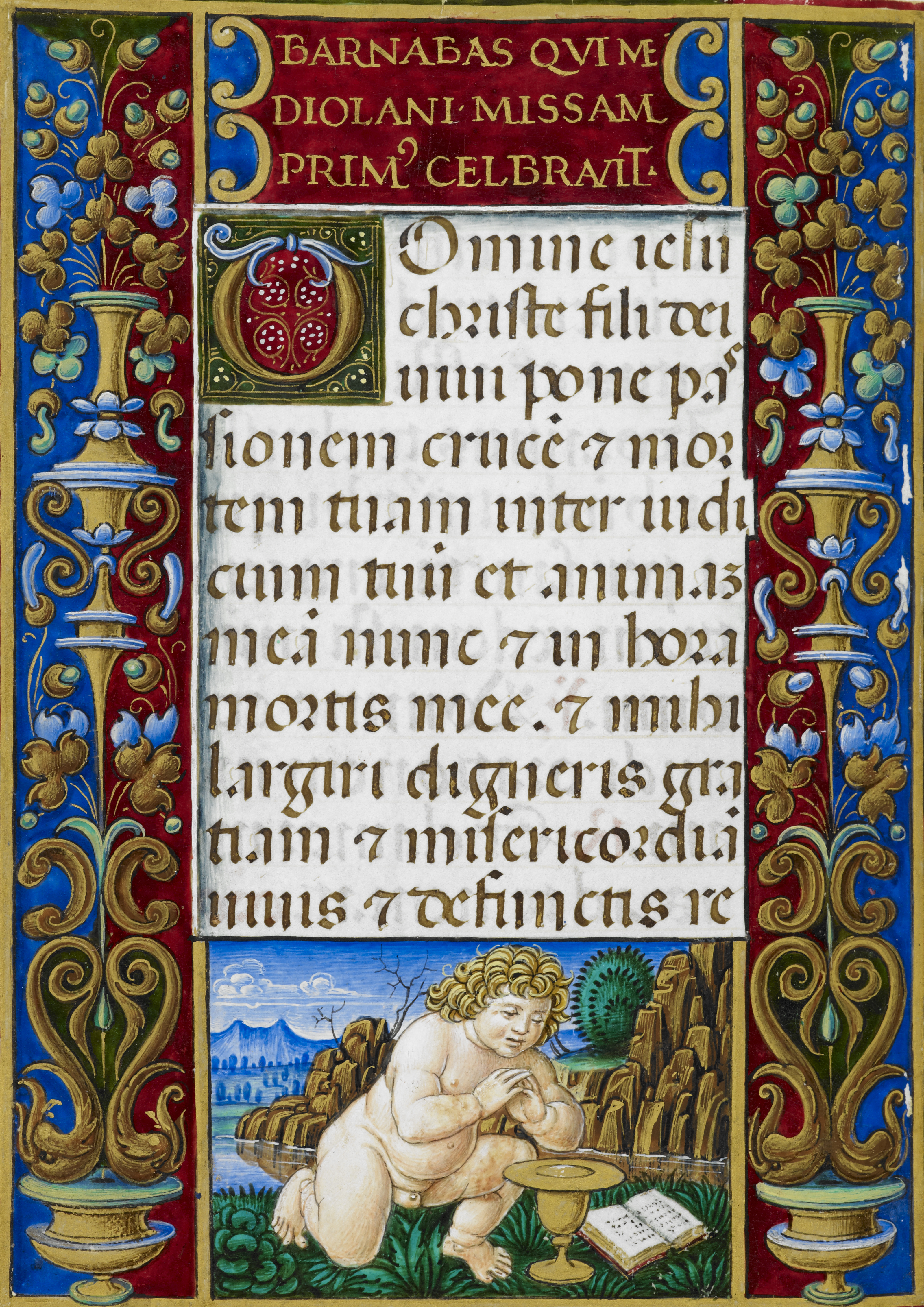
Gothic Southern Textualis, 15th century
-
Title
Book of hours (Use of Rome) -
Text
Hours of the Cross -
Language(s)
Latin -
Writing System
Roman -
Script(s)
Gothic Southern Textualis -
Country
Great Britain -
City
London -
Repository
British Library -
Shelf Mark
Add. 34294, vol. 1, fol. 14v -
Common Name
The Sforza Hours -
Century
15th century -
Year Range
1490-1494 -
Place Of Origin
Italy, Milan -
Provenance
Bona of Savoy, Duchess of Milan; Philibert II, Duke of Savoy; Margaret of Austria from ca. 1504; Charles V, Holy Roman Emperor, probably from Margaret's death in 1530. In Spain by ca. 1600. Purchased in Spain in 1871 by Sir John Charles Robinson and afterwards by John Malcolm of Poltalloch, from whom it went to the British Museum in 1893. -
External Facsimile
The Sforza Hours was originally made for Bona Sforza, duchess of Milan, at the end of the 15th century, and was completed a generation later for Margaret of Austria. See the link to the full manuscript at the British Library for its colorful history and a detailed discussion of the artists involved in the stages of its production.
This super-luxury Book of Hours illustrates the most formal grade of Southern Textualis script, more commonly known as "Rotunda" for its round appearance. This is the version of Gothic script practiced in the Mediterranean countries, especially Italy, Spain, and Portugal – though scribes working in other countries could certainly write this script along with many other contemporary varieties.
Southern Textualis shares many features with Northern Textualis, including large minim-height in proportion to ascenders and descenders; a striking contrast between thick and thin strokes; parallel minims that can make it hard to distinguish minim-rich words; biting of opposing bows; and the usual Gothic repertoire of letterforms and abbreviations: 2-shaped r after round letters; Uncial d; and the 7-shaped Tironian et abbreviation. However, several "round" letters that would be made with a series of straight strokes in Northern Textualis are made with generous curves in Southern Textualis. Note particularly c, d, h, o, and p. The combined effect of these letters gives the script its "rotund" aspect. Besides the rounded aspect, telltale signs of Southern Textualis are the d whose stem leans all the way over to the left, and the wide version of 7-shaped et that stands on the baseline instead of descending.
The heading in gold Square Capitals on a dark red ground commemorates the legendary association of St. Barnabas with Milan.
Acknowledgements: Described by Carin Ruff
Transcription
Heading:
1 BARNABAS QVI ME(-)
2 DIOLANI MISSAM
3 PRIM(VS) CELEBRAVIT
Main text:
1 DOmine iesu
2 christe fili dei
3 uiui pone pas(-)
4 sionem cruce(m) et mor(-)
5 tem tuam inter iudi(-)
6 cium tuu(m) et animam
7 mea(m) nunc (et) in hora
8 mortis mee. (et) mihi
9 largiri digneris gra(-)
10 tiam (et) misericordia(m)
11 uiuis (et) defunctis re(-)
Paleographic Features
1. The "plaque" at the top of the page commemorating St. Barnabas is written in Square Capitals, in the classicizing style of the Italian Renaissance. However, the -us abbreviation on PRIM(VS) is a wholly Gothic phenomenon.
2. In the first word of line 2 of the main text, christe, note the roundness of c and h and the stylized 2-shaped r following the bow of h. These are typical of Southern Textualis/Rotunda.
3. The d in dei at the end of line 2 has its stem leaning way over to the left, so it runs along the headline. This is a telltale sign of Southern Textualis. Note also the "biting" or "fusion" of the opposing curves of d and e. This is a feature common to all forms of Textualis and defines Gothic script in contradistinction to earlier and later scripts. The same phenomenon is even clearer in the po of pone in the middle of the next line.
4. The first word of line 3 of the main text is uiui. Note how even in a script noted for the roundness of some of its forms, the typical Textualis row of look-alike minims can make words like this very difficult to read.
5. Note the biting or fusion of opposing bows in the po of pone, line 3.
6. In this hand, the common mark of abbreviation is a small, precisely-formed lozenge rather than a line. This mark appears over the e of cruce(m) in line 4.
7. The Tironian et that does not descend below the baseline and has a proportionally broad headstroke is one of the telltale signs of Southern Textualis. The Tironian et in line 4 is a good example.
8. The 3-shaped symbol at the end of line 6 is an m turned on its side — not an uncommon Gothic form.
9. The elaborate ductus of a and g in largiri, three lines from the bottom, is a sign of the extremely high grade of this formata script. It also shows the relationship of this version of Textualis to the northern variety, since both use broad strokes made with an angled pen with very fine hairstrokes at 90 degrees from the main strokes to link up the parts of letters.
