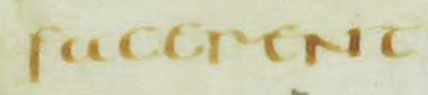
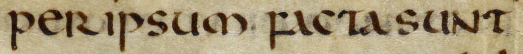
This word is facerent. Notice the open top of a and the difference between the f that starts the word and the r in the middle. (Note also that Half-Uncial uses "upper-case" N.)
Uncial and Half-Uncial, the dominant scripts of Christian books in late antiquity. The transition from the roll to the codex. Introduction to the analysis of page layout.
In this lesson, we look at the two dominant book scripts of late antiquity, concentrating on the period from about the 4th century, when Christianity became the official religion of the Roman Empire, to the 8th century, when the Roman Empire had fallen in the West. At that time, the successor communities and kingdoms within its former territory and on the edges of the old Empire were beginning to establish their own, localized book cultures.
These scripts are Uncial and Half-Uncial.
Uncial and Half-Uncial were of enormous importance in the later development of Latin script, because it was in these scripts that the post-Roman world and its neighbors received Christian texts: the Bible, liturgical texts, and the works of the Fathers of the Church.
See the images below to explore and compare these scripts before we discuss them in detail.
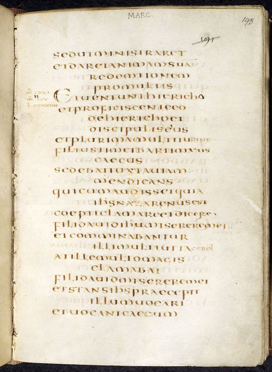
© The British Library Board, Harley 1775, f. 193r.
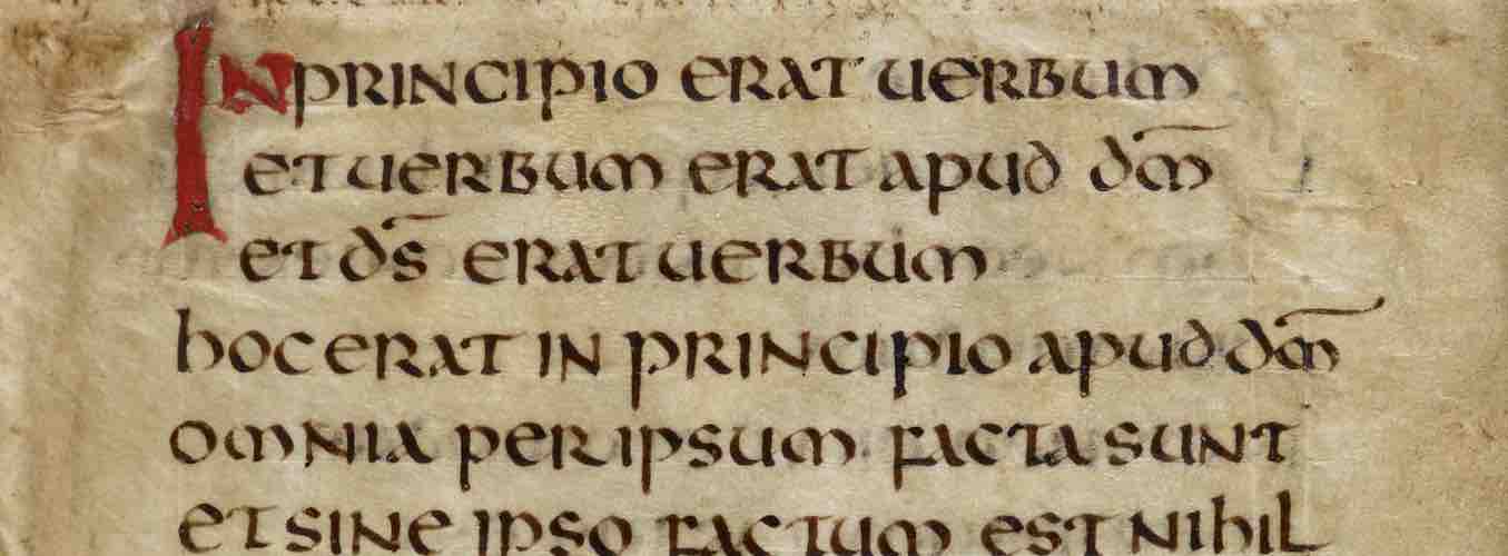
St. Gallen, Stiftsbibliothek, Cod. Sang. 1395, p. 25. (https://www.e-codices.unifr.ch/en)
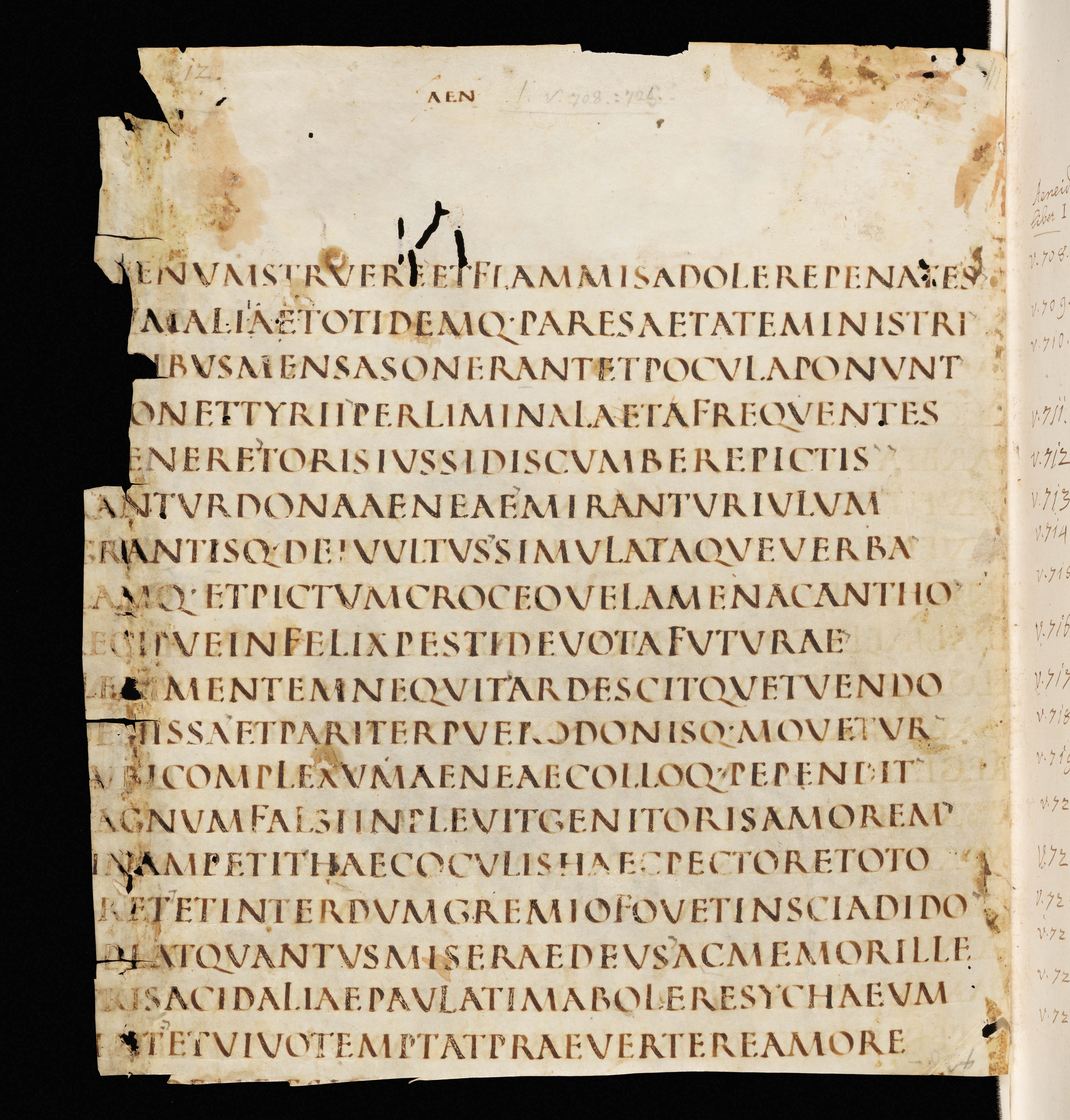
UNCIAL is a majuscule script used as the main text script of very high-grade books between the 5th and 8th centuries, and also as a display script throughout the Middle Ages thereafter. (A display script is used for titles, chapter headings, and the like, to distinguish them from the main text script of the manuscript.)
Uncial is characterized by a generous, rounded aspect. Uncial is characteristically used in late antiquity and the early Middle Ages for manuscripts of the Bible. You can think of Uncial as being to Christian books what Square and Rustic Capitals were to manuscripts of Vergil in the same period: a special script for very special texts. However, there are over 500 surviving Uncial manuscripts, whereas only a handful of manuscripts in ancient capitals survive.
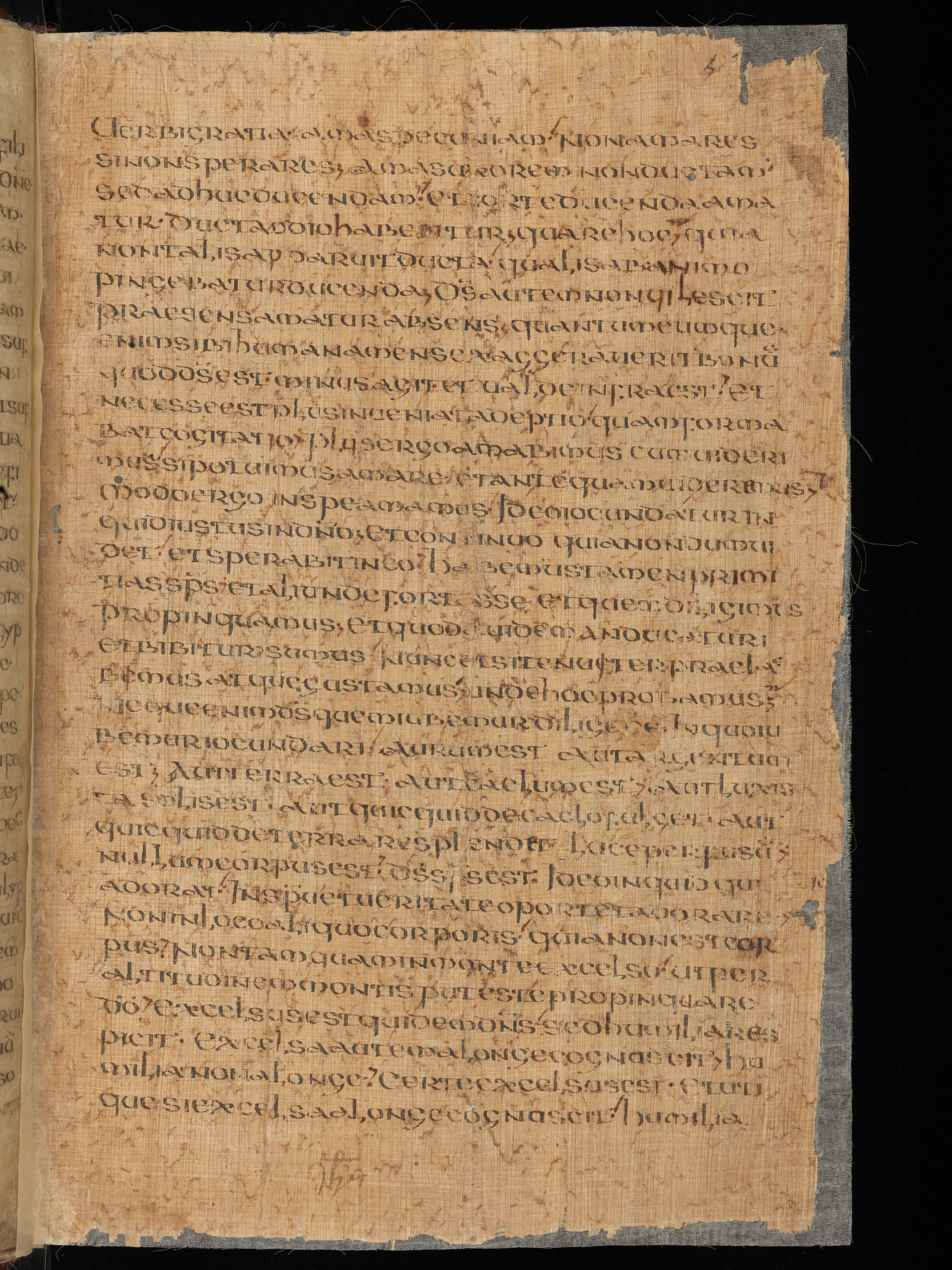
HALF-UNCIAL is a minuscule script used in books of all kinds from the 2nd to the 5th centuries. Half-Uncial emerged from Roman documentary cursive scripts in areas where Roman administrators worked and was thus the common book script of the post-Roman world. It is the immediate ancestor of the scripts of the early Middle Ages (Insular minuscule, Caroline minuscule) and is recognizably the ancestor of our modern lower-case alphabet.
Despite its widespread use and unparalleled influence, significantly fewer Half-Uncial manuscripts survive than Uncial ones. This is in part because books in Half-Uncial were, on average, less precious and more intensively used than the ultra-high-grade books written entirely in Uncials.
Take a closer look at manuscripts in the two scripts. Explore the two images and note similarities and differences. Pay attention to what makes Half-Uncial minuscule and Uncial majuscule. Are there letters in the Half-Uncial manuscript that you recognize from our modern lower-case alphabet? What do you see that looks unfamiliar?
St. Gallen, Stiftsbibliothek, Cod. Sang. 1395, p. 25. (https://www.e-codices.unifr.ch/en)
© The British Library Board, Harley 1775, f. 193r.
A note on nomenclature: Despite what their names would suggest, Half-Uncial is not a cut-down or small-scale version of Uncial. In fact, Half-Uncial emerges a bit earlier than Uncial. Both names were applied in the 17th century by early paleographers, on somewhat doubtful grounds.
The term "Uncial" was first used as a modern term for a particular ancient script by Jean Mabillon in his De re diplomatica (1681). Mabillon took the term from Jerome's preface to his translation of Job, where Jerome says, "Let those who want them have ancient books written in gold or silver on purple parchment or burdened, rather than written, with uncialibus..." The meaning of uncialibus is uncertain, but the best guess is something like "letters an inch high." Mabillon associated the large letters of luxury ancient Christian books with Jerome's remarks, even though the script we now call Uncial postdates Jerome's lifetime.
"Half-Uncial," meanwhile, is a term invented by René-Prosper Tassin and Charles-François Toustain in their Nouveau traité de diplomatique (1750-65). They thought Half-Uncial looked like a cut-down version of Uncial and named it accordingly. Paleographers today know that Half-Uncial did not develop from Uncial. It emerged earlier than Uncial and is an independent development of Later Roman Cursive.
You can see from the detail below that Uncial is a "chubby" script in aspect. Can you see what letters particularly give it that impression?
© The British Library Board, Harley 1775, f. 193r.
Several letters that are made in whole or in part of straight lines in the ancient capitals are made up of generous curved strokes in Uncial.
Compare this manuscript in Square Capitals that we looked at in the last lesson. What do Uncials and Square Capitals have in common? What are the differences?
St. Gallen, Stiftsbibliothek, Cod. Sang. 1394, p. 12. (https://www.e-codices.unifr.ch/en)
Uncial uses a mix of letterforms that we would consider "upper case" — notably the B, N, R, and S — and others that we recognize from our lower-case alphabet — especially the d, e, h, m, and u. (The A is somewhere in between, with the upright, triangular shape of our upper-case A, but with a loop for the left leg that ultimately turns into a form that gives us our typographic lower-case a.) Nonetheless, we classify the script as a majuscule because the majority of letters are the same height — as if written between two imaginary lines. Just a few letters stick up a bit or hang down a bit.

To recognize Uncial when you see it in the future, remember to check for the rounded, lower-case style d with its ascender leaning over to the left, the lower-case-style e, and the very rounded m with two large bows.
See the images of other Uncial manuscripts below to explore the script in more detail.
© The British Library Board, Harley 1775, f. 193r.
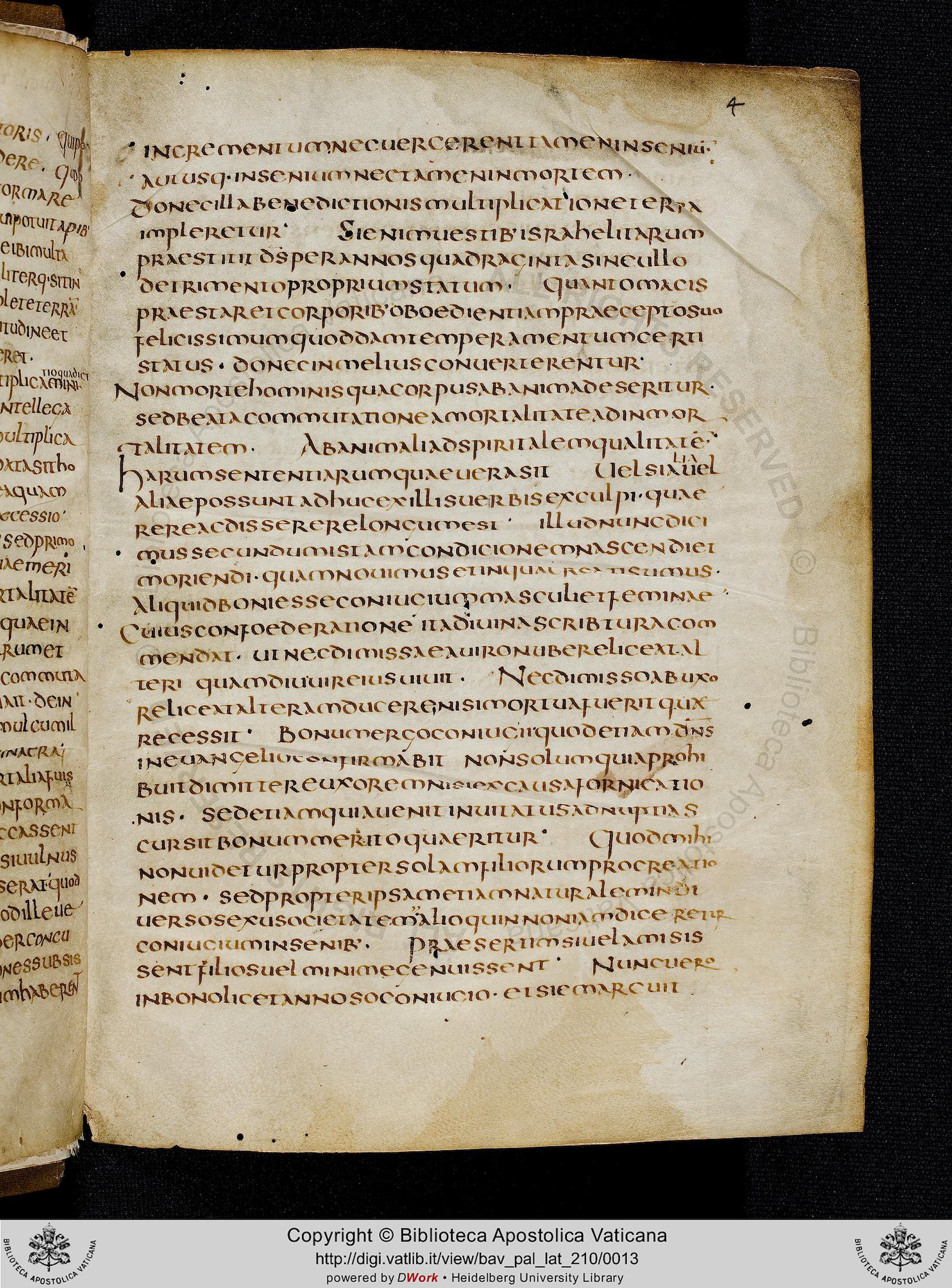
© Bibliotheca Apostolica Vaticana, Pal. lat. 210, f. 4r
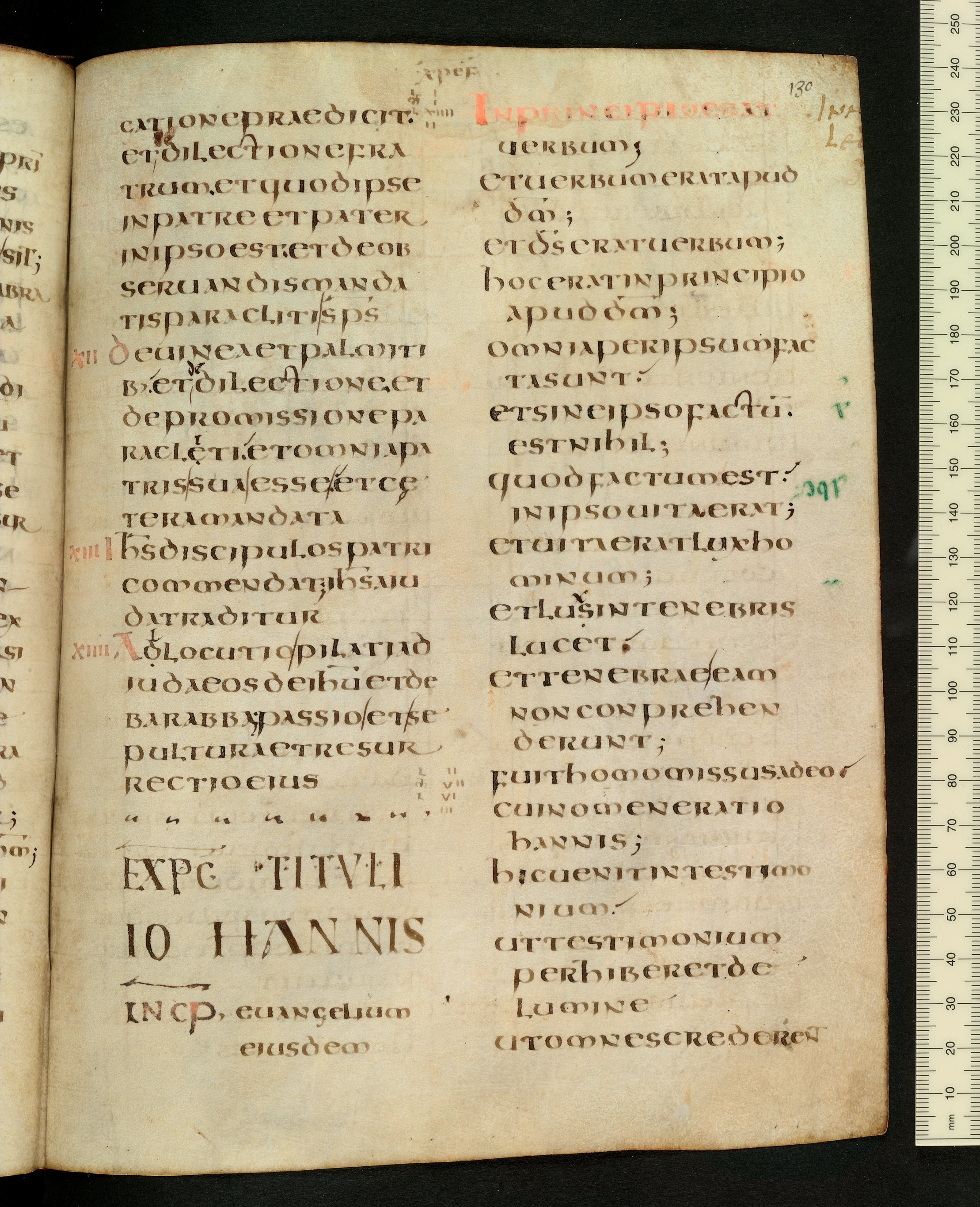
The Bodleian Libraries, The University of Oxford, Auct. D. 2. 14, f. 130r.
© The British Library Board, MS Add. 89000, f. 1r.
Important letters in Half-Uncial that are distinct from Uncial and earlier Capital forms, and that anticipate medieval and modern minuscule forms, are as follows:
St. Gallen, Stiftsbibliothek, Cod. Sang. 1395, p. 25. (https://www.e-codices.unifr.ch/en)
This word is facerent. Notice the open top of a and the difference between the f that starts the word and the r in the middle. (Note also that Half-Uncial uses "upper-case" N.)
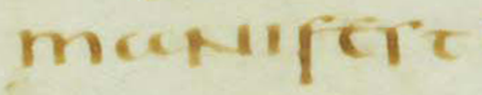
This letter sequence is manifest. Note again the open-topped a, "upper-case" N, and the difference between f and s. The s stops on the baseline, whereas the f descends below it.
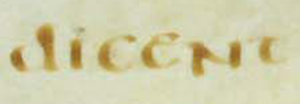
This is dicent. Note the upright d (as opposed to the curvy, leftward-leaning d of Uncial).
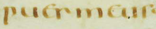
This is puer meus. Pay close attention to the difference between the fourth letter, r, and the last letter, s. The shoulder of r curves down below minim-height, but that of s curves upward.
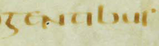
This word is gentibus. Note the 5-shaped g, "lower-case" b, and tall s at the end.
Would you recognize these forms if you saw them in the wild? Would you be able to tell these Half-Uncial forms from Uncial ones? Review the list of important Half-Uncial letterforms above. If you're ready, click through to try a quick exercise in telling Half-Uncial from Uncial.
The period of the development of Half-Uncial and Uncial script is also the period of the transition from roll to codex as the dominant form of the book. The reasons for the rise of the codex are much disputed. The numbers of surviving books in each form, however, make it clear that the codex was becoming the dominant form by the time the earliest examples of Half-Uncial and Uncial script appear.
Furthermore, 80% of surviving Christian books from late antiquity are in codex form.
Source: William A. Johnson, "The Ancient Book," The Oxford Handbook of Papyrology, ed. Roger S. Bagnall (Oxford, 2009), 256-281.
As a result, we almost invariably see Half-Uncial (2nd-5th centuries, but with most survivals from late in that period) and Uncial script (5th-8th centuries) in codices.
Those codices are usually, though not always, made of parchment. There were papyrus codices in antiquity, but papyrus is comparatively ill-suited to the codex form because it does not stand up well to folding.
Papyrus, a product of Egypt, did continue to be used in Europe into the early Middle Ages, but with less and less frequency by the start of the 8th century. One of the Uncial manuscripts we looked at earlier in this lesson is actually a mixed parchment-papyrus codex from the turn of the 8th century in Gaul. Parchment forms the outer bifolium of each quire, and the inner bifolia are made of papyrus. (We see something similar with parchment and paper manuscripts at the end of the Middle Ages.) This is far from a common situation and seems to be an artifact of the transition from one writing support to another.
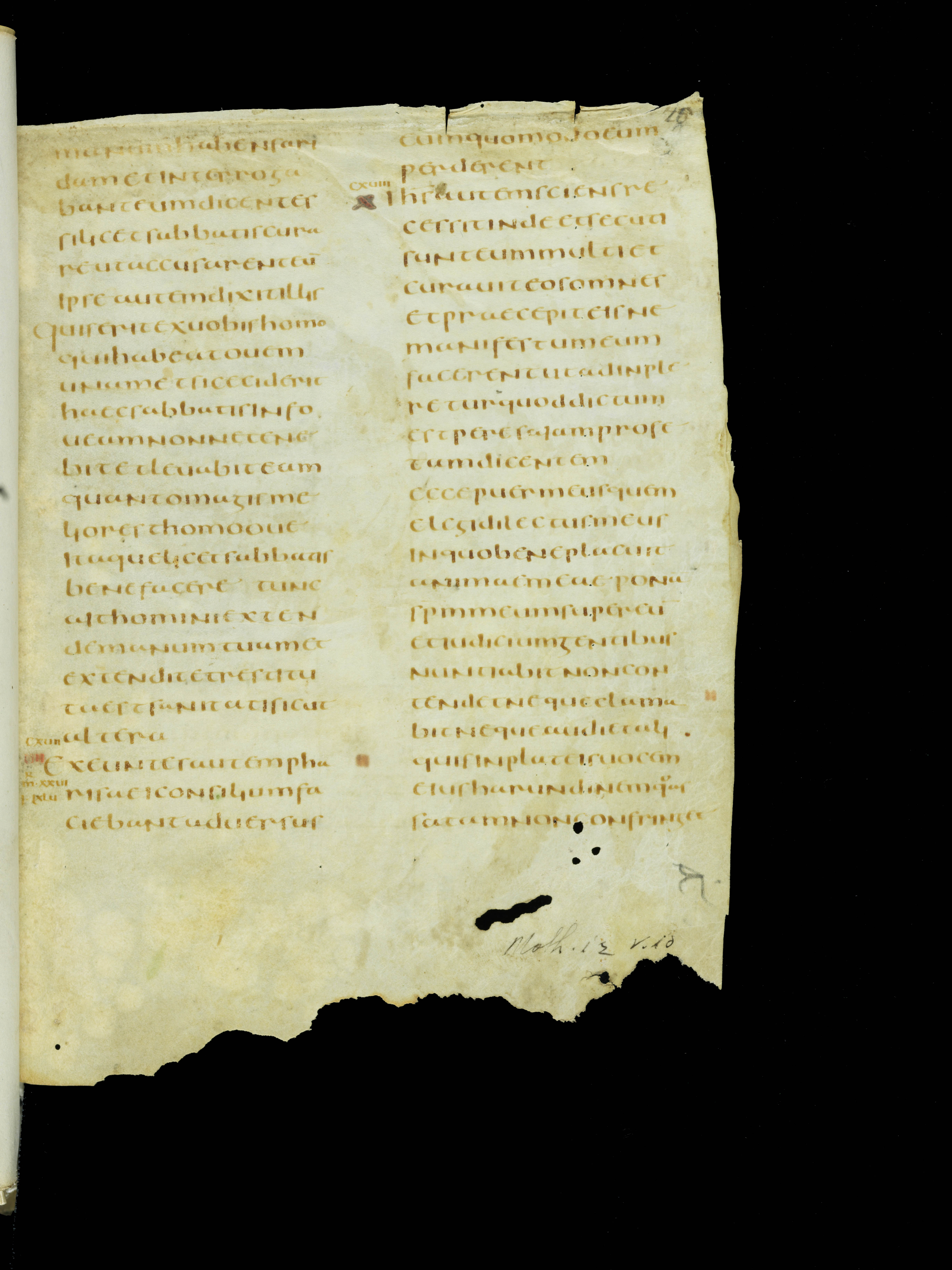
Geneva, Bibliothèque de Genève, MS lat. 16, f. 4v. (https://www.e-codices.unifr.ch/en)
Geneva, Bibliothèque de Genève, MS lat. 16, f. 5r. (https://www.e-codices.unifr.ch/en)
The interplay of script, text, decoration (if any), and blank space on the page varies over time, from region to region, and with type of book. Beginning with this lesson, we will consider layout features that we associate with the scripts we are studying and with the periods we are focusing on in each unit.
The emergence of the codex, whether of papyrus or parchment, seems to be associated with a new aesthetic of the layout of text on the page. Whereas the papyrus roll presented the reader with a series of long, narrow columns, the earliest codices usually, though not always, have single-column pages.
The written area of these books is usually framed by ample empty parchment. Sparse marginal apparatus might include marks indicating correspondences with other texts, collation with another version of the text, or scriptural citations. But manuscripts of this period do not have the extensive glossing and marginal commentaries we see later in the Middle Ages.
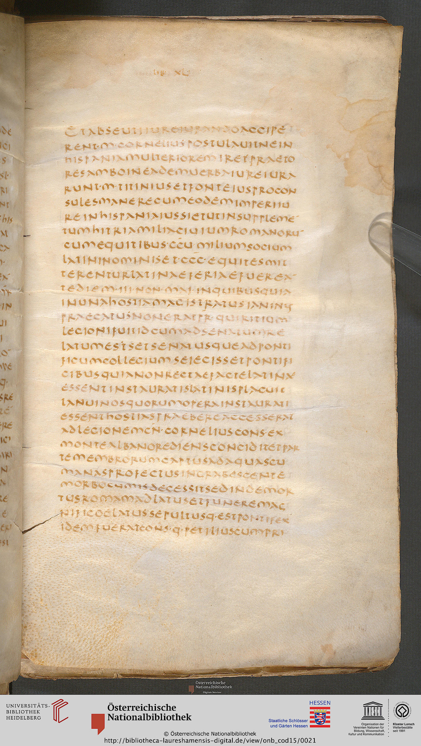
Österreichische Nationalbibliothek, MS 15, f. 6r, used under a CC BY-NC-SA 3.0 license. (https://bibliotheca-laureshamensis-digital.de/view/onb_cod15/0021)
© Bibliotheca Apostolica Vaticana, Pal. lat. 210, f. 4r
Texts from before the 8th century, especially those from areas where late forms of Latin were spoken, observed the ancient habit of writing in scriptio continua, with no breaks between words.
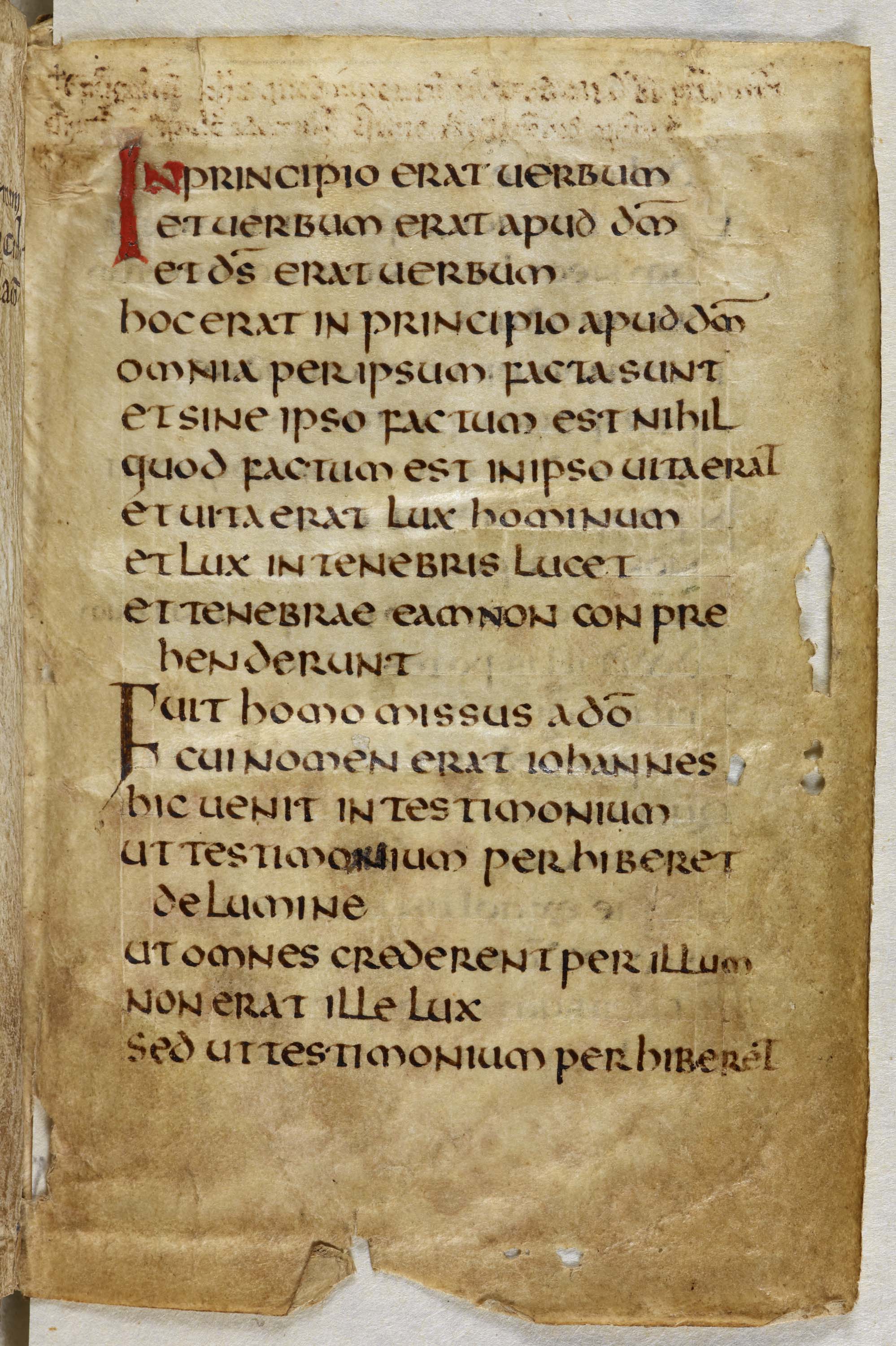
However, in late antiquity we do see several scribal strategies for helping the reader perceive sense- and syntax-units on the page. One is the layout per cola et commata — "by clause and phrase" — introduced by Jerome in his Vulgate translation of the Bible. In a copy of the Bible laid out per cola et commata, every new sense/syntax unit starts on a new line, so the text looks a bit like verse with ragged line ends. An example is the Harley Golden Gospels, below left.
In text presentations of the same period in which the text fills out a rectangular written area, we sometimes see large spaces between sentences, even if there are no spaces between words, as in Vatican manuscript Pal. lat. 210, below right. Large spaces between sentences may may be an accommodation to the difficulty of tracking scriptio continua when it is written in a single column with long lines.
In both layouts, litterae notabiliores, which may be colored or simply a larger version of the letters of the main text, also help punctuate the page.
© The British Library Board, Harley 1775, f. 193r.
© Bibliotheca Apostolica Vaticana, Pal. lat. 210, f. 4r
Despite a preference for single-column layouts in codices of late antiquity, we do find double-column layouts. This was a practical choice especially for larger-format Bible manuscripts laid out per cola et commata, because a single column of short lines of text would be very profligate of parchment, even for a super-luxury manuscript. Two columns of text per cola et commata made it possible to fit longer biblical texts, or even whole Bibles, in a single codex. With a spacious Uncial script, this layout was a user-friendly solution in the era before regular word separation, as we can see in this Gospel manuscript from around the year 600.
The Bodleian Libraries, The University of Oxford, Auct. D. 2. 14, f. 130r.
In the next unit, on Insular manuscripts, we will see these scripts and layouts adapted for use in countries where Latin was not a native language.
Biblical and patristic manuscripts in these plain-page layouts with Uncial and Half-Uncial script were carried to England and Ireland at the conversion of those countries to Christianity, where they were both imitated and transformed by adaptation to native artistic traditions.
Repeatedly through later centuries, the unadorned single-column page with plenty of space around the text was associated with antiquity, because in most cases the oldest manuscripts later scribes knew were those of late antiquity, or books modeled directly on them. Layouts based directly or indirectly on this model were popular in times and places where scribes wanted to convey the authority of antiquity.
If you read Latin, go to the Classical Antiquity Transcription lesson to learn about abbreviations in Latin manuscripts and practice reading Uncial and Half-Uncial script. If you have already finished that transcription lesson, move on to the Christian Late Antiquity Transcription exercises. Otherwise, go directly to the Insular Paleography lesson to learn about the scripts of Britain and Ireland in the early Middle Ages.
Try your hand at transcribing Christian Late Antiquity scripts