Lesson
Latin Scripts - Gothic Cursiva
Description
Cursive scripts of the later Middle Ages (13th-15th centuries).
Overview and Terminology
In this chapter, we return to Gothic scripts of the later Middle Ages and examine the other major class of scripts besides Textualis. This group of scripts is known in Albert Derolez’s classification system as Cursiva.
Beginning in the 13th century, scripts that had been used primarily for documents (documentary cursives) began to be used as book scripts as an alternative to Textualis. Cursiva is the name for these book scripts developed from documentary cursives. Cursive-based scripts took less time to write and were suited to the expanding production of books in this period. The use of Gothic Cursiva in books increased during the era when the copying of vernacular literature was also increasing, and we find many vernacular texts, as well as Latin ones, written in the regional varieties of Cursiva.
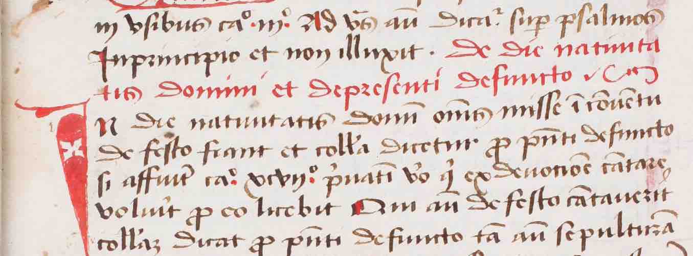
Gothic Cursiva written in England, ca. 1390-1410
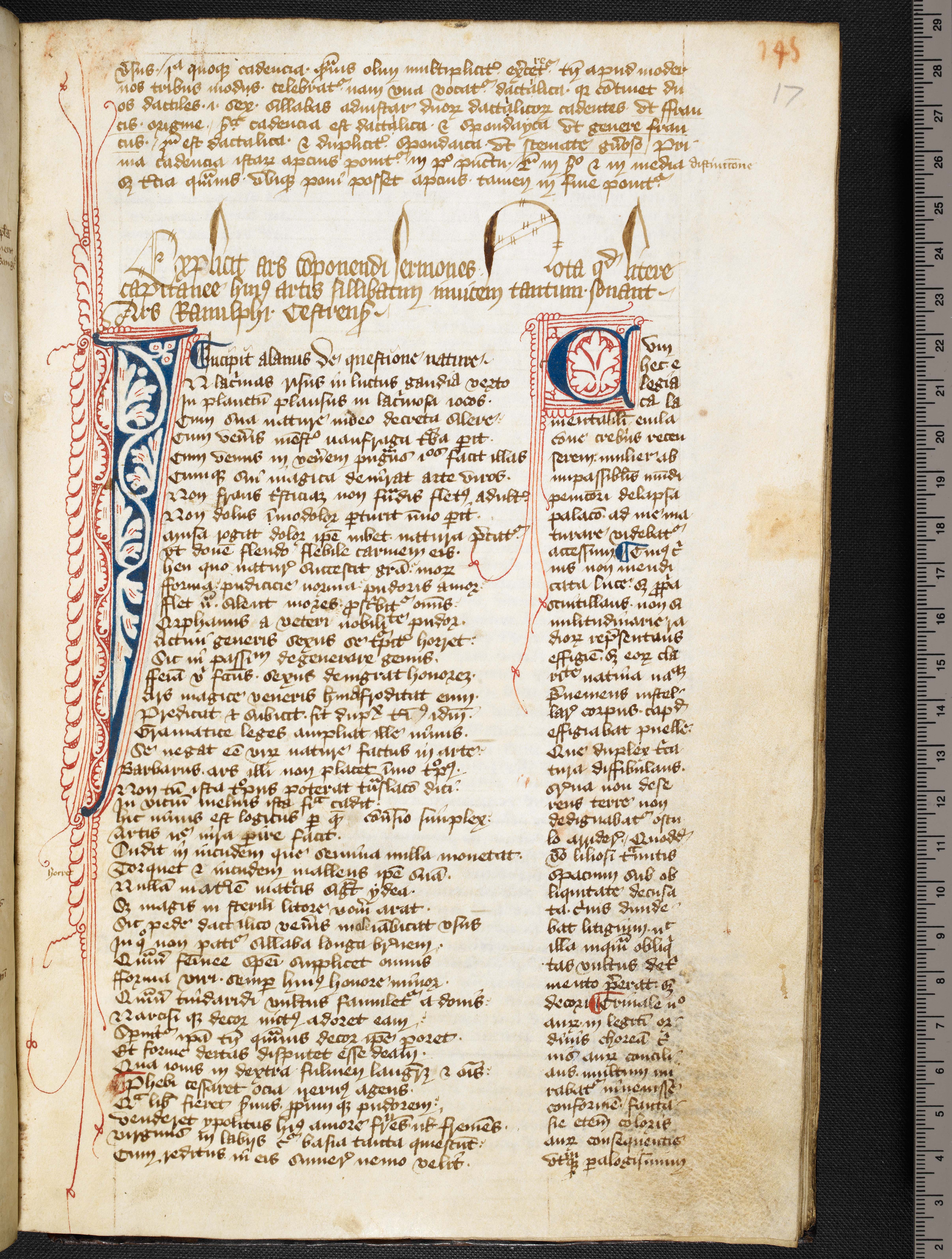
© The British Library Board, Harley 866, f. 17r.
Gothic Cursiva written in France or Flanders, ca. 1430-1450
_p_4.jpg)
Geneva, Bibliothèque de Genève, Codex 206(49), p. 4. (https://www.e-codices.unifr.ch/en)
Gothic Cursiva is for the most part a phenomenon of the 14th and 15th centuries. These scripts appear with all the varieties of Gothic page design that we see with Textualis, of which two styles are shown above: long columns with blue and red pen flourish decoration, at left, in a less formal manuscript, and framed columns of text with a border of the kind we might expect to see in a luxury book of hours of the same period.
The phenomenon of documentary scripts being formalized for use as book scripts recurs throughout the history of Latin script. We saw it early in this course in the development of Half-Uncial and the National Hands out of Later Roman Cursive. We can generalize and say that innovation in script happens in two ways. Experimentation and proliferation of different scripts happen in documentary and less-formal contexts. Some of those scripts get adapted to use as book scripts. And then, periodically, reform inaugurates a new era of clarity and consolidation in the realm of book scripts. We saw this in the proliferation of post-Roman scripts in the centuries before the Carolingian reforms, followed by the establishment of Caroline Minuscule as a new international standard. We see it again when the proliferation of Gothic scripts in the later Middle Ages prompts a reform by Italian Humanists, which we will examine in the final lesson.
“Cursive” and “Cursiva”
As we discussed back at the beginning of the course, paleographers use the term “cursive” in various and inconsistent ways. Cursive, as a technical term, means a script written with comparatively few lifts of the pen. That is a distinction based on ductus. Cursive can also be used to mean simply “rapidly written” or “messy,” as in the Roman cursives. The term cursive has long been used for the whole class of scripts we are considering in this lesson. When these scripts come to be executed in a very careful, formal way, however, they are no longer cursive in the sense of hasty or messy. Some varieties are almost as highly-constructed as formal Textualis. This class of Gothic scripts uses elements (like loops) that are derived from cursive writing, but which are purely ornamental in the higher-grade versions.
In an effort to cut through the many confusing uses of the term “cursive,” Albert Derolez decided to call these later Gothic book scripts Cursiva, and we follow his usage here.* Textualis and Cursiva are thus the two major categories of book script in the Gothic period. Each has regional variants and each has very informal and very formal grades, and a range of levels of formality in between. In what follows, we identify the small group of features that identify a script as belonging to the category Cursiva, and then we look at some of its regional varieties.
*Note: Derolez’s categories classification scheme is more complicated than this and includes scripts that show elements of both Textualis and Cursiva. You can read about his schema in more detail in Albert Derolez, The Palaeography of Gothic Manuscript Books (Cambridge: Cambridge University Press, 2006).
Cursiva Features
Key identifying features
The identifying features of Cursiva are a single-story a; loops on the ascenders of b h k l; and descenders on f and the straight or long (formerly “tall”) version of s.
Influence of documentary cursives and Textualis
The looped ascenders are a product of the origin of these scripts in documentary cursives, where loops are part of a ductus that joins letters to one another (in the manner of the modern cursive or “joined up” writing). In Cursiva, the loops may serve a real function, or they may be purely decorative. In general, Cursiva reduces the number of ligatures used in documentary cursives, and the more formal the Cursiva, the more likely that the loops are decorative and do not serve to link one letter to another.
Cursiva was always under the influence of Textualis. Scribes who wrote one also wrote the other, and could write several varieties of either script. Textualis was often used for headings in manuscripts whose main text was in Cursiva, rather in the way that Uncial was used in the early Middle Ages as headers for texts in minuscule. We see the influence of Textualis on the earliest and latest varieties of Cursiva. In the earliest Cursiva of England, known as Anglicana, a two-story a was normal — but since loops on ascenders and f and s with descenders were present, we still call Anglicana a variety of Cursiva. On the other end of the period, the most formal 15th-century varieties of Cursiva tend to show a greater influence of Textualis in ductus (with letters made of many more separate strokes) and in lateral compression. Readers should be prepared to see a great range of scribal practice within this class of script.
Aspect
The aspect of Cursiva can vary a great deal with the level of formality and from variety to variety, but there are some constants. Compared to Textualis, Cursiva generally has little lateral compression, a smaller proportional minim-height (and hence more space between the lines). Because of the loops and descenders, it tends to appear both loopy and pointy. Some Cursivas are markedly vertical and others are characterized by competing diagonal strokes.
Let us see what these features look like in some manuscript examples.
The British Library Board, Harley 866, f. 17r.
The manuscript above is an English copy of Alain de Lille’s De planctu naturae. The script is quite informal, and is both cursive, in the sense of being written with few lifts of the pen, and Cursiva, because it has (mostly) single-story a, looped ascenders, and f and s with long descenders. Even if you can’t read the script, which is very challenging even if you read Latin, you can see the loops and the long, pointy descenders, which contribute to the script’s aspect.
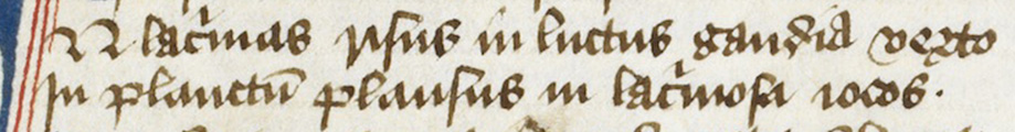
The British Library Board, Harley 866, f. 17r.
The lines above read:
[I]N lac(ri)mas risus in luctus gaudia verto
In planctu(m) plausus in lac(ri)mosa iocos.
Try matching up the letters in the transcription to those in the image. (The first line appears to start with a big N, because the I of the word IN is in fact the large red and blue initial that you can see in the larger image above.)
S is long in the middle of words, where in earlier minuscules you'd expect it to be tall (i.e., to sit on the baseline), and you can see that it is a strong diagonal amid the other letters. You will see the loops on l, and also on d, whose loop turns to the left and crosses back around over itself. In lacrimas, lacrimosa, and gaudia, the scribe uses the two-story a, often quite tall, which is characteristic of the English variety of Cursiva known as Anglicana. He uses the standard Cursiva single-story a for the second a in lacrimas and lacrimosa, and in planctum and plausus in the second line.
Features that this script shares with Textualis include the 2-shaped r in verto at the end of the first line, and abundant minim-confusion. The minim-rich letters i n m u are slanting here, and they are joined to adjacent letters, which makes it even harder to distinguish them. Look at risus in line 1: we have an r that looks like a deep v, joined to a following i, which leads into a long s, followed by a u, followed by a round s, which in this script can look a lot like a capital B.
This mid-15th-century French or Flemish manuscript, by contrast, is much more formal and much more influenced by Textualis. The letters and their parts are more regular than in the less-formal English manuscript above. But it still has the features that qualify it as Cursiva: single-story a, looped ascenders, and f and s with long descenders.
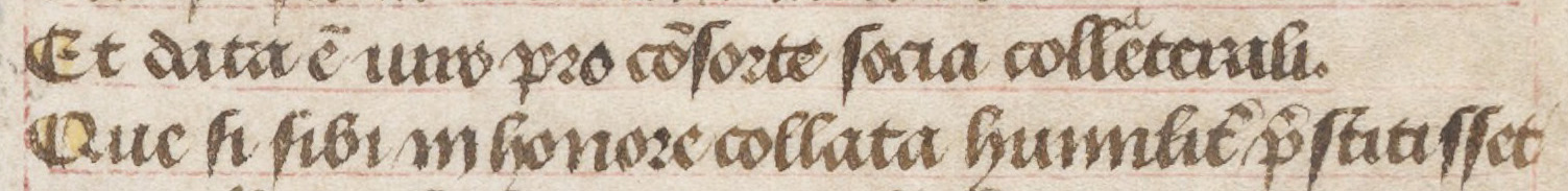
Geneva, Bibliothèque de Genève, MS fr. 1/2, 1rb, ll. 9-10.
The text here reads:
Et data e(st) uiro pro co(n)sorte socia colleterali
Que si sibi in honore collata humilit(er) p(re)stitisset
You can see three looped ascenders on l in colleterali (corrected to collaterali with a small superscript a), and on h and l in several words in the second line.
The long s jumps out of the page because it is made with an extra-dark, extra-thick stroke with a very pointy descender. This is characteristically French or Flemish and is typical of the high-grade regional variety of Cursiva known as Bastarda.
Textualis-influenced features here include lateral compression; the shape of the d; systematic use of biting or fusion, as in the da of data and the oc of socia; and 2-shaped r after round letters, as in consorte and honore.
The next manuscript is a very formal Cursiva, with an even more marked use of the dark, thickened, pointy, and diagonal f and s. This manuscript is in French and was written during the first half of the 15th century. If you explore the page, you will see many decorative loops and flourishes, and the aspectual effects of the strong, dark diagonals.
Geneva, Bibliothèque de Genève, MS fr. 1/2, f. 1r. (https://www.e-codices.unifr.ch/en)
If you zoom out, you can see how even though the language is vernacular and the script is Cursiva, the page layout features are exactly what you would expect from a manuscript in Textualis: long columns, visible ruling, and the letters floating between the two ruled lines.
If you are getting eyestrain from trying to pick out letters in these scripts, then you will sympathize with the Italian scholars who were working on reviving Caroline Minuscule around the time the manuscripts above were written. Go to the Humanist Paleography lesson to learn about the reformed minuscule and cursive scripts of 15th-century Italian scholars.
Ready to transcribe?
Try your hand at transcribing Gothic Cursiva scripts