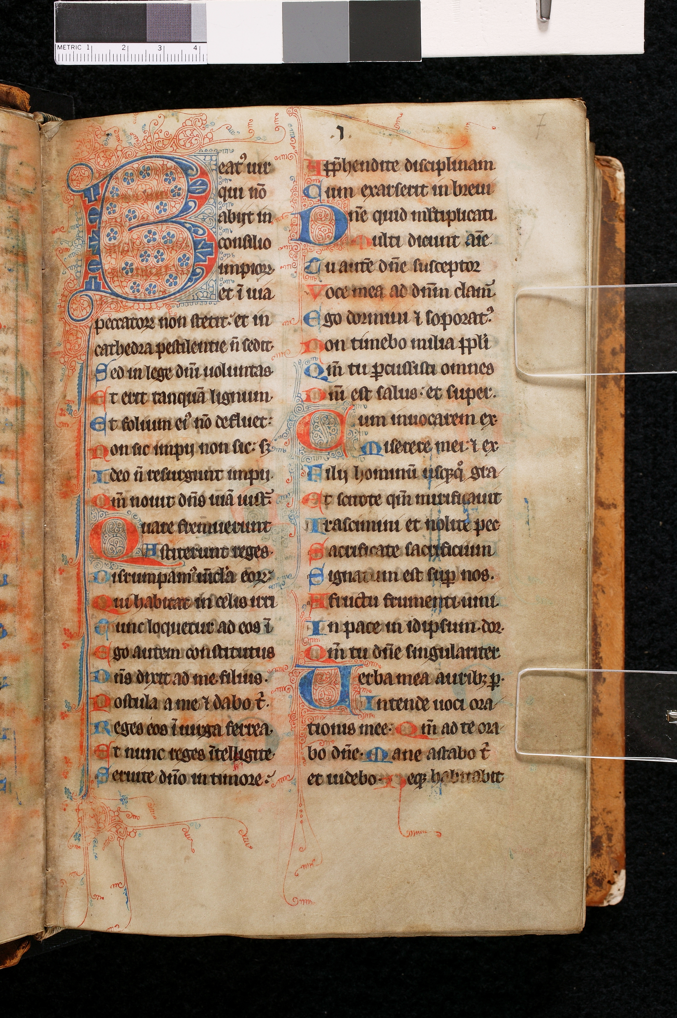
Gothic Textualis, 13th-14th century
-
Title
Breviary-Missal -
Text
Psalms 1-5 (abbreviated) -
Language(s)
Latin -
Writing System
Roman -
Script(s)
Gothic Textualis -
Country
United States of America -
City
Collegeville (Minnesota) -
Repository
Hill Museum & Manuscript Library -
Shelf Mark
Bethune MS 2, fol. 7r -
Common Name
Bethune Breviary -
Century
13th-14th century -
Year Range
1290-1310 -
Place Of Origin
NE France -
Provenance
Mgsr. Felix Bethune (1824-1909); Gaston S. Bethune (1877-1966); Ade Bethune of Newport, Rhode Island, donated the manuscript to HMML
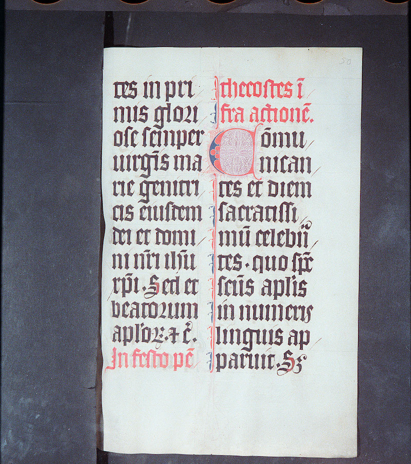
A breviary is a book in which all the texts for the Daily Office are compiled. Some breviaries, like this one, also include the texts for the Mass and are called Breviary-Missals or Missal-Breviaries. It is likely that this breviary was made for the use of a Benedictine community, since the feasts of St. Benedict and of his translation are red-letter days in the calendar.
As its name suggests, a breviary is designed to compress a vast amount of material into a brief space so the book will be portable. (This manuscript is just a little bigger than a trade paperback.) Almost everything in it is abbreviated to make this possible. The texts written in a breviary are designed to prompt a user who already knows those texts by heart about which one to recite, so the texts don't have to be written out in full.
A breviary always begins with the Psalter. In this breviary, the first few words of each verse of each psalm are given, except for Psalm 1, verse 1, at the top of the left column on this page, which is given in full. Each abbreviated verse starts on its own line, beginning with a colored letter. Larger initials decorated with elaborate penwork mark the beginning of each psalm. In at least one place, the original scribe added hyphen where a word breaks at the end of a line. A later user of the book added hyphens in a lighter brown link in a couple more places. Note that unlike normal hyphenation, medieval or modern, these hyphens do not indicate that the word continues on the next line on the page. Because every verse is snipped off at the end of a line, the hyphen only indicates that a word was severed at line-end. The next line begins the next verse. (This system is abandoned in the last five lines of the second column, where the verses are still abbreviated, but the verse-portions run over the line breaks. Here the hyphens do operate in the normal way.)
The script is a Gothic Textualis. The script is very carefully executed, though it is not the angular Textualis formata in which every stroke is actually made up of multiple angular strokes and hairlines. General characteristics marking the script as Textualis are a large minim height in proportion to very short ascenders and descenders; a regular rhythm of parallel minims, equally spaced; and the biting or fusion of opposing bows, where the rounded parts of two letters overlap and share a stroke when they face each other within a word.
Specific letterforms that mark this as fully-developed Textualis of the high Middle Ages are: a with a sizable upper compartment; consistent use of uncial d; a g that has almost no descender; consistent use of 2-shaped r after round letters; consistent use of round s at word end; and a crossed version of Tironian et that sits on the baseline.
The layout in two long columns, dense with dark text, is typically Gothic, as is the red-and-blue color scheme with elaborate penwork. In several places, small guide letters are visible: these would have been entered by the original scribe to instruct the rubricator which letters to put in in colored ink.
Acknowledgements: Described by Carin Ruff
Transcription
Column 1
1 Beat(us) uir
2 qui no(n)
3 abiit in
4 consilio
5 impior(um)
6 et i(n) uia
7 peccator(um) non stetit.´et in
8 cathedra pestilentie n(on) sedit∙
9 Sed in lege d(omi)ni uoluntas∙
10 Et erit tanqua(m) lignum∙
11 Et folium ei(us) no(n) defluet.´
12 Non sic impii non sic.´ s(ed)
13 Ideo n(on) resurgunt impii.
14 Q(uonia)m nouit d(omi)n(u)s uia(m) iust(orum)∙
15 Quare fremuerunt
16 Astiterunt reges∙
17 Disrumpam(us) ui(n)c(u)la eor(um).´
18 Qui habitat in celis irri(-)
19 Tunc loquetur ad eos i(n)
20 Ego autem constitutus
21 D(omi)n(u)s dixit ad me filius.
22 Postula a me (et) dabo t(ibi)∙
23 Reges eos i(n) uirga ferrea∙
24 Et nunc reges i(n)telligite∙
25 Seruite d(omi)no in timore.´
Column 2
1 App(re)hendite disciplinam
2 Cum exarserit in breui
3 D(omi)ne quit m(u)ltiplicati.
4 Multi dicunt a(n)i(m)e.
5 Tu aute(m) d(omi)ne susceptor
6 Voce mea ad d(omi)n(u)m clam(aui)
7 Ego dormiui (et) soporat(us)∙
8 Non timebo milia p(o)p(u)li
9 Q(uonia)m tu p(er)cussisti omnes
10 D(omi)ni est salus.´ et super.
11 Cum inuocarem ex∙
12 miserere mei (et) ex∙
13 Filii hominu(m) usq(ue)q(uo) gra/-\
14 Et scitote q(uonia)m mirificauit
15 Irascimini et nolite pec-
16 Sacrificate sacrificium
17 Signatum est sup(er) nos.
18 A fructu frumenti∙ uini
19 In pace in idipsum. dor(miam)
20 Q(uonia)m tu d(omi)ne singulariter.
21 Uerba mea aurib(us) p(er)∙
22 Intende uoci ora/-\
23 tionis mee.´ Q(uonia)m ad te ora/-\
24 bo d(omi)ne∙ Mane astabo t(ibi)
25 et uidebo∙ Neq(ue) habitabit
Paleographic Features
1. The tops of minims of many letters are thickened into a wedge shape by going over the stroke a second time with the pen at a slightly different angle. You can see this clearly in the u, i, and n in line 2 of the first column.
2. Col. 1, line 3: When two is appear side by side, writing the second one in the form of a j helps to distinguish the adjacent minims. The strokes were probably added by a later user. There are two more instances of ij without strokes in lines 12 and 13 of col. 1.
3. impiorum in col. 1, line 5, and peccatorum in col. 1, line 7 show the Gothic form of the -orum ending: o plus 2-shaped r with a stroke through the tail of r to indicate suspension of the final -um. In Textualis, the 2-shaped r is used after round letters to avoid putting a straight stroke up against a round bow.
4. There is a 2-shaped r following Uncial d in cathedra, directly below peccatorum.
5. Col. 1, line 9: g (here in lege) is becoming vertically more compact, so that its lower stroke hardly descends below the baseline: a feature of Textualis.
6. Col. 1, line 11: The de in defluet shows biting, an obligatory feature of Textualis: when the curves of two rounded letters face one another, they overlap or share a stroke.
7. impii in col. 1, lines 12 and 13: The ij form of ii. When we transcribe this, we transcribe it as ii, not ij, since the jis just a graphical variant of i and does not represent the letter j.
8. nouit in col. 1, line 14 shows the regularity of minims in Textualis. Although each stroke is not particularly angular, the overall aspect of the script is one of regularly-spaced minims and diagonal hairstrokes – here adorning the feet of minims, but see elsewhere the angle of the middle strokes of a and e.
9. Col. 1, four lines from the bottom: Tironian et sits on the baseline and is crossed – a feature of later medieval Textualis.
10. In the last line in col. 1, you can see a tiny guide-letter s entered by the scribe of the main text to tell the rubricator which letter to put in in blue ink. Several guide letters are also visible in the lower half of the second column.
11. Large, decorated initials mark the beginning of a new psalm, as in col. 2, line 3.
12. Smaller red and blue initials mark the beginning of each verse.
13. At the end of col. 2, line 13, a hyphen has been added by someone else after the original preparation of the manuscript. The hyphen indicates that gra- is an incomplete word – the whole word in the verse is graui – but because the verses are truncated here, the word does not actually continue on the next line.
14. At the end of col. 2, line 15, however, the hyphen after pec- appears to have been added by the original scribe to indicate that the word peccare is incomplete at the end of the line. Compare the end of line 13, two lines above.
15. At the end of col. 2, line 18, the later corrector has added strokes above the two is in uini, to help distinguish them in the series of minims that makes up the word.
16. In the last four lines of col. 2, the scheme of starting a new verse on each line is abandoned, possibly for reasons of space. The scheme resumes on the next page of the manuscript.