Lesson
Latin Scripts - Gothic Textualis
Description
The transition from Caroline Minuscule to Gothic Textualis script in the 12th century. Features of Textualis and of Gothic page design in the 12th to 15th centuries.
Overview — Gothic Textualis
Historical Overview
In the course of the twelfth century, a cluster of changes in the proportions and ductus of Caroline Minuscule gradually transforms the script into Gothic Textualis, the script popularly known as “blackletter.” The changes in script go along with a group of changes in page layout, some of which are aesthetic and some functional.
9th-century Carolingian manuscript
St. Gallen, Stiftsbibliothek, Cod. Sang. 152, p. 3. (https://www.e-codices.unifr.ch/en)
Early-12th century Protogothic manuscript
Walters Art Museum, W.18, f. 11v. © 2011 Walters Art Museum, used under a CC BY-SA license.
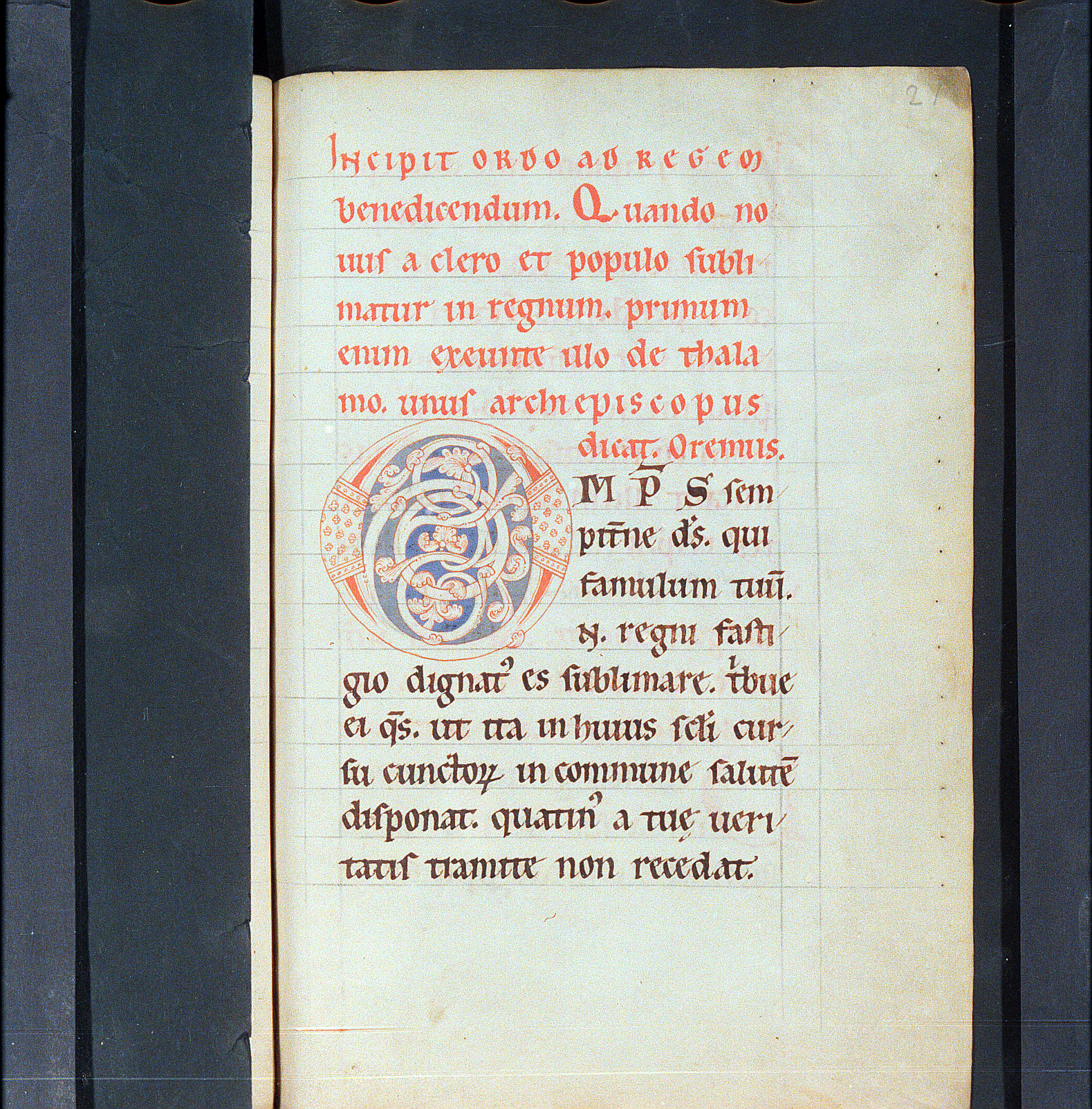
Late-13th/early-14th century Gothic manuscript
HMML, Bethune Breviary, MS 2, f. 7r. Used under a CC BY-NC 4.0 license.
“Textualis” means, simply, “bookish.” It is the term applied by modern paleographers to the dense, angular script used in the common book culture of northwestern Europe from the twelfth century to the end of the Middle Ages and beyond. We call it “Gothic” by tradition and because of its association with the broader developments in art and design known to modern scholars as Gothic.
The period of the emergence of Textualis is the period of the rise of the universities, beginning in the first half of the twelfth century, when book production moved, at least in part, from the monasteries to professional scribes and booksellers serving the needs of university scholars. Books increased both in kind and in sheer numbers in this period. Textualis is found in many different grades in books with many different kinds of layouts, according to the demands of the texts and commentaries they contained, and the needs of the ever-increasing population of readers.
In this lesson, we examine the letterforms and layout features that mark the transition from the Carolingian to the Gothic book aesthetic and identify the features common to fully-developed Gothic Textualis. [Note: To read more about the many varieties of Textualis as practiced in the High Middle Ages and to learn how they are classified, see Albert Derolez, The Palaeography of Gothic Manuscript Books (Cambridge: Cambridge University Press, 2006).]
Transition from Caroline to Textualis
The scripts of the later 11th through the 12th centuries show to varying degrees the symptoms of the transition from Caroline to Textualis. It is helpful to have a category, “Protogothic”, for varieties of script in this period that are recognizably no longer canonical Caroline Minuscule but are not yet fully-developed Textualis.
Aspect in the transitional period
The most obvious feature of late Caroline and 12th-century Protogothic script is a change in the proportions of letterforms. Minim-height grows markedly in proportion to the whole letter — or, to put it another way, the relative length of ascenders and descenders decreases. At the same time, the letters, and eventually the words, are laterally compressed. It is as if the small, rounded bowls of canonical Caroline Minuscule had been squeezed into elongated egg shapes. The change in proportion of the letters is apparent in this mid-12th-century manuscript from Germany:
Köln, Erzbischöfliche Diözesan- und Dombibliothek, Cod. 139, f. 21r.
The manuscript below, which has an extensive marginal and interlinear gloss, shows the change in proportion both in the main hand and in the less-formal glossing hand. Both manuscripts are recognizably Carolingian in their careful spacing and use of Rustic Capitals for headings. The differences in layout between this manuscript and the one above have more to do with purpose than with style or period: the Cologne manuscript is a liturgical manuscript containing a bishop’s part of the liturgy, while the more complex, glossed book from the Walters is designed for study.
Walters Art Museum, W.30, f. 6v. © 2011 Walters Art Museum, used under a CC BY-SA license.
In this early-12th-century English Gospel manuscript, the letters are even more markedly laterally compressed. That feature, combined with reduced space between lines, is beginning to make the columns of writing look denser:
Walters Art Museum, W.18, f. 11v. © 2011 Walters Art Museum, used under a CC BY-SA license.
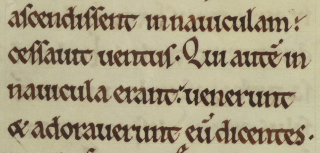
This manuscript also shows another of the signal features of the emergence of Textualis: the uniform treatment of the feet of letters, giving a characteristic rhythm at the baseline. The uniformity of the feet of minims tends to emphasize the vertical stroke as the basic building-block of Gothic script.
Note how every vertical stroke is finished at the bottom with a uniform hairline uptick, and how the accumulation of feet in that style affects the overall rhythm of the script (Walters Art Museum, W. 18, f. 11v. © 2011 Walters Art Museum):
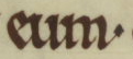
eum
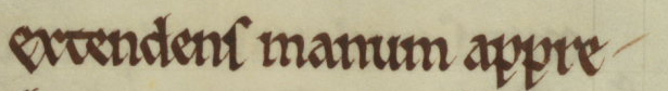
extendens manum appre-
Meanwhile, the tops of upright strokes come to be embellished with forking penstrokes. You can see this feature is also apparent in the detail below, on the ascender of d and at the top of l:
Letterforms
If you look up close at these and similar manuscripts of the 12th century, you will see that although the proportions of the letterforms have changed, the letters themselves overwhelmingly retain their Caroline Minuscule forms.
As the transition from Caroline to Gothic Textualis continues, though, a number of particular letterforms can be seen to change. Watch for these as signs of the emergence of Textualis:
- Uncial d — the rounded form with stem leaning over to the left — reemerges and is used in variation with upright d.
- Uncial (round) s — our normal form of the letter — is reintroduced at word-end only, where it alternates with tall s.
- The upright stroke of t begins to peek ever so slightly above its crossbar.
- The hasta of e begins to slope upward and to the right.
- Following o, r comes to have a 2-shaped form. The or ligature in this shape is the normal form of that letter sequence in Textualis.
- The bow of h bends around and finishes with a hairstroke pointing down and to the left. By the end of the 12th century, the end of that stroke descends below the baseline.
- The 7-shaped “Tironian et” — the ancient sign for “and” used in Insular manuscripts — is reintroduced and gradually supplants the ampersand (e-t ligature), which was the exclusive form of et in Carolingian manuscripts.
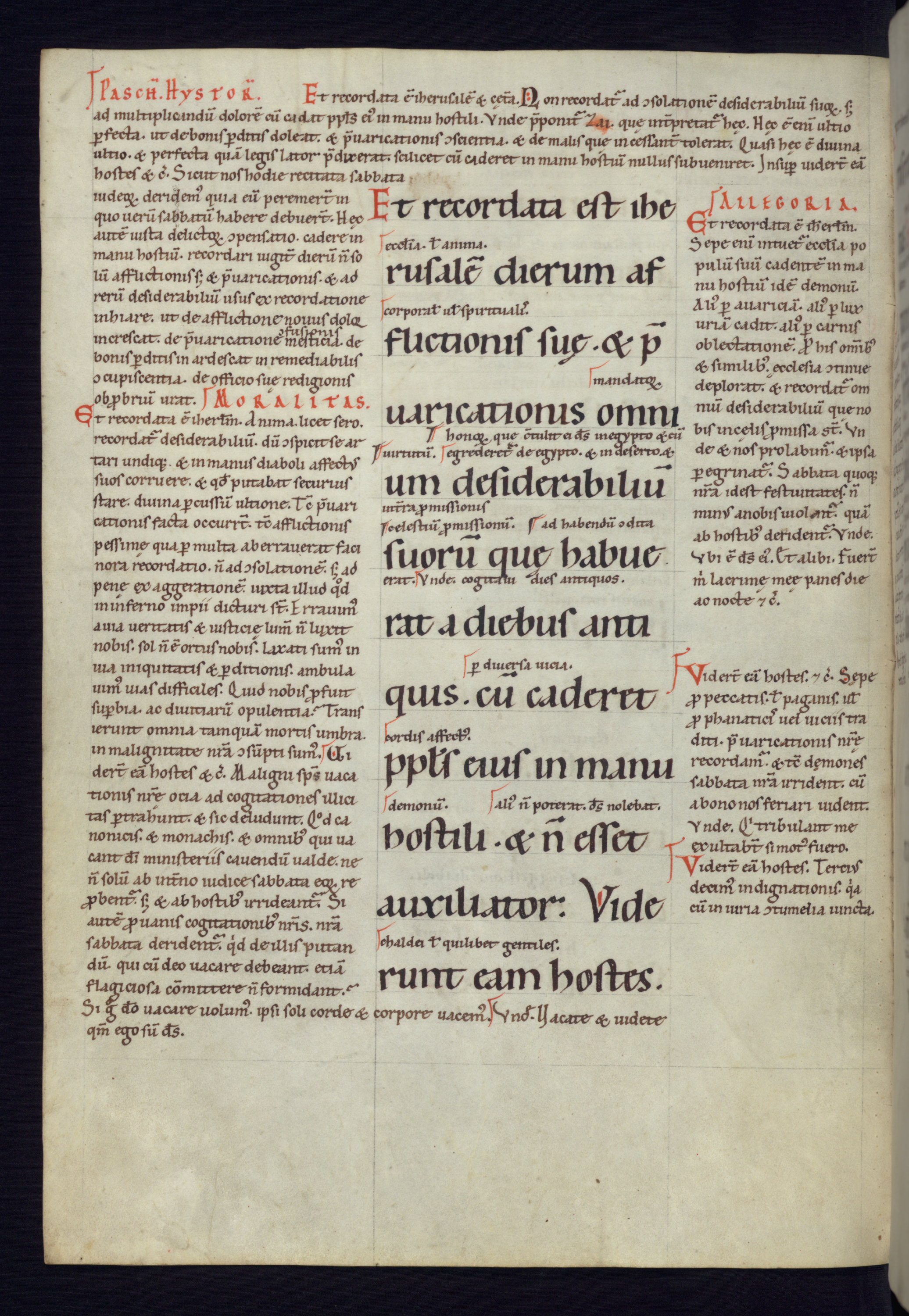
In the detail below, you can see tall s at the end of (-)flictionis at the beginning of the line, and round s at the end of (-)uaricationis at the beginning of the next line. The upright of t in (-)flictionis pokes ever so slightly above its crossbar. The e in the second word in the first line, suę, has a hasta with a marked diagonal slant. And if you look at the little word between the lines, you can see o plus 2-shaped r. This word is mantator(um). The r looks like a 2 whose second stroke is a large swash down and to the right, and it is closely attached to the o it follows. The diagonal slash through the tail of the 2-shaped r indicates that the end of the word is abbreviated.
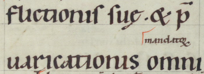 Walters Art Museum, W. 30, f. 6v. © 2011 Walters Art Museum
In this detail below, you can see the use of round s at word end, and also the alternation between upright and Uncial d. The text reads:
regni insignia exterius conde-
corant eundem laudabilia
The round s is used at the end of exterius, something you would not see in earlier Carolingian manuscripts. Meanwhile, conde- uses an Uncial d, but eundem and laudabilia each have an upright d.
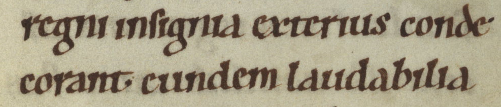 Walters Art Museum, W. 30, f. 6v. © 2011 Walters Art Museum
This detail is a good chance to observe, too, how comparatively larger minim-height and the lateral compression of the letters have changed the look of the script. But note that the a and the g are still completely Caroline.
Are you ready to try recognizing transitional forms in the wild? Click ahead to the exercise in the next section to try your hand at telling Protogothic from Carolingian manuscripts.
Fully-formed Textualis
By the 13th century, a script emerged that incorporated all of the above features with a much more marked emphasis on angularity, with upright strokes and diagonal linking lines as the building-blocks of letters. This is Textualis, the book script par excellence of the later Middle Ages and the model for the earliest European printing types.
Textualis proper has the lateral compression of Protogothic, but even more marked, because nearly all the strokes that make up the letters are thick vertical strokes. Even notionally “curved” letters, like c and o, come to be composed of straight and diagonal strokes, with marked contrast between thick and thin. Ends of letters are finished with angular hairlines, sharp forks, or lozenge-shaped finials. The proportionately large minim height and small ascender/descender length become even more marked. Space between lines gets smaller. The result is a highly-compressed, angular script that appears dense on the page.
This 14th-century manuscript in a highly calligraphic form of Textualis (by a woman scribe!) shows clearly the salient characteristics of the script: verticality and angularity, with the vertical strokes that make up the letters forming a regular rhythm along the line of writing:
Germany (Cologne, Convent of the Poor Clares), before 1357 CE
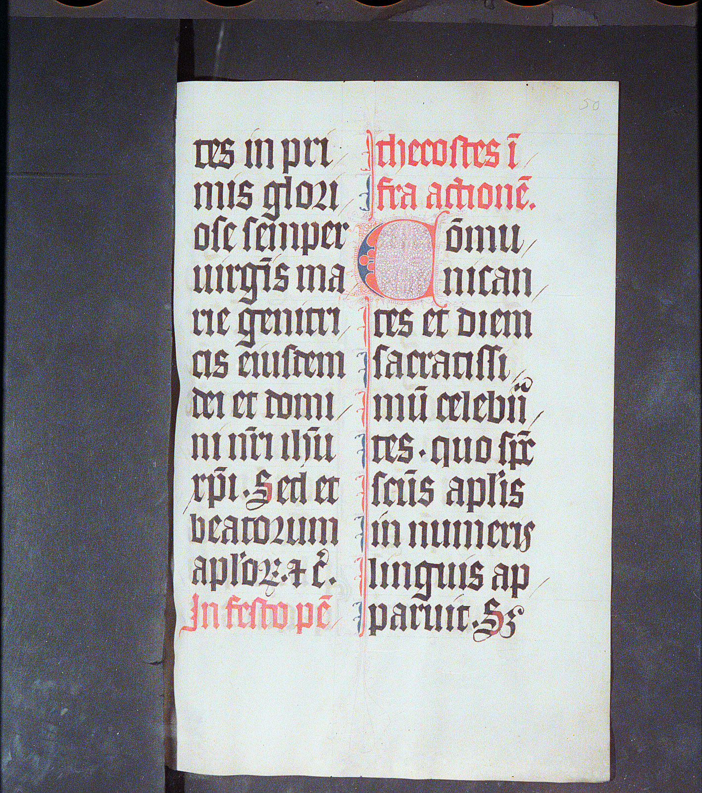
Köln, Erzbischöfliche Diözesan- und Dombibliothek, MS 149, f. 50r.
In it, you can see the fully-developed results of the changes in letterforms we saw in Protogothic:

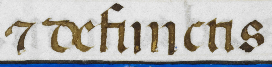
This is or. The 2-shaped form of r after o has become standard. (Look at the second line from the top and the second and third lines from the bottom in the left-hand column.)
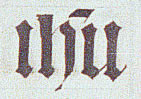
This is ihu, an abbreviation for iesu. The right-hand stroke of h curves around and descends below the baseline.
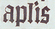
These letters are aplis, an abbrevation for apostolis. The a shows another development of later-medieval Textualis: the upper stroke has become closed, so that the letter has, in effect, two “stories.” The p in the word here and the q in the following detail show how short descenders have become.
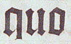
This quo shows how notionally “round” letters come to be made up of straight strokes...
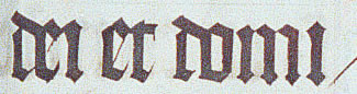
... as does this detail, which reads dei et domi-
In the dei et domi- detail above, you can see another defining feature of Textualis, the so-called “biting” (or “fusion”) of opposing bows. Whenever the bows of two “rounded” letters face each other, those letters are written so that the bows overlap. In effect, since bows in Textualis are constructed of straight lines, this means that the two letters share one vertical stroke where they overlap. You can see the “biting” of de and of do in the words above. (Note that this is only possible once d has assumed its “Uncial” form, with the stem leaning over to the left and with a curve — or, in Textualis, a notional curve — on the right where it faces the next letter.)
The dei et domi- detail above is also a good place to see how the consistent treatment of the feet of minims contributes to the rhythm of the script.
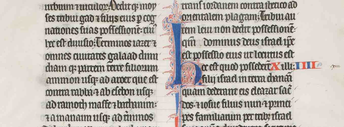
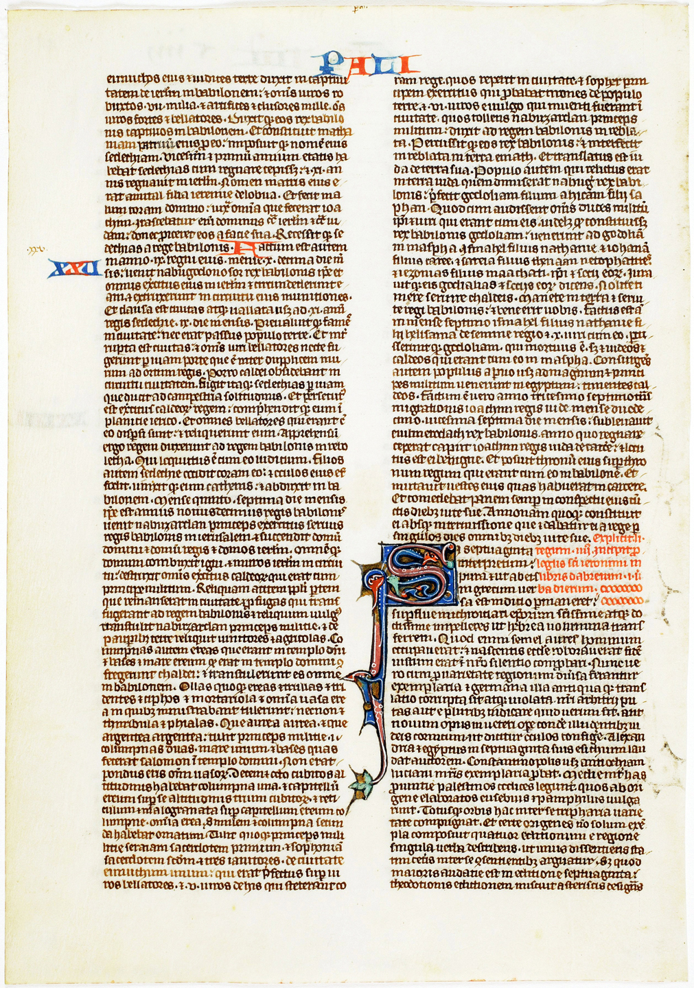
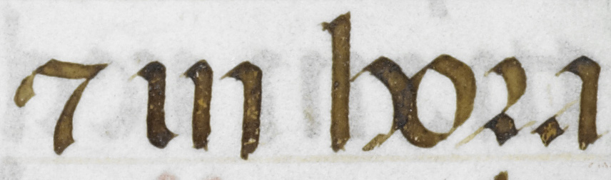
In more rapidly-written forms of Textualis, fewer strokes are used, and strokes that are genuinely curved may appear, but the same sense persists that the script has a rhythm of evenly-spaced, heavy, parallel upright strokes. This late-13th-century breviary gives a good sense of the typical page of Gothic Textualis. Can you spot any of the individual letterforms mentioned above in this manuscript? Can you find an instance of biting of opposing bows?
Northeast France, ca. 1290-1310
HMML, Bethune Breviary, MS 2, f. 7r. Used under a CC BY-NC 4.0 license.
Compare this manuscript to the Protogothic examples from the previous century earlier in this lesson, and to the Carolingian manuscripts in the last unit. See if you can identify the relationship between the forms of individual letters and the look of the script as a whole.
Page Layout in Gothic Manuscripts
The changes in the shape and proportions of letters that come with the development of Textualis — short ascenders, close-set lines, rows of evenly-spaced minims — lend a block of text written in that script a darker, denser appearance than is found in Carolingian manuscripts. The characteristic Gothic page layout is two long, narrow, dense columns whose boundaries are clearly set off from the surrounding space. You can see a trend in that direction in the 12th-century Protogothic manuscript at left, and it is fully developed in this mid-13th-century leaf from a small-format, portable Bible:
12th century
Walters Art Museum, W.18, f. 11v. © 2011 Walters Art Museum, used under a CC BY-SA license.
Mid-13th century
HMML, Arca Artium (aap1306 verso). Used under a CC BY-NC 4.0 license.
Zoom in and take a look at how the proportions of the letters in the 13th-century manuscript above contribute to the very dense appearance of the two columns.
The two-column layout is, of course, not new in this period: we saw it in Bible manuscripts from late antiquity and the early Middle Ages, too. But the long, narrow proportions and density of the columns as blocks of text are an innovation of the Gothic period. Narrow columns make it somewhat easier for the eye to track through text that has little space between lines and is laterally compressed, as well as highly abbreviated.
Smaller-format books often still retained a single-column layout with squarer proportions. This is typical for Books of Hours, luxury private devotional books of the end of the Middle Ages, which were designed to be held easily in the hand and were typically written in large, carefully-formed letters for lay readers. However, the presentation of the text as a densely-set, dark block, clearly bounded by marginal space or decoration, is in keeping with the Gothic aesthetic of the large-format Bibles above.
Ruling becomes a frame
Early in the Gothic period, several changes in ruling technique alter the relationship between ruling lines and the text on the page.
- Ruling is done in ink, rather than dry-point or faint lead, so it becomes more visible. Indeed, there seems to be no effort to make it invisible, and it increasingly becomes part of the decoration of the page.
- The first line of text comes to be written below, rather than above, the top ruled line.
- The feet of letters start to float above the ruled line, rather to sit right on it.
We can see all of these developments in this 15th-century Low German (?) manuscript:
HMML, Arca Artium (aap1301 verso). Used under a CC BY-NC 4.0 license.
The cumulative effect of these changes is that each line of text appears to be contained within a ruled box, while the text as a whole is also bounded by visible lines. Think about how different this is from early-medieval manuscripts in which the ruling was all but invisible. (If you zoom in, you can also pick out some of the letterforms we discussed in the last section.)
More complex layouts and ruling patterns
From the 12th century on, books studied in the new universities and copied by and for students were increasingly provided with standard glosses and commentaries. Elaborate layouts and ruling patterns developed to accommodate marginal and interlinear glosses as well as the main text. This page from a glossed copy of the Gospel of Luke from early 13th-century Paris illustrates these developments:
HMML, MS Frag. 19, recto. Used under a CC BY-NC 4.0 license.
Red and blue pen flourishes, running titles, and numbers were used to help the reader find his way around these complex texts. Both the red-blue color scheme and the proliferation of “signposting” in books are typical of Gothic manuscripts. The somewhat earlier glossed manuscript we looked at early in this lesson also illustrates these developments in layout. If you zoom in, you can see that the page is ruled with double-height spaces for the main text and closer-set lines for the glosses:
Walters Art Museum, W.30, f. 6v. © 2011 Walters Art Museum, used under a CC BY-SA license.
Other Forms - Southern Textualis
The script whose evolution and characteristics we have been studying in this lesson is, strictly speaking, Northern Textualis. The Mediterranean countries — Italy, Spain, and southern France — had a variant form of Textualis that has traditionally been known as Rotunda. In Albert Derolez’s taxonomy of scripts, this script is called Southern Textualis.
Features of Southern Textualis
Southern Texualis is like Northern Textualis in its repertory of letterforms, including Uncial-style d and s, 2-shaped r following round letters, and the Tironian et; in observing the rule of biting or fusion of opposing bows; in having a large minim-height in proportion to ascenders and descenders; and in having a marked contrast between thin and thick penstrokes.
It is unlike Northern Textualis in that its round letters are truly round. In Southern Textualis, letters like b, c, d, e, o, and p have generous curved strokes where Northern Textualis has “curves” that are actually composed of several straight and angled strokes. Partly as a result of this use of generous curves, Southern Textualis is far less laterally compressed than Northern Textualis.
Compare a page of Southern Textualis from the late 15th century to one in Northern Textualis at a comparable level of execution:
Southern Textualis
© The British Library Board, Add. 34294, f. 14v.
Northern Textualis
Köln, Erzbischöfliche Diözesan- und Dombibliothek, MS 149, f. 50r.
You can see the difference in lateral compression at a glance: the Southern Textualis manuscript on the left feels very spacious compared to the Northern Textualis manuscript on the right. Then compare how o is made in each script. The first letter of the Southern example sets the tone, and you will find other examples throughout the page: the normal Southern Textualis o is constructed of two curved strokes and it reads as quite round. Then look at the os in the Northern example. There is one at the beginning of the third line, and you can find other examples. The Northern Textualis o is constructed entirely of straight lines, and it is much narrower than the Southern Textualis version.
The following details show the similarities and differences between the two scripts.
Here is the same word, dei, in both scripts. They both show Textualis’s characteristic “biting” of opposing bows where the d and the e face each other. Note how in the Southern version at left, the bows are really bows — they curve, and the curving strokes overlap — whereas the ostensible curves at right are all made up of straight strokes, with one vertical stroke shared between the two letters.
Compare the ds, too. Both are the “Uncial” d, with a stem that leans over to the left (as opposed to the Half-Uncial/Caroline d, whose stem is upright). But in Southern Textualis, the stem of d leans so far over to the left that it is horizontal, and it appears to be part of a continuous curve with the rest of the letter. (In fact, the letter is made up of at least three strokes.) This d is one of the telltale signs of Southern Textualis.
dei

dei
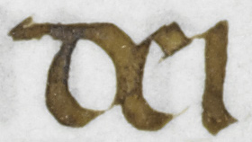
In these words, where p meets o at left, and d meets o at right, we see the same difference in how biting works in the two scripts.
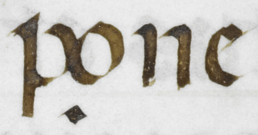
pone
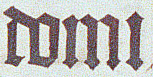
domi
On the other hand, in the ea below, you can see how Southern Textualis shares angular elements with the Northern version, particularly in the use of diagonal hairlines to join parts of letters.
ea
There are several features to note in the Southern Textualis et defunctis below. This detail begins with the Tironian et, the 7-shaped mark of abbreviation. In Southern Textualis, the Tironian et is confined to minim height and its horizontal stroke is proportionally broad, in keeping with the proportions of the script. Its upright is never crossed, as it generally is in later versions of Northern Textualis.
et defunctis
In this example, you see again the Southern Textualis version of d with the stem leaning way over to the left. At the same time, you can see that even though many letters are rounded, minims are still straight and parallel, as in the Northern version. You need to look closely, count minims, and have a good knowledge of Latin to tell u from n, especially when they are sitting next to each other.
Here you see the Southern version of Tironian et again, at left, and you can compare the 2-shaped r in both scripts. The r itself is virtually identical. The “round” o that precedes it is genuinely round in the Southern version at left, but it is made up of straight lines in the Northern version at right.
et in hora
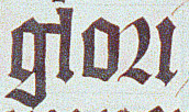
glori
Southern Textualis: Dates and distribution
Southern Textualis originates in Italy and was the normal version of Textualis in the Mediterranean region, but books in this script were also produced elsewhere in Europe. The diffusion of the script has a number of different causes. A smaller and less formal version of Southern Textualis, known as the littera bononiensis, was the normal script of canon law books emanating from the University of Bologna, which was the center of canon law studies from the late 11th century. Those manuscripts were widely distributed across Europe, so people in regions where Northern Texualis was normal would also have been familiar with Southern Textualis. And in the era of printing, typographic versions of Southern Textualis were widely used for the same purpose.
The later Middle Ages, especially the 14th to 16th centuries, were also the age of professional scribes and private patronage of book production. Such an economy of books meant that a particular script was far less bound to a particular location than had been the case in the age of monastic book production. Southern scribes wrote Southern Textualis for northern European patrons, and vice-versa.
Southern Textualis: Page design
Because of the wide range of its dates and geographic distribution, as well as the early development of Renaissance art in the script’s Italian homeland, we find Southern Textualis in manuscripts of every decorative style of the later Middle Ages. The manuscript we have been looking at above has an entirely Renaissance-style, classicizing frame, which we might expect to accompany the Humanist scripts we will study at the end of this course. But canon law books in Southern Textualis come with page layouts that resemble the complex, text-dense pages of the glossed biblical manuscripts we looked at earlier in this lesson. You could identify them as Gothic from across the room. Southern Textualis is also used, with musical notation, in many of the giant choirbooks that survive from late medieval and Renaissance Spain and Italy. These are the kinds of books in which you are most likely to see Southern Textualis in North American collections.
If you read Latin and would like to try deciphering some manuscripts in Textualis, go to the Gothic Textualis Transcription. Otherwise, go ahead to the Visigothic and Beneventan Paleography lesson to learn about other scripts used in Spain and Italy.
Ready to transcribe?
Try your hand at transcribing Gothic Textualis scripts