Gothic Textualis, 14th century
-
Title
Ordo Missae -
Text
Prayers of the Canon of the Mass -
Language(s)
Latin -
Writing System
Roman -
Script(s)
Gothic Textualis -
Country
Germany -
City
Cologne -
Repository
Erzbischöfliche Diözesan-und Dombibliothek -
Shelf Mark
149, fol. 50r -
Common Name
Rennenberg Codex -
Century
14th century -
Year Range
1300-1337 -
Place Of Origin
Germany, Cologne -
Provenance
Convent of the Poor Clares of Cologne; Cologne Cathedral
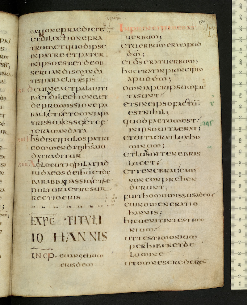
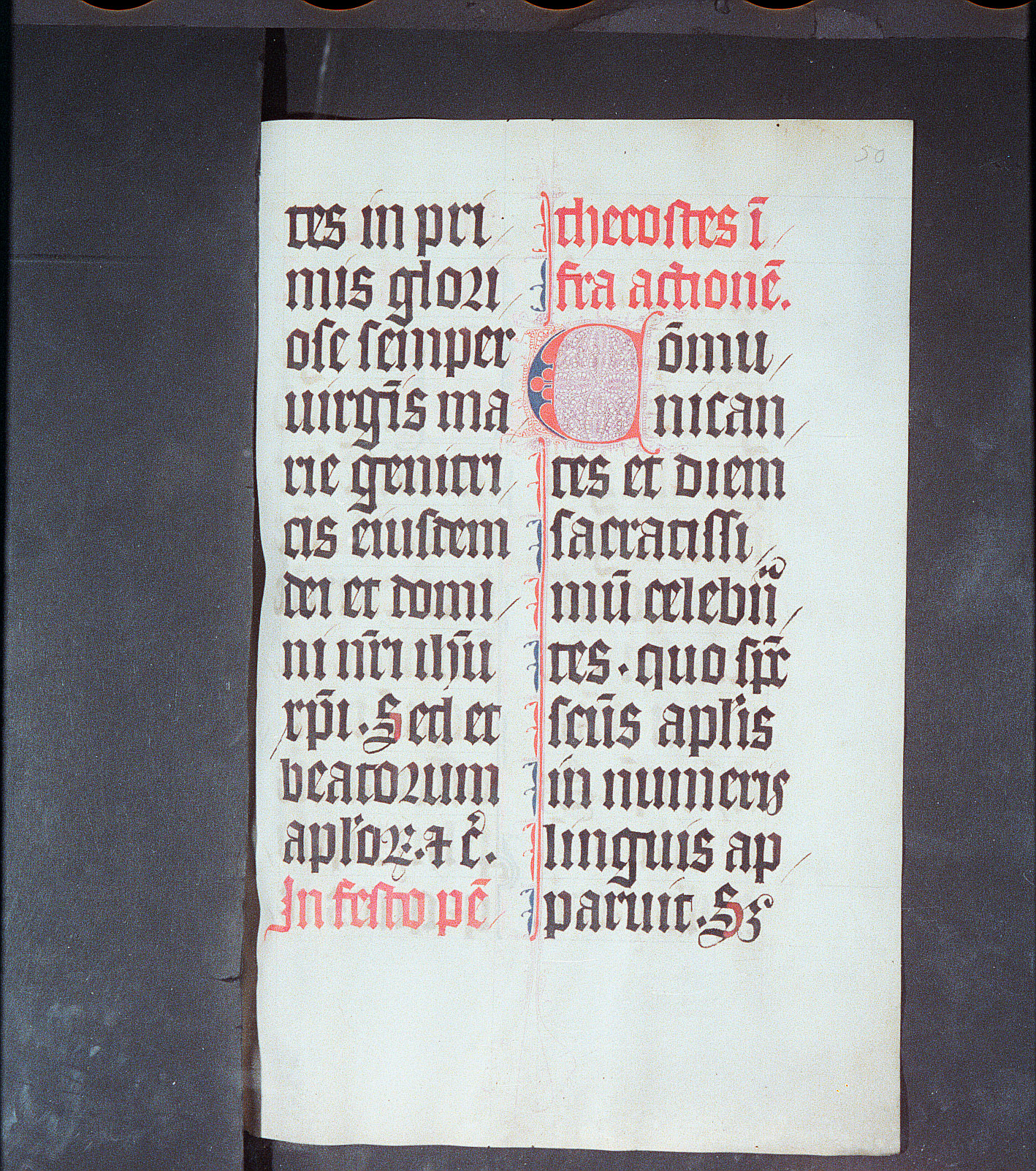
This missal was copied by the Poor Clares of Cologne for Conrad of Rennenberg, Dean of Cologne Cathedral (d. 1357). The nuns of this convent specialized in producing luxury liturgical manuscripts in the 13th and 14th centurie. The scribe Loppa vom Spiegel is thought to have been responsible for this manuscript.
The script is a Gothic Textualis of formata grade – that is, executed with a very high degree of care and precision, involving many separate lifts of the pen. Its full name under Derolez's system of nomenclature would be littera gothica textualis formata. The script has all the hallmarks of Textualis:
- a regular pattern of minims, set close to one another and evenly spaced, with the regular treatment of the feet emphasizing the rhythm
- "round" letters and letter-parts formed by a series of straight strokes
- "biting" or fusion of opposing bows
- very large minim height in proportion to ascenders and descenders
- the 7-shaped Tironian abbreviation for et
- regular use of "round" s at the ends of words
- the 2-shaped r after o
Besides these general Textualis features, the carefully-applied diamond-shaped serifs at the feet of letters are a feature of formata-grade script, as are the very fine and evenly-slanted diagonal hairlines.
Usages pointing to a later-medieval date are the strokes over single is and the relatively large upper compartment of a.
The blue and red decoration scheme with extremely fine penwork is typical of Gothic manuscripts.
Acknowledgements: Described by Carin Ruff
Transcription
Column 1
1 tes in pri-
2 mis glori-
3 ose semper
4 uirg(in)is ma-
5 rie genitri-
6 cis eiusdem
7 dei et domi-
8 ni n(ost)ri ie(s)u
9 chr(ist)i. Sed et
10 beatorum
11 ap(osto)lor(um) (et) c(etera).
12 In festo pe(n)-
Column 2
1 thecostes i(n)-
2 fra actione(m).
3 Co(m)mu-
4 nican-
5 tes et diem
6 sacratissi-
7 mu(m) celeb(ra)n-
8 tes. quo sp(iritu)s
9 s(an)c(t)us ap(osto)lis
10 in numeris
11 linguis ap-
12 paruit. S(ed)
Paleographic Features
1. Col. 1, line 1: Note the strokes over individual letter i in in and pri-. Stroking an i when more than one i appears together helps to distinguish the letter in a script where all minims look alike. Adding strokes when the i is not next to a minim with which it might be confused, as here when it is next to r, was a development of the 14th century.
2. Col. 1, line 2, first letter: Diamond-shaped serifs at the feet of minims are a feature of some varieties of Textualis formata
3. Col. 1, line 2: Note the 2-shaped r following o in glori- — a Gothic feature
4. Descenders are very short in proportion to the bodies of letters, as in the p of semper in col. 1, line 3.
5. "Round" s is used at the ends of words – a Gothic feature. Note that this letter of curves is actually made of a series of straight strokes – a defining feature of Textualis.
6. Col. 1, line 4: Note the very fine diagonal hairstrokes as ornament, a feature of Textualis formata.
7. Biting or fusion of opposing bows, a defining feature of Textualis, is seen in dei and domi in col. 1, line 7.
8. The b at the beginning of col. 1, line 10 shows how short ascenders are in proportion to the size of the bodies of letters in this script.