Lesson
Latin Scripts - Basics
Description
Basic terminology for the description of scripts and letters, and the physical features of the pages that carry them. Introduction to papyrus, parchment, and the codex.
Overview
This lesson introduces the basic terminology needed to describe scripts and letters, and the physical features of the pages that carry them. The first goal of this lesson is to explain the terms we will use in subsequent lessons to talk about the features of scripts, the differences between them, and the differences in the ways they are laid out on the manuscript page.
A secondary goal is to equip you to understand descriptions of scripts by scholars in other paleographical handbooks and in manuscript descriptions. Paleographers have used and continue to use a bewildering variety of terms, sometimes in contradictory and inscrutable ways, and scholars of typography have yet another set of terms for describing typefaces and printed letters. In this course, we aim to teach a limited set of terms that would be understood by most Anglo-American scholars who work with manuscripts. Once you become familiar with how we use these terms to describe scripts and letterforms in this course, you should be better equipped to understand other scholars' descriptions of scripts, even if their terminology is slightly different.
Branches of Manuscript Study
Paleography is the study of ancient and medieval handwriting. More broadly, it encompasses all aspects of the study of the manuscript book.
Codicology is the study of the physical characteristics of the manuscript book, or codex, apart from its script and letterforms per se. Some schools of codicology focus on the codex as a complete object, while others are more interested in the design of the manuscript page, or mise en page — the French term for page layout.
Diplomatic is a special branch of paleography devoted to the study of charters — both their script and their formulaic language.
Papyrology is the study of the script and material form of documents and texts written on papyrus in the ancient world.
This course concentrates on paleography in the sense of the history of script, with an emphasis on scripts used in books in late antiquity and the Middle Ages. We discuss codicology mainly in the sense of page layout, emphasizing changes over time in the way script and text are deployed on the page.
The emphasis on the page, as opposed to the three-dimensional codex, is because we are preparing you for an encounter with the medieval manuscript which is, in the first instance, digital: when you use online manuscript collections, you encounter the medieval book as a collection of digitized pages. In the lessons that follow, you will learn to recognize and describe scripts and characteristics of the whole manuscript page, and to associate these scripts and page layout features with particular times and places from antiquity to the Renaissance.
Classes of Script; How Script Looks and How It Is Executed
Majuscule vs. Minuscule
Paleographers classify all scripts as either majuscule or minuscule. The technical definitions of these terms are different from our “upper case” and “lower case”, which are terms derived from typography.
Majuscule script: A majuscule script is one in which all letters are written as if between two imaginary lines. That is, nothing sticks up above minim-height and nothing hangs down below the baseline. All letters are the same height. (There may be one or two letters with parts that poke up or down a tiny bit, but a script in which the overwhelming majority of letters fit between two notional lines is classified as a majuscule.)
St. Gallen, Stiftsbibliothek, Cod. Sang. 1394, p. 12. (https://www.e-codices.unifr.ch/en)
The script above, which we will study in the next unit, gives us our upper-case letters, but here we are concerned with why it qualifies as a majuscule script. Notice that, although F and L stick up slightly above minim-height and the tail of Q dips very slightly below the baseline, the overwhelming majority of letters fit between two notional lines. A glance at the page tells you that this is so.
Minuscule script: A minuscule script, by contrast, is one that has ascenders and descenders, like our lower-case alphabet. A minuscule script can be defined as a script written between four imaginary lines: most letters sit on the baseline and reach only up to minim-height, but ascenders on some letters reach up to an imaginary line above minim height, and descenders reach down to an imaginary line below the baseline. Here is a minuscule script:
St. Gallen, Stiftsbibliothek, Cod. Sang. 116, p. 3. (https://www.e-codices.unifr.ch/en)
On this page, the top line is written in a majuscule script and the rest of the text is written in a minuscule script:
St. Gallen, Stiftsbibliothek, Cod. Sang. 152, p. 3. (https://www.e-codices.unifr.ch/en)
How a script looks and how it is executed
Aspect: A script's aspect is its general appearance. The vocabulary of aspect is highly subjective and not at all standardized. A script may be spiky, cramped, spacious, rounded, squiggly — you name it. Even though descriptions of aspect are highly personal, it is helpful to evaluate aspect when you encounter a new script. See how it appears to you, especially in comparison to other scripts. A sense of its overall “look” will help you identify that script in future. You should evaluate aspect when looking at a page of script as a whole, rather than when you are looking close up at individual letters and their parts.
Ductus: A script's ductus, by contrast, is a way of describing what the scribe did as he was forming the letters. The ductus consists of the number of strokes in a letter and the order of execution of those strokes. The concept of ductus may thus be used to describe how a letter o in one script may be made in a single, circular stroke of the pen, whereas in another it may be made of six individual angular strokes. We will not give a great deal of attention to ductus in this course, but it is a useful concept to bear in mind when you are more advanced in your work with manuscripts and you come to evaluate how the approaches of individual scribes to a script differ from one another, or how the use of different kinds of pens affects the execution of letters.
A note about the term cursive: We are familiar with the idea of cursive as meaning writing in which all the letters are joined together. That notion gets at the same general point as the technical definition of cursive in paleography. A cursive script is one that is made with comparatively few lifts of the pen.
That may or may not mean that the letters are joined to one another. An example of a cursive way of forming letters is the example just given, in which an o is made in a single stroke instead of six separate strokes. You will see paleographers refer to cursive scripts as having a “simplified ductus”, which just means that their letters are made of fewer separate strokes. Cursive scripts are, in general, less time-consuming for the scribe to write than non-cursive scripts, though some cursives are so elaborate that they must have been as time-consuming as non-cursives.
Paleographers have, over the centuries, tended to apply the term cursive to any script that appears hastily written. While this is not the technical definition of a cursive, it has led to the term “cursive” sticking to some scripts that we might not describe as cursive if we were planning a system of nomenclature from scratch. It is worth bearing in mind the technical definition of cursive while being prepared to learn the standard names for some scripts that have traditionally been known as “cursives.” We will encounter these at the very beginning and the very end of our course, in the units on Classical Antiquity and on Gothic Cursiva.
Papyrus and the Roll
A writing support is the surface on which the scribe writes.
Papyrus: In the ancient Mediterranean world, and in the wider Roman empire, the normal writing support was papyrus, which is made from the papyrus plant, a wetland plant with long, fibrous stems. (Think of the fibers in celery.)
To make papyrus into sheets one can write on, the pith of the long papyrus stem is soaked to soften it and sliced into long strips. A group of strips is laid side by side on a flat surface, then a second set of strips is laid on top of them, perpendicular to the first. The two layers are mashed together, which yields a strong sheet that is less likely to warp or tear than a single layer would. You can see the fibrous texture of the resulting writing surface in this papyrus document from 2nd-century CE Syria:
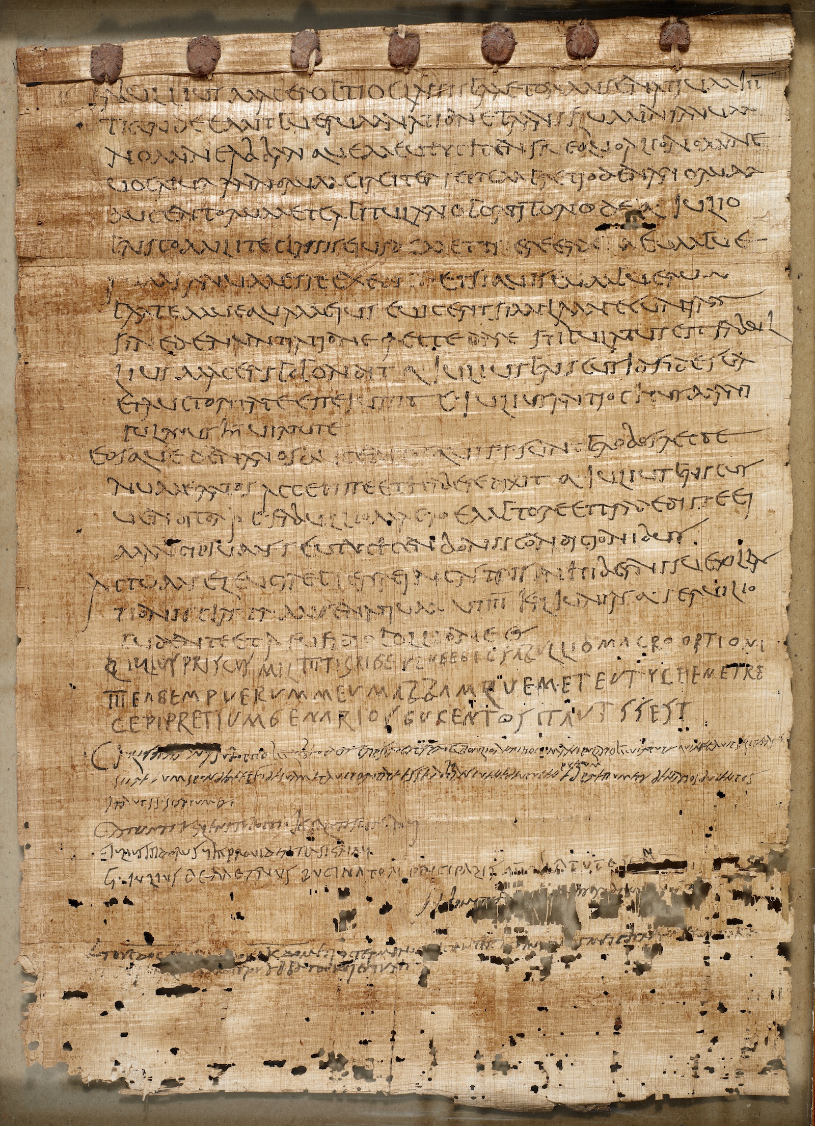
© The British Library Board, Papyrus 229.
Roll or volumen: Individual pieces of papyrus could be used for short documents, but for longer texts, numerous papyrus sheets would be joined into a long, horizontal writing surface that could be rolled from the ends. (Think of the side-to-side rolling of a Torah scroll, not the top-to-bottom rolling of the scrolls used by medieval heralds in movies.)
The papyrus would be rolled so that the side with the fibers running horizontally was on the inside. This was the surface that would be written on, and the scribe could use the fibers to guide the writing. A papyrus roll is called a volumen in Latin (plural: volumina). This is where we get our word volume. A whole book would fill up many volumina — many volumes.
Parchment and the Codex
Parchment: From late antiquity through the Middle Ages, the normal writing support was parchment, which is animal skin. (We will discuss the transition from papyrus to parchment in Unit 3.) Parchment was normally made from the skin of sheep, or calves for larger books, and, in southern Europe, sometimes goats. The term vellum derives from the word for calf and is generally but imprecisely used to mean extra-fine or high-grade parchment. In this course, we stick to the word parchment.
Making parchment: To make parchment, the animal skin was soaked in lime and water and then scraped to remove the hair from the outside surface and the flesh from the inside. In finished parchment, it is very often still possible to tell the side that used to have the hair (the hair side) from the side that used to have the flesh (the flesh side), because the latter is smoother and the former slightly shinier, sometimes with visible hair follicles.
Folio and bifolium: A sheet of prepared parchment would be folded in half to make two leaves, or four pages. A leaf of a manuscript is called a folio and a single sheet of parchment that forms two folios is called a bifolium (plural: bifolia). Two folios that are physically joined together at the fold — part of the same sheet of parchment — are said to be conjoint.
Quires or gatherings: A number of bifolia — normally four or five — would be nested together and sewn together through their central folds to make booklets. A parchment booklet is called a gathering or quire. (The terms are interchangeable. We will usually use the term quire.)
Hair side to hair side, flesh side to flesh side: The general, though not universal, practice in the Middle Ages was to assemble quires with the hair sides of the parchment sheets facing each other, and the flesh sides facing each other. That way, any opening of the finished codex — two facing pages in the book — would have matching textures.
Codex: Codex refers to the form of the book that we still use today (when we still use physical books). A codex is a book made up of a number of quires sewn together at their folds — at what becomes the spine of the book. The quires are normally sewn onto bands which are then threaded through boards that form the covers of the book, and the boards and bands are in turn covered in leather. (We will discuss the transition from roll to codex in late antiquity in Unit 3).
This short video illustrates folios, bifolia, and gatherings, and how gatherings (or quires) go together to make a codex.
This video shows all the steps from preparing animal skins through binding the finished codex, and includes information about pens, erasure, and illumination as well
Recto and verso: As mentioned in the first Getty video, we refer to the front side of a folio — the right-hand page when a book is open — as the recto, meaning right side. The flip side — the left page when a book is open — is called the verso, meaning reverse.
Modern scholars generally refer to the pages of manuscripts by folio number and recto or verso, abbreviated r or v, so you will see pages referred to as fol. (or f.) 1r, fol. 1v, etc., instead of page 1, page 2, etc. Despite this general practice, a few libraries that hold large collections of medieval manuscripts conventionally use page numbers instead of folio numbers to refer to the pages in their manuscripts — notably the Abbey Library of St. Gall, Switzerland. You will see many St. Gall manuscripts in this course. You should get used to seeing both page numbers and folio numbers.
The numbering of folios, which is called foliation, does not generally appear until the very end of the Middle Ages, and pagination — numbering pages — is even later. So any numbering scheme you see in modern catalogs is later than the original creation of the manuscripts we are studying. If you see folio or page numbers written on a medieval manuscript page, they were almost certainly added by a later owner or librarian.
Page Layout, Pricking and Ruling
To guide their work, medieval scribes made lines on the parchment on which they were going to write: horizontal lines to guide the lines of writing and vertical lines to define the outside edge of the written area. Sometimes vertical lines were added to provide a space for marginal annotations or decorative elements. These lines are called ruling. In order to rule the page, scribes would use a knife to make prickings — little holes — in the far outer margins of the page, and then line up a straight edge from pricking to pricking in order to make straight lines.
In late antiquity and the early Middle Ages, ruling was generally done in dry point: the scribe would use a sharp stylus to incise furrows in the thickness of the parchment to guide the writing. The resulting dry-point ruling was visible to the scribe working close to the page, but did not stand out to the reader, so the ruling pattern did not interfere with the look of the script on the page.
The 11th-century Gospel manuscript seen here (Walters W.7) has dry-point ruling. The ruling is invisible when you look at the page as a whole, so the written area and the illuminated initial stand out against a large, plain background. This is typical of book aesthetics in this period.
If you zoom in and explore the image in detail, you can see the dry-point ruling, especially along the top of the page, above the gold letters in the top line.
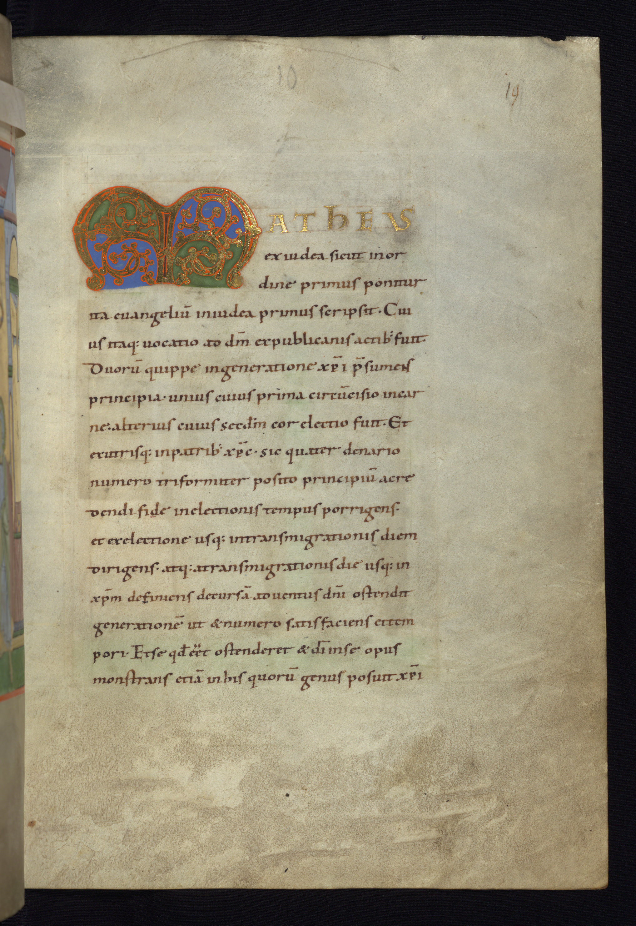
Walters Art Museum, W.7, f. 10r. © 2011 Walters Art Museum, used under a CC BY-SA license.
From the 12th century on, ruling with plummet, or lead, became common. In the next manuscript (Köln Cod. 139) you can zoom in and see both horizontal and vertical ruling.
You can also clearly see the prickings that were made to guide the ruling of the lines. Look along the outer margin of the page and at the top of the two vertical rules, right at the top edge of the page.
The fact that you can so clearly see the prickings here, and that they are well inset from the right edge of the page, is a good sign that the manuscript has not been trimmed in rebinding, and therefore that we are looking at the original proportions of the page, or something close to them. Many medieval manuscripts have been rebound several times over the centuries, usually with some loss of the original edges of the page.
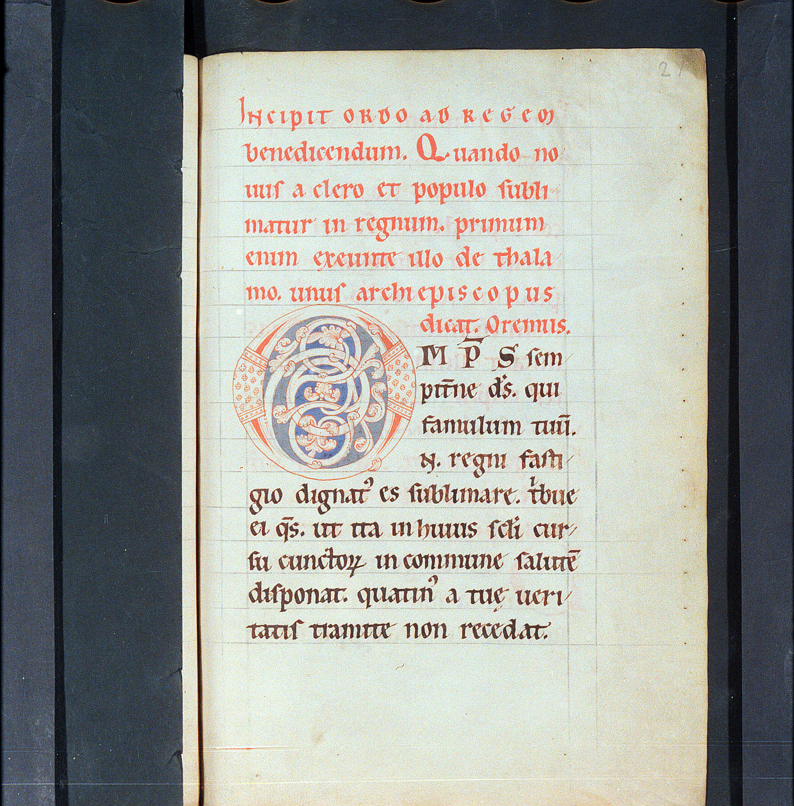
Köln, Erzbischöfliche Diözesan- und Dombibliothek, Cod. 139, f. 21r.
In the later Middle Ages, ruling with ink became normal. Sometimes the ink is very dark and is clearly visible as part of the design of the page. In this 15th-century manuscript, the ruling is done in light brown ink, but you can still see how it helps create a page design with strong, rectangular forms. If you zoom in and explore, you can see that the ruling is more complex than in the earlier manuscripts. It outlines the spaces not only for the text, but for the marginal decoration as well.
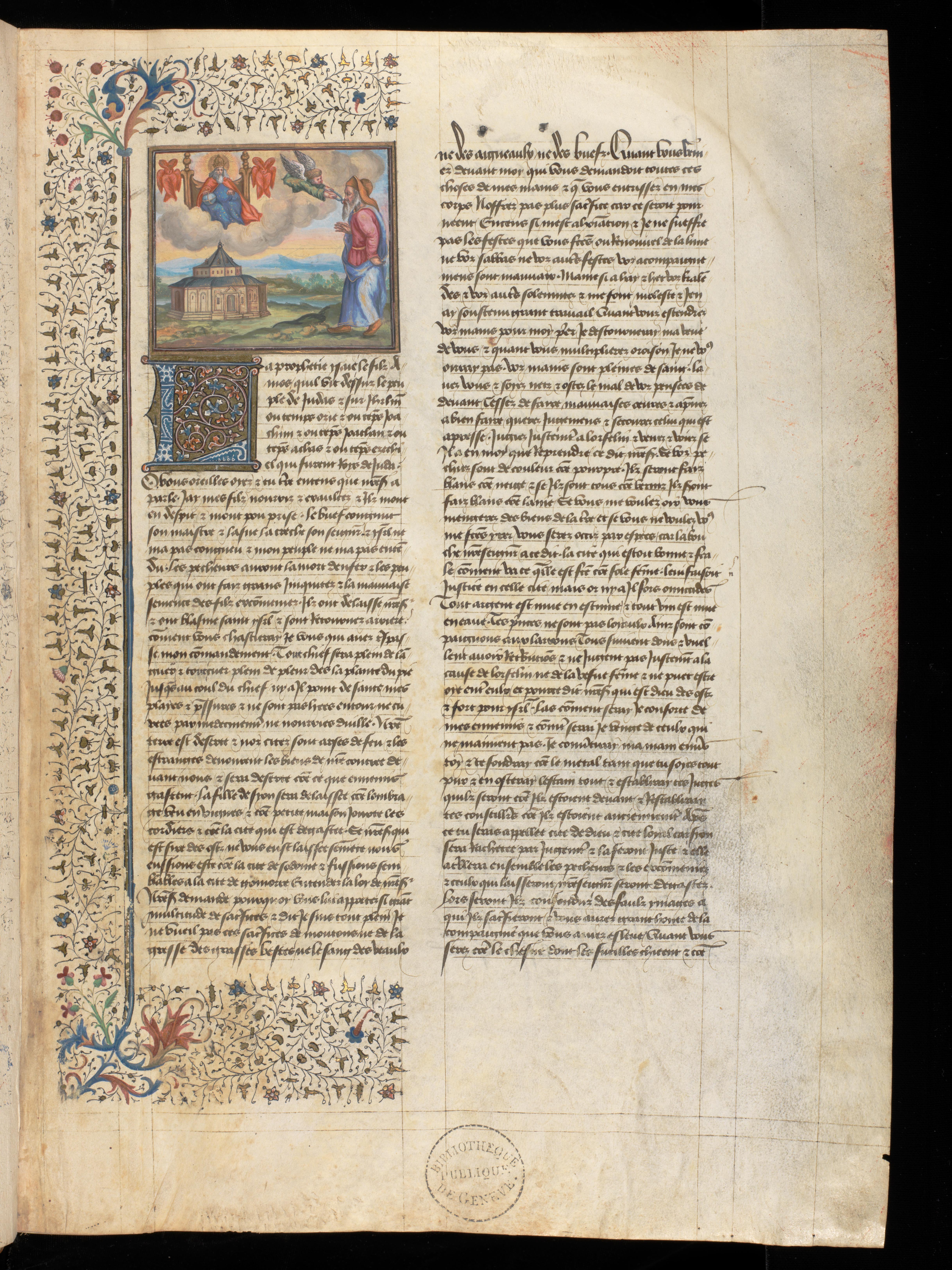
Geneva, Bibliothèque de Genève, MS fr. 1/2, f. 1r. (www.e‑codices.unifr.ch)
Ready to transcribe?
Try your hand at transcribing Basics scripts