Lesson
Latin Scripts - Visigothic and Beneventan
Description
The scripts of Spain and southern Italy in the central and high Middle Ages.
Overview
The last three lessons have traced the evolution of script in northwestern Europe — Britain and Ireland and the areas of the Continent under the cultural influence of the Carolingian empire and its successors: modern France, the Low Countries, Germany, and northern Italy. That is a story of the emergence of regional and local scripts in the early Middle Ages; a consolidation over the 9th and 10th centuries with the spread of Caroline Minuscule; and the transformation of Caroline Minuscule into Textualis between the late 11th and the early 13th centuries.
In southern Europe — the Iberian peninsula (modern Spain and Portugal), southern Italy, and Dalmatia — the history of script is different in some respects. This lesson covers two distinctive scripts of southern Europe: Visigothic, the script of the Iberian peninsula; and Beneventan, the script of the Abbey of Monte Cassino and its region of influence (primarily southern Italy and Dalmatia, on the eastern shore of the Adriatic).
Visigothic Script, 10th century
© The British Library Board, Add. 11695, f. 194r.
Beneventan Script, 11th century
© The British Library Board, Add. 30337, f. 8r.
We are going backwards in time to discuss Visigothic and Beneventan. These are both scripts that emerged in the early Middle Ages. Their development broadly paralleled that of the Insular scripts and the pre-Caroline scripts of northern France. Both scripts developed in the heart of the former Roman world — Italy itself, south of Rome, for Beneventan, and Spain, one of the most ancient Roman provinces, for Visigothic.
These scripts emerge from an environment where books were written in Half-Uncial in late antiquity, and where the tradition of the Roman documentary scripts — Later Roman Cursive and its descendants — persisted after the end of the Roman empire. They thus share a minuscule alphabet with the other early medieval scripts that descend from Half-Uncial and Later Roman Cursive. Their alphabets are essentially those of Half-Uncial, with a repertory of ligatures that comes from Later Roman Cursive. As Visigothic and Beneventan were perfected and codified, they developed specialized uses of those ligatures, special varieties of the originally-Half-Uncial letterforms, and, in the case of Beneventan, an entirely distinctive ductus.
These are scripts with very long lifespans. They emerge in the 8th century or earlier. Visigothic lasts at least until the 13th century and Beneventan lasts till the end of the Middle Ages. Rather than tracing the whole history of these scripts and their varieties, the discussion in the sections that follow focuses on the key identifying characteristics of each script, with examples from the 10th and 11th centuries.
Visigothic Script
Eight lines of Visigothic Minuscule, 1091-1109 CE, “The Silos Apocalypse”
© The British Library Board, Add. 11695, f. 194r.
The “Visigothic” script has nothing to do with the Visigoths, except that it arose in Spain, which had been ruled by the Visigoths in previous centuries. The script we call Visigothic emerged in recognizable form in the 8th century, a development of the local version of Later Roman Cursive with some influence from Half-Uncial and, indirectly, Uncial. Visigothic continued to be written until at least the 13th century, though it was to a great extent replaced by Caroline Minuscule by the late 11th century. The imposition of a new liturgy at that time, as part of a regularization of the liturgy under Pope Gregory VII, was decisive in bringing Spain into the mainstream of European script, especially because the new liturgy was disseminated in books written in Caroline Minuscule. But that did not entirely end the practice of Visigothic script.
Recognizing Visigothic Script
Aspect: Visigothic script has much in common in general appearance with other early medieval minuscules we have studied. It typically has a small minim-height and long, very vertical ascenders and descenders. Indeed, a 10th-century Visigothic manuscript at first glance is not all that different in aspect from a contemporary Carolingian manuscript, and it has an even closer resemblance to an Anglo-Saxon manuscript from the same period, even though the two scripts are quite independent in development. Here is the same 10th-century Visigothic manuscript depicted above, next to the 10th-century Anglo-Saxon manuscript we looked at in the Insular lesson:
Visigothic Script, 10th century
© The British Library Board, Add. 11695, f. 194r.
Anglo-Saxon Minuscule, 10th century
The Bodleian Libraries, The University of Oxford, Junius 27, f. 66r.
Letterforms
Visigothic uses some special forms of ligatures and individual letters in certain places in words, to represent particular pronunciations as well as for aesthetic effect.
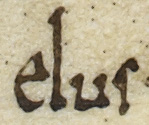
I-longa: Visigothic uses a tall i (I) at the beginning of words, and also between vowels, where it has the value of a semiconsonant (“y” or IPA j). You can see the latter use in eius, the last word in the first column of the manuscript at the head of this section (The British Library Board, Add. 11695, f. 194ra. ll. 28-31.):
Ligatures: Visigothic script uses two ligatures for ti depending on how they are pronounced in the local version of Latin. T joined to an i that descends below the baseline, like a j, is used when the t is “assibilated” — softened to an s-like sound. T joined to a normal i it used when the t is “hard.” You can see the ligature for assibilated t here, in the word dicentium (pronounced dicensium). The last two letters, which will be easy to pick out, are um. The complex form just before that is a t whose crossbar curves around like a c on the left and reaches out to join a j-like i on the right:
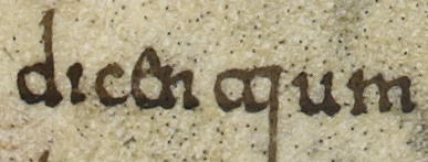
You can also see in the detail above, in the fourth and fifth letters of dicentium, that e tends to be tall and to join the letter that follows it in ligature. This is a feature common to many of the early medieval minuscules.
The Visigothic G: In order to identify Visigothic decisively, one needs to pay attention to the letter g. The Visigothic g is utterly distinctive. It looks like a letter c with a very long tail coming down from the right side. (This is ultimately a descendant of Uncial g.) Observe the gs in the following words:
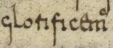
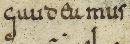
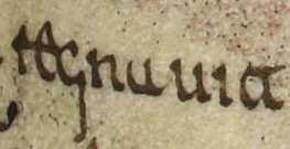
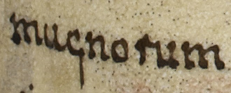
Compare the Visigothic g in the details above to the Insular g in the Anglo-Saxon manuscript (Bodleian Libraries, The University of Oxford, Junius 27, f. 66r.):
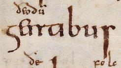
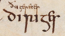
The Insular g is much closer to the Half-Uncial g and resembles an elongated number 5. (Note also that the Visigothic glorificemus and gaudeamus and the Insular gentibus and diriges all have a tall e in ligature with the letter that follows.)
Now compare both of those g styles to the Caroline g, which has an upper and a lower bow joined by a long stroke on the right side of the letter (St. Gallen, Stiftsbibliothek, Cod. Sang. 116, p. 3.).

G is very often a telltale letter for a given script, and it can also be helpful to observe gs when trying to tell one scribe from another. This is a situation where the concept of ductus is particularly helpful. In addition to noting what the g looks like, pay attention to how it is formed and how many strokes seem to be involved. Try imitating on a piece of paper the various forms of g shown here and see if that helps understand how they are constructed, and how they differ from one another.
Beneventan Script
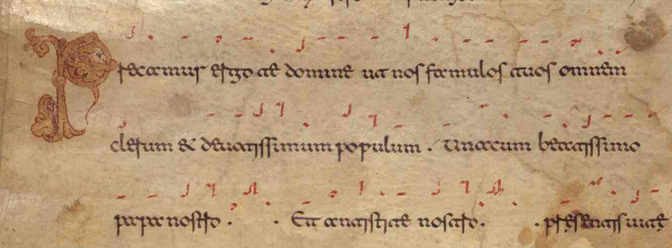
Initial four lines from the Monte Cassino Exultet Roll, ca. 1075-80 CE. This manuscript is in a form specific to the Beneventan region, a roll containing the text of the Easter Proclamation, which is sung at the Easter Vigil. The red marks above the text are neums, a musical notation.
© The British Library Board, Add. 30337, f. 8r.
The other distinctive script of southern Europe is Beneventan, which was developed and perfected at the Abbey of Monte Cassino, the birthplace of Benedictine monasticism. (The name “Beneventan” comes from Beneventum, the territory around Monte Cassino.) Because of the immense prestige of Monte Cassino as St. Benedict’s own monastery, the use of the Beneventan script spread throughout southern Italy and across the Adriatic to Dalmatia.
The Beneventan script emerges in the 8th century, around the same time as Visigothic. Examples have been found as late as the 16th century. The “period of perfection” of the script is the 11th century, and we illustrate the characteristics of the script from an 11th-century manuscript from Monte Cassino.
Beneventan is a highly formal, canonical script. Scribes trained in the script use a wide variety of ligatures, including many also seen in Visigothic, but in Beneventan there are many more of them, and they are used according to a strict system specific to Beneventan.
In what follows, we introduce the main identifying characteristic of Beneventan, the “broken minim” and the look of Beneventan ligatures, which will help you identify the script when you see it.
Recognizing Beneventan: The Broken Minim
The most distinctive and important characteristic of Beneventan is the so-called “broken minim.” The basic vertical stroke that is the building block of letters in any script is, in Beneventan, made up of two short, wide diagonal strokes meeting at a point in the middle.
Before we look at examples of the broken minim, let's review what minims look like in Textualis.

This is from Cologne, Erzbischöfliche Diözesan- und Dombibliothek, MS 149, fol. 50r, column b, which we looked at in the last lesson. Textualis, especially in its formata (carefully-composed, highly-calligraphic) form, is noted for its angularity. If you look carefully at the detail above, you can see how that angularity comes about. Each minim — the upright strokes of i n u m e and r — starts with an angled approach stroke coming from the upper left, and finishes with either a separately-applied lozenge-shaped stroke at the bottom, or a stroke angled down and to the right with a hairstroke up and to the right. Those angles, plus the fact that the minims are made precisely vertical and parallel to one another, identify this as Textualis and make it feel like a script of straight lines with very few curves.
At first glance, Beneventan can seem similarly angular (and is definitely similarly regular), but if we get in close, we can see that the angularity results from a different ductus.

In this detail, from the Beneventan Exultet Roll shown at the head of this section, you can see that every letter that in Textualis would be made up of vertical minims (with added strokes at head and foot), here made up of two diagonal strokes. In cum omni above, u m n and i are each composed of two flag-like strokes that touch at a point at mid-minim. This is the Beneventan “broken minim.”
Now compare that broken minim to a less-formal Textualis. As we saw in the last lesson, less-formal versions of Textualis do not have the extreme angularity of Cologne manuscript 149, discussed above. But a less-formal Textualis will still have a regular pattern of parallel minims and a consistent rhythm of feet — and not have broken minims. Compare this detail of the Bethune Breviary, with which we worked in the last unit, to Beneventan:
Textualis:

Beneventan:

In the Textualis example, each minim (as in the letters n and m) has a hairline or wedge-shaped approach stroke and a hairline finishing stroke, but the body of the minim is made with one continuous stroke — in this case, slightly curved. In the Beneventan example, each minim is “broken” in the middle — formed with two distinct strokes that meet each other at a point.
Ligatures
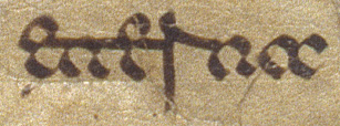
The other thing that makes Beneventan recognizable is the effect of obligatory ligatures on the script’s aspect. (By “obligatory,” we mean that a scribe trained in Beneventan will always make these ligatures, with the result that this is a constant feature of the script.) The letters e, f, g, r, and t all have connecting strokes that reach out and join the following letter at minim-height. Even if you can't decipher the ligatures, the visual effect is distinctive. A series of letters all joined with horizontal strokes at minim-height can make it look like a line has been drawn through the word.
For example, this word is eterna. The two es, the t, and the r (with pointy top and descender) have their middle strokes extended out to the right to touch the next letter. The cumulative effect is a line at minim-height across the first half of the word.
Here is a similar effect in the word antistite:
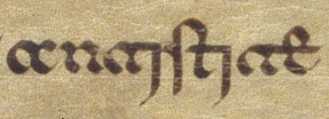
In addition to the ligatures that join letters with horizontal strokes at minim-height, Beneventan also uses a variety of ligatures with i in which the i is long and curvy like a j. Beneventan has a different set of rules from Visigothic about when the j-like i is used. In antistite, above, you can see two ligatures with t joined to j-like i, which in Beneventan represents the hard ti sound. In imperatoris nostri below, there are two examples of the pointy-topped Beneventan r joined to a curvy, flourishy i that swoops below the baseline.

Go back up to the larger image of this manuscript at the head of this section and explore. Can you find more broken minims, pointy-topped rs, j-style is, and runs of horizontal ligatures?
Ready to transcribe?
Try your hand at transcribing Visigothic and Beneventan scripts