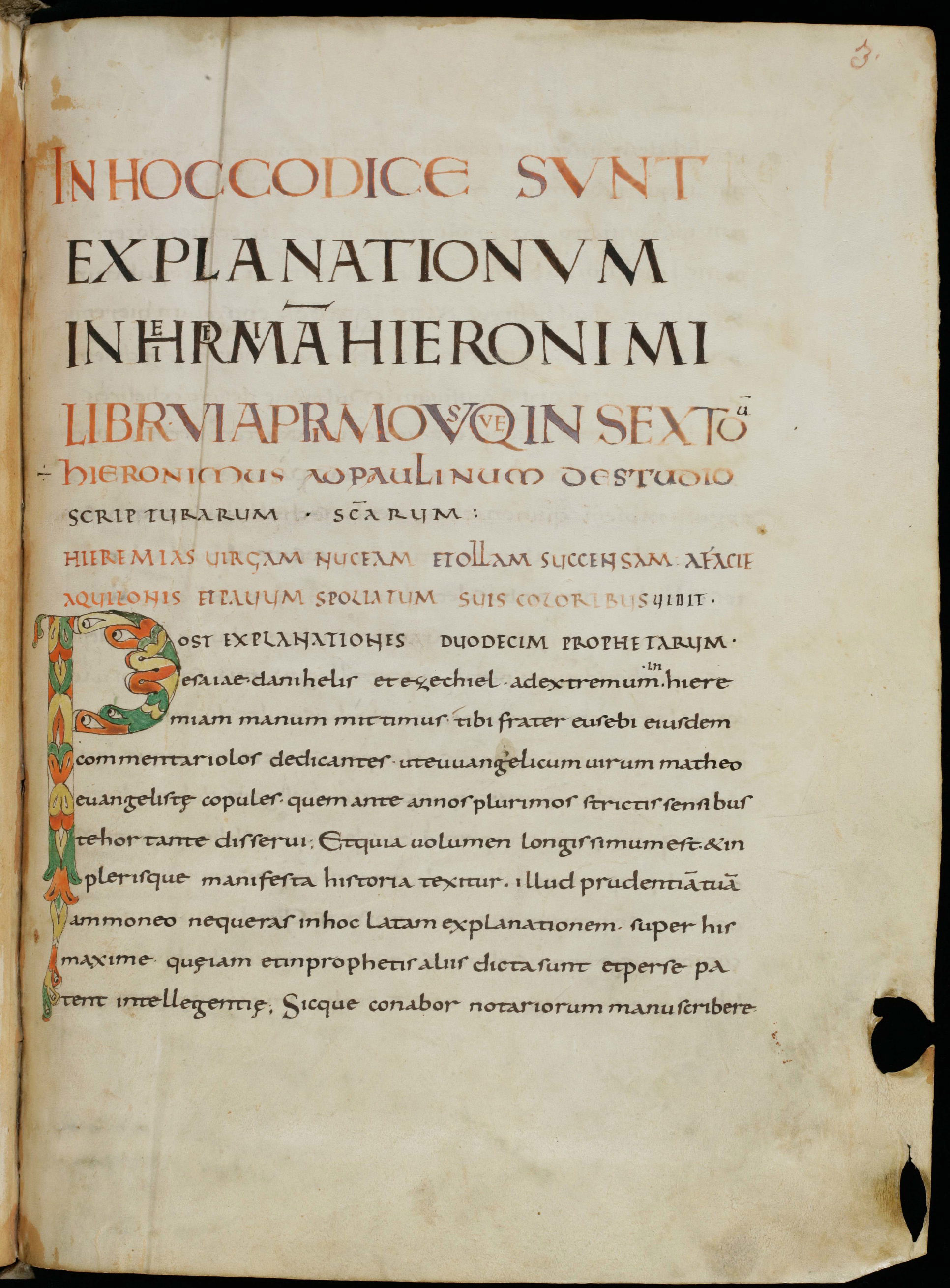
Note the relationship between the small minim-height and large space between one line and the next. St. Gallen, Stiftsbibliothek, Cod. Sang. 116, p. 3. (https://www.e-codices.unifr.ch/en)
Caroline Minuscule, the reformed script of the Carolingian world from the late 8th through the 11th centuries. Hierarchy of scripts and other features of Carolingian page design.
Caroline Minuscule developed towards the end of the 8th century in conjunction with Charlemagne’s program to reform the liturgy and establish a correct and uniform text of the Bible. Several monasteries in the Carolingian realms of Northern France and Germany had begun developing scripts in the latter half of the 8th century that sought to bring some clarity and consistency to the welter of barely-legible scripts that had developed from late-Roman documentary scripts. Under the patronage of Charlemagne and the leadership of his circle of scholarly advisors, a consensus style of script emerged that was clear, legible, and relatively consistent — Caroline Minuscule.
In this manuscript the headings are in Square Capitals and Uncials and the main text is in Caroline Minuscule.
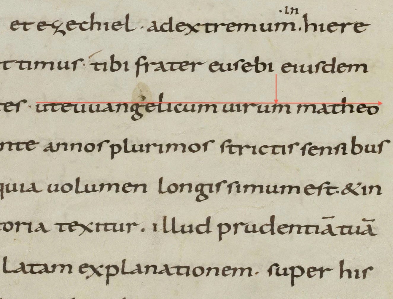
St. Gallen, Stiftsbibliothek, Cod. Sang. 317, p. 9. (https://www.e-codices.unifr.ch/en)
We can appreciate the innovation of Carolingian script and page layout if we compare a Carolingian manuscript like the one above to one from the decades just before the Carolingian reforms. During the first three quarters of the 8th century, a number of monastic houses, mostly in the northeast of France, developed book scripts from Merovingian chancery scripts, which were in turn derived from later Roman cursive. These manuscripts typically show some of the innovations that would help readers navigate a book, like capitals for headings and colored inks marking divisions of the text, but their scripts are extremely challenging. There is some word separation, but the lateral compression of the script and its many ligatures make it hard to discern separate word breaks. This 8th-century manuscript gives a sense of what the Carolingian reform of script was reacting to:
St. Gallen, Stiftsbibliothek, Cod. Sang. 214, p. 17. (https://www.e-codices.unifr.ch/en)
Charlemagne’s circle of scholars included men from Italy who had access to libraries, like those of Monte Cassino and Verona, where ancient texts were still preserved that survived nowhere else in Europe. In the 780s, Alcuin of York arrived at Charlemagne’s court, bringing with him the fruits of a century of Insular development of aids to legibility in writing Latin. Alcuin and his fellow scholars worked intensively on establishing a better text of the Latin Bible as the basis for uniform liturgy and preaching. The Carolingian scholars also studied late-antique grammars and sought to regularize Latin usage. Caroline Minuscule reflects the goals of these studies and reforms: its legibility assisted in the accurate dissemination of the newly-corrected sacred texts, and its consistent letterforms and limited repertory of abbreviations accord with a linguistic ideal in which one sound was to be represented by one written form.
Caroline Minuscule was the dominant script of Europe in the 9th, 10th, and 11th centuries, before giving way slowly to Gothic Textualis in the 12th — a transition we will study in the next unit. More than 7000 manuscripts in Caroline Minuscule survive today. Most of the texts of classical antiquity that we know today reached the modern period in Carolingian manuscripts. Caroline Minuscule was the model for Humanist Minuscule and, therefore, the ultimate source of our modern Roman lowercase alphabet.
Aspect: Caroline Minuscule is neither compressed nor spaced out laterally. Caroline Minuscule has a comparatively small minim height and is normally written with plenty of space between lines. That feature, combined with generally careful word-spacing and regular letter-spacing, lends the script a tidy, upright appearance. Plenty of space between lines also means that the page as a whole has an open, spacious feel.
Note the relationship between the small minim-height and large space between one line and the next. St. Gallen, Stiftsbibliothek, Cod. Sang. 116, p. 3. (https://www.e-codices.unifr.ch/en)
Large spaces between lines and plenty of space in the margin lend this Carolingian manuscript page a characteristically open, legible appearance. St. Gallen, Stiftsbibliothek, Cod. Sang. 116, p. 3. (https://www.e-codices.unifr.ch/en)
Most of the letterforms of Caroline Minuscule will be familiar from Half-Uncial or from our modern alphabet (All images from St. Gallen, Stiftsbibliothek, Cod. Sang. 116, p. 3.):

a is a development of uncial A, with a sloping stroke on the right poking just a little way above the lobe on the left.

The d has an upright ascender, as in Half-Uncial.

s is always tall, at beginning, middle, and end of words; the rounded Uncial s is not used.

Be careful not to confuse tall s with r. In this script, as in most medieval minuscules, s has a higher shoulder that reaches up above minim-height, whereas r's shoulder is a little flourish at minim-height, or, in some varieties, a sharp point at the top followed by a downward flourish.
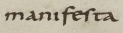
Also note the difference between f and s. This word is manifesta.

e typically has a tongue that reaches out to the right and may join up with following the following letter, as it does with t here. The upright stroke of t reaches barely or not at all above its cross-stroke.

A form that is new to medieval script with Caroline Minuscule is the g, with a bow on the baseline and another on the tail, both facing left. Individual scribes’ g’s may be very distinctive and are a good way to spot a change of hand in a manuscript, but they will usually follow this general form.
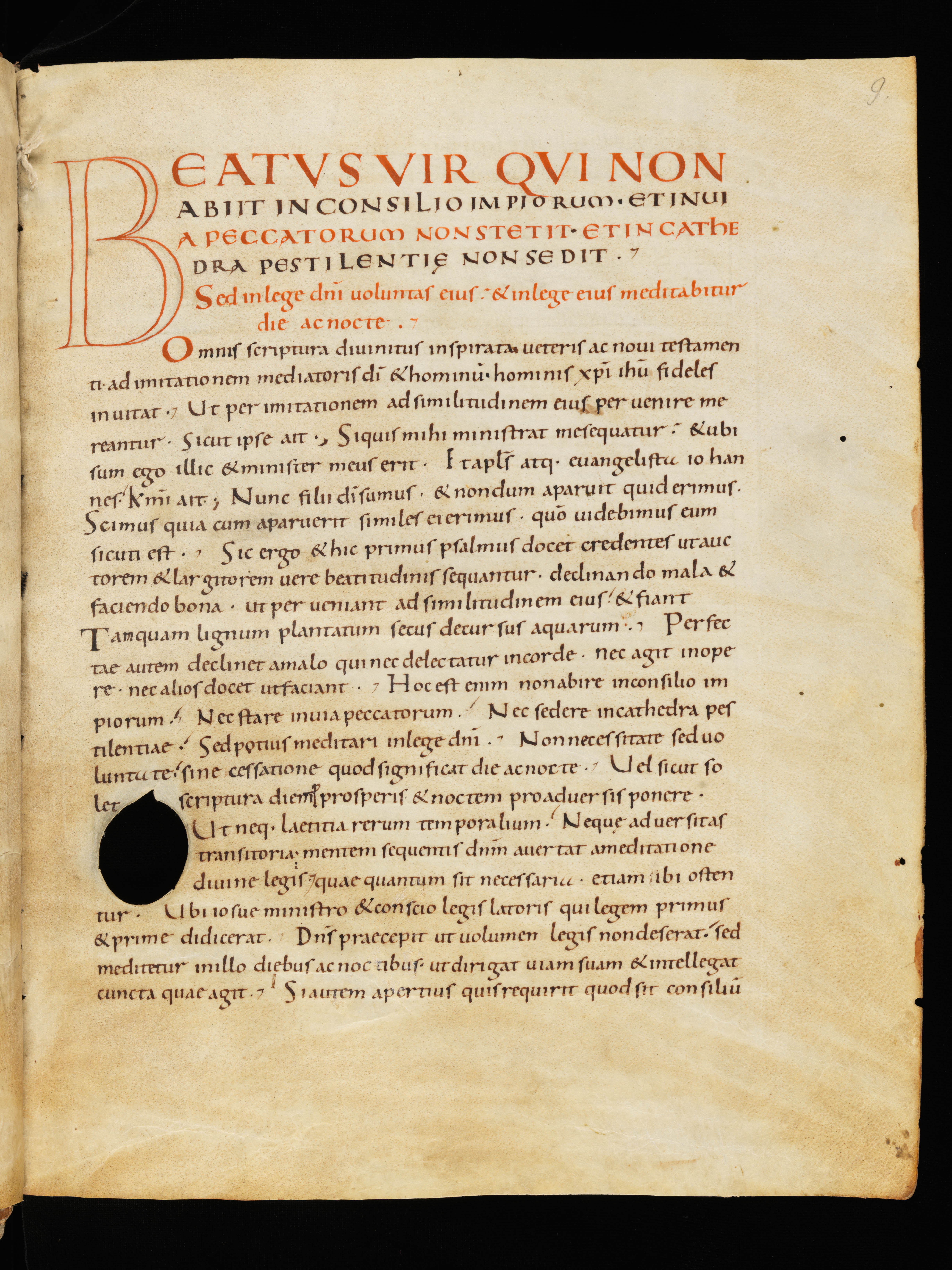
The Carolingian period saw the development of a widely-observed protocol for using the scripts of antiquity in a descending sequence of prestige in major and minor titles and headings, with Caroline Minuscule for the main text script. We saw the beginnings of this system in Insular manuscripts, but Carolingian scribes regularized the process.
Square Capitals, if present, were always at the top of the hierarchy, followed by Uncials, Rustic Capitals, and then Caroline Minuscule for the main text. Uncial continued to be used for litterae notabiliores within the text.
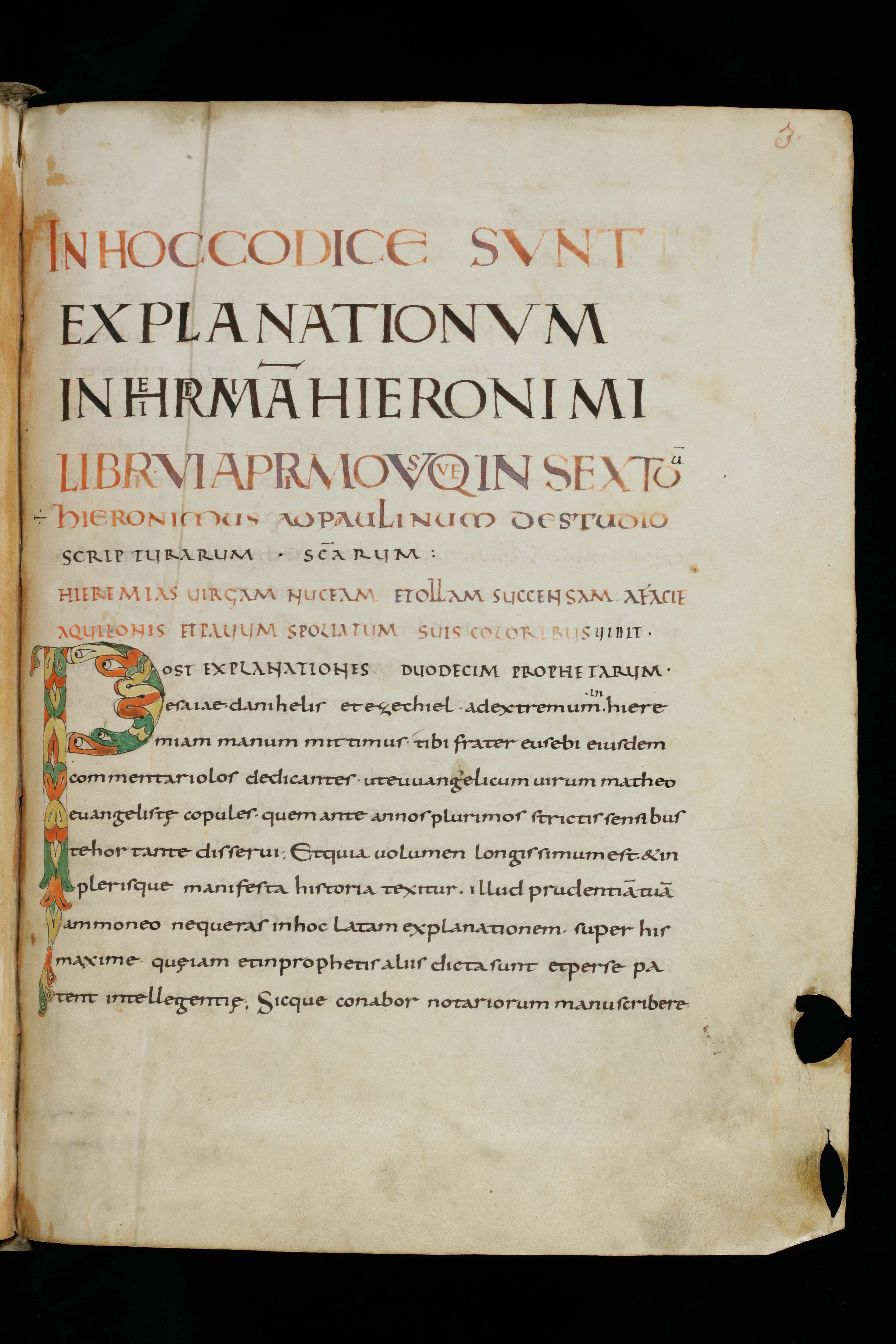
St. Gallen, Stiftsbibliothek, Cod. Sang. 116, p. 3. (https://www.e-codices.unifr.ch/en)
On this page from a 9th-century manuscript, the first four lines are in Square Capitals; the next two are in Uncial, the three below that are in Rustic Capitals, and then the body of the text is in Caroline Minuscule. Note that, in addition to the elaborate initial P full of eyes, there are litterae notabiliores marking minor divisions of the text, an Uncial E five lines up from the bottom and an S in the last line. The hierarchy in the headings, the prominent initial, and the litterae notabiliores combine with the clear word separation to make the text easy to navigate.
The influence of minim-height and line length:
As we noted earlier in this lesson, the small minim-height of Caroline Minuscule, combined with the tendency to leave ample space between lines, contributes to the sense of spaciousness and unclutteredness of the page. Space between lines is a useful legibility feature in manuscripts written in long lines (i.e., in wide, single columns), since it helps to prevent the reader’s eye from skipping a line. As a general rule in the history of Western scripts, single-column layouts tend to go hand in hand with smaller minim heights and more space between lines. This is a feature to keep an eye on as Caroline Minuscule begins to evolve into Gothic Textualis in the 12th century.
Ruling:
From late antiquity through the Carolingian period, ruling was done in dry-point or hard-point — that is, with a stylus that made a furrow in the parchment, rather than with a pencil or pen that left colored marks on the page. As a result, the ruling pattern is not visible except on close inspection, so the ruling pattern does not interfere with the generally plain and open appearance of the page. Carolingian ruling can be very difficult to detect in even high-resolution digital images, unless the page has been photographed in raking light.
If you look very closely at a Carolingian manuscript page and are able to see the ruling, you will see that the first line of writing on each page sits above the first ruled line. Zoom and scroll to the top of the page and you can just make out the way the writing sits atop the line incised in the parchment at the top of the left column in this 9th-century manuscript of the Bible from Tours:
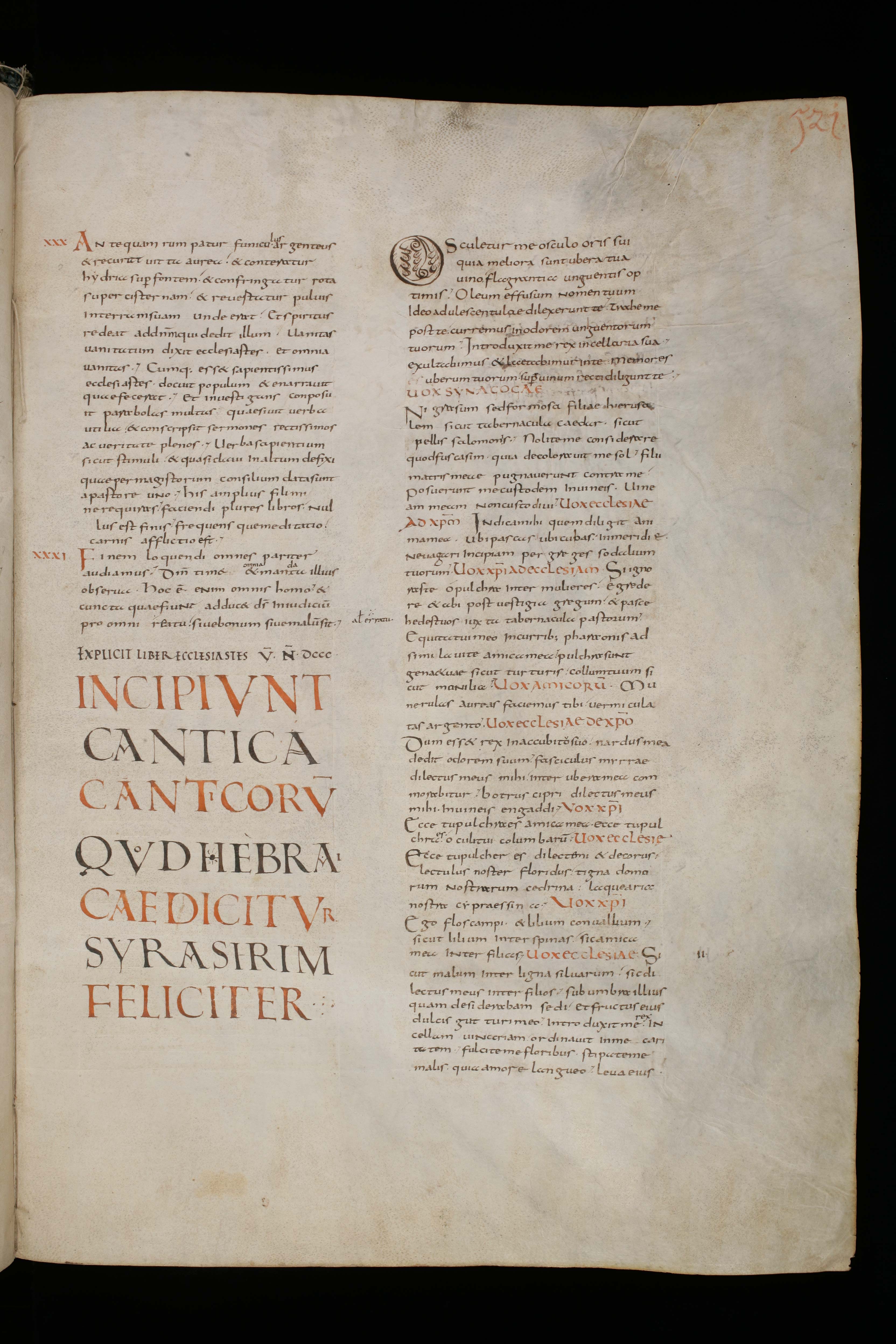
St. Gallen, Stiftsbibliothek, Cod. Sang. 75, p. 521. (https://www.e-codices.unifr.ch/en)
This is another feature to watch out for, as its disappearance is one of the signs of the end of Caroline Minuscule.
This is a later Carolingian manuscript (11th C.) and its ruling pattern is more elaborate, but note that the dry-point ruling means that the ruling pattern does not interfere with the look of the page as a whole. If you zoom in, you can see the dry-point ruling clearly. If you zoom out, you can see that the luxury in this manuscript of the Gospels is expressed not only through judicious use of gold leaf and color, but through ample empty parchment.
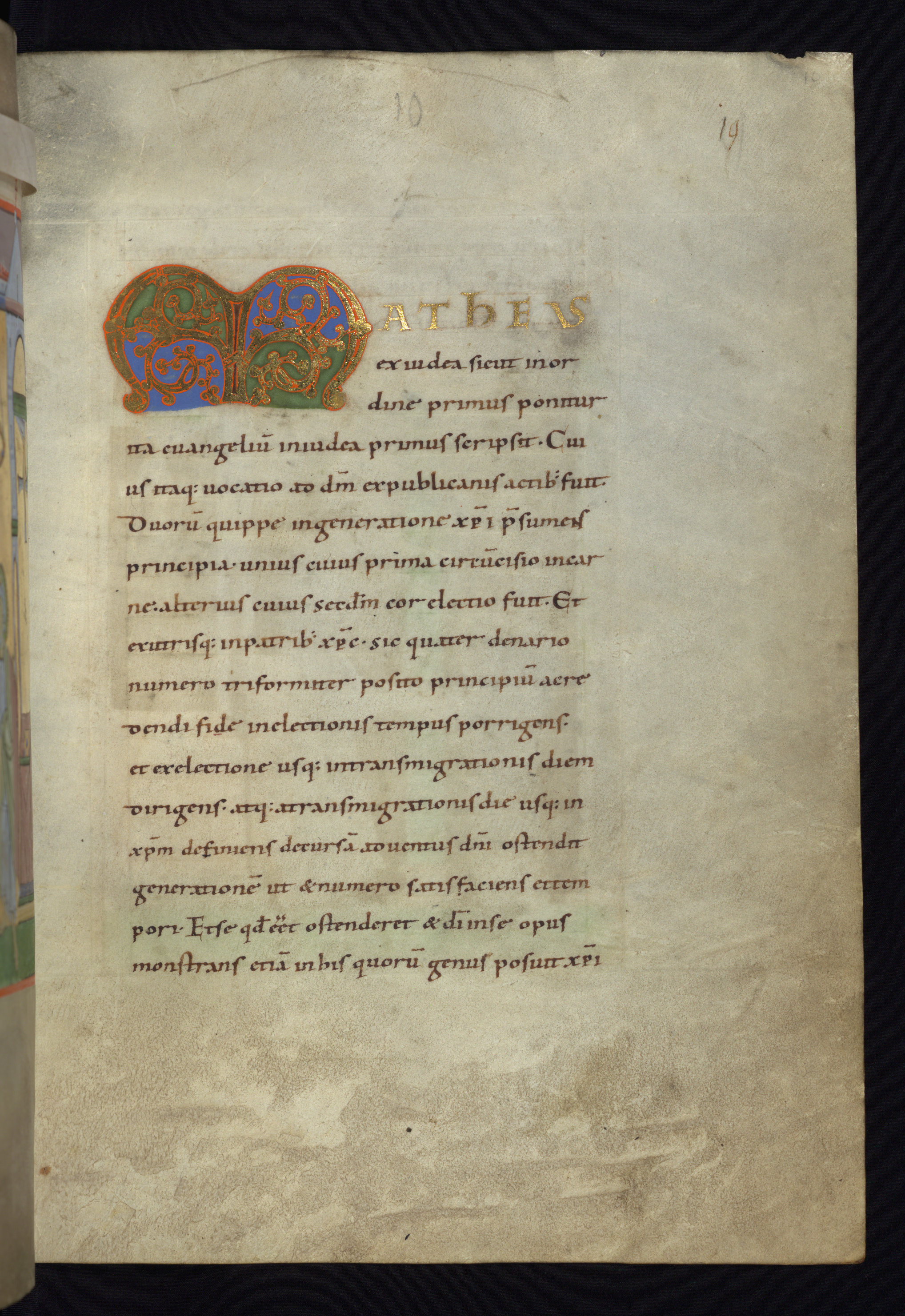
Walters Art Museum, W.7, f. 10r. © 2011 Walters Art Museum, used under a CC BY-SA license.
In the next unit, we will see how changing proportions in the script and changing aesthetics of the page gradually transform the look of manuscripts between the 11th and 13th centuries.
If you read Latin, go to the Caroline Minuscule Transcription lesson to practice transcribing Caroline Minuscule. Otherwise, go directly to the Gothic Textualis Paleography lesson.
Try your hand at transcribing Carolingian Manuscripts scripts