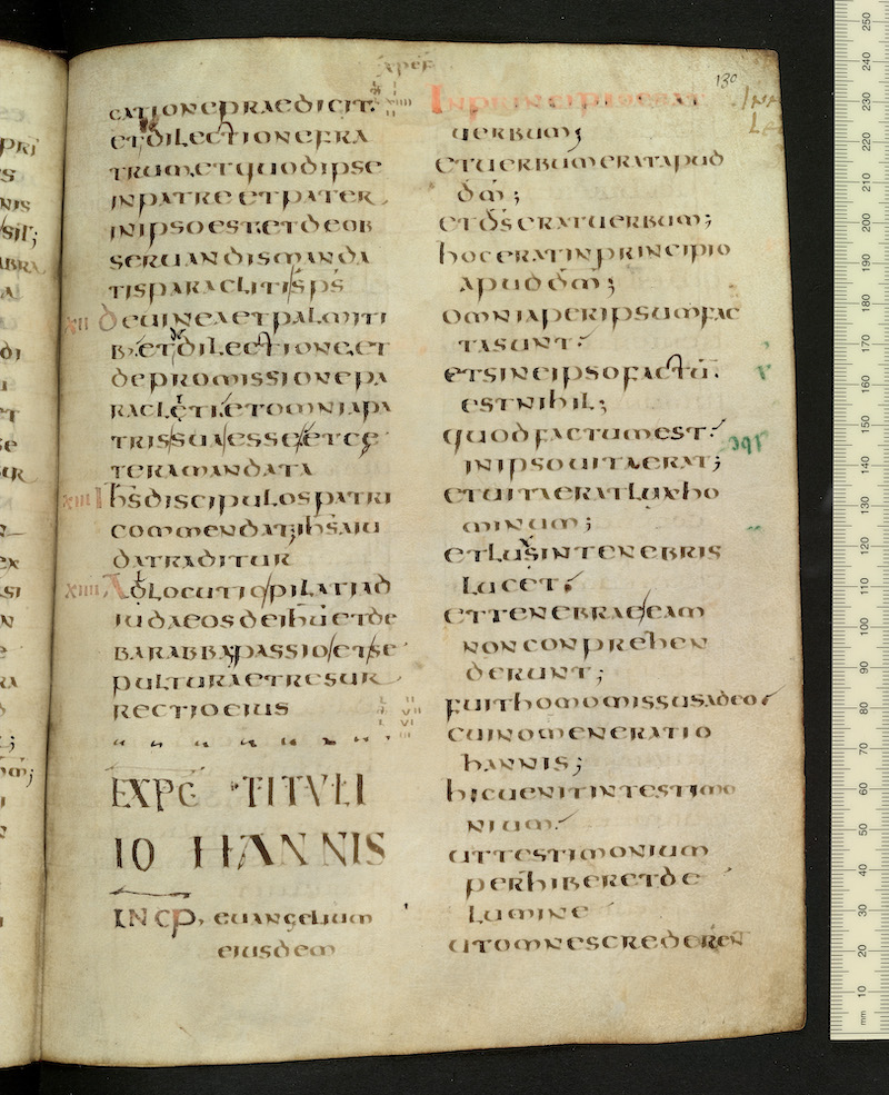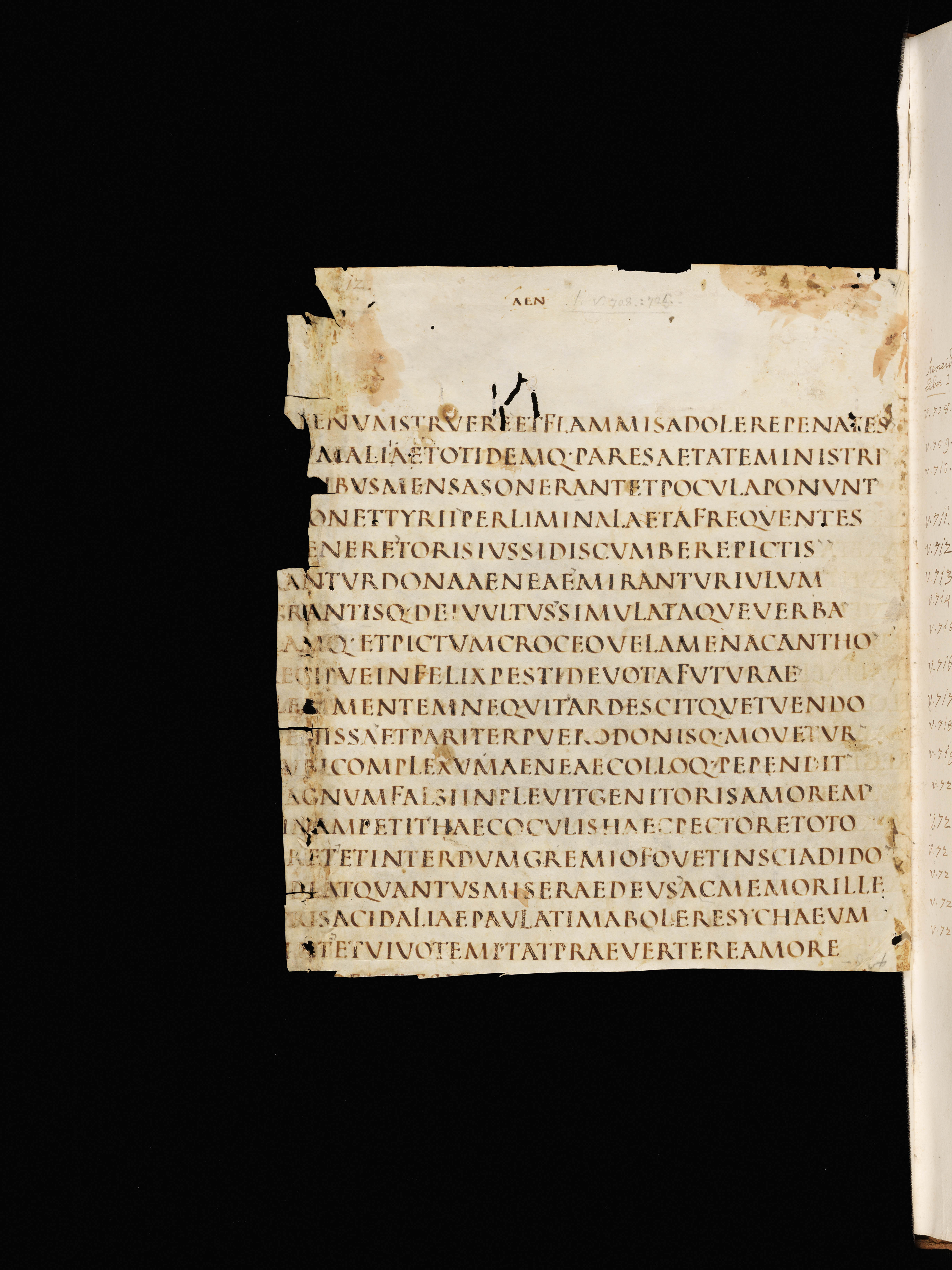
Square Capitals, 4th-5th century
-
Title
Vergil, Aeneid -
Text
Book 1, lines 704-721 -
Language(s)
Latin -
Writing System
Roman -
Script(s)
Square Capitals -
Country
Switzerland -
City
St. Gall -
Repository
Stiftsbibliothek -
Shelf Mark
1394, page 12 -
Century
4th-5th century -
Year Range
300-500 -
Place Of Origin
Italy -
Provenance
At St. Gall by 1461 -
Bibliography
Elias Avery Lowe, Codices Latini Antiquiores. A Palaeographical Guide to Latin Manuscripts Prior to the Ninth Century. Part VII: Switzerland (1956), 39-41.
Gustav Scherrer, Verzeichniss der Handschriften der Stiftsbibliothek von St. Gallen (1875), 456-461.
-
External Facsimile
This 4th-century manuscript of Virgil survives as only 12 whole or partial leaves, which are bound together with miscellaneous other fragments in a St. Gall codex. The fragmentary Virgil manuscript is one of only three extant ancient manuscripts written entirely in Square Capitals – a script which, on the basis of the surviving evidence, seems to have been used only for manuscripts of Virgil. Square Capitals are written in imitation of ancient inscriptional capitals and were never, as far as we can tell, in widespread use as a book script in antiquity.
Square Capitals are so called because of the letters approximate the square in their proportions, being in many cases almost as wide as they are high. The roundness of O, Q, C, and D, and the width of M and V, for example, lend the script its spacious, extremely regular aspect. The alternation of thick and thin strokes imitates the effect of chisel on stone. This example has proportions that are slightly taller than they are wide, but careful spacing between letters means that the overall effect reflects that of the highest grade of inscriptional capital. L and F are slightly taller than other letters; this is a regular feature of ancient capital scripts.
The manuscript is written in scriptio continua – entirely without spaces between words. The text is laid out in verse lines, which accounts for the ragged-right layout. (This was the normal practice in antiquity and for Latin verse throughout the Middle Ages. The meter helps the reader parse a line with no word spacing.) The only abbreviation used is Q∙ for enclitic -que. The running titles are part of the original preparation of the manuscript. The occasional apostrophe-like mark, which indicates a rhetorical pause, was added at an early date, but not by the original scribe of the manuscript. Various other apparent dots are actually areas of damage to the parchment.
The drypoint ruling is particularly visible under the first and last lines of writing.
Acknowledgements: Described by Carin Ruff
Transcription
(Note: Ellipses are recorded where the letters are on the surviving piece of the page, but not legible. Letters lost where the left edge of the page is cut off are not indicated.)
1 [[*]]enum struere et flammis adolere penates
2 [[*]]m aliae totidemq(ue) pares aetate ministri
3 ibus mensas onerant et pocula ponunt
4 on et tyrii per limina laeta frequentes
5 enere toris iussi discumbere pictis
6 antur dona aeneae mirantur iulum
7 grantisq(ue) dei uultus simulataque uerba
8 amq(ue) et pictum croceo uelamen acantho
9 ecipue infelix pesti deuota futurae
10 le[[*]i mentem nequit ardescitque tuendo
11 e[[*]]issa et pariter puero donisq(ue) mouetur
12 ubi complexum aeneae colloq(ue) pependit
13 agnum falsi inpleuit genitoris amorem
14 inam petit haec oculis haec pectore toto
15 ret et interdum gremio fouet inscia dido
16 deat quantus miserae deus ac memor ille
17 ris acidaliae paulatim abolere sychaeum
18 [[**]]t et uiuo temptat praeuertere amore
Paleographic Features
1. Dry-point ruling is visible in the middle of the top line where it overlaps the feet of letters
2. The Q∙ abbreviation for -que appears in the middle of line 2. This is the only abbreviation used by the scribe.
3. Apostrophe-like marks in an ink that now appears gray were added by a later (but probably early) corrector. They indicate divisions of sense where a reader might pause. Examples are in the middle of line 6 after AENEAE and in the middle of line 7 after VVLTVS
4. In the third line from the bottom, at the beginning of the line, the reading for the first word of Aeneid 1.719 accepted by modern editors is insidat, but it seems reasonably clear that the scribe wrote INSIDEAT (of which the last four letters are visible). Compare the proportions and angles of the partially-obscured letter here to the E directly above.