(et)c(etera).jpg)
(um) (et) c(etera)
The transition from Caroline Minuscule to Gothic Textualis script in the 12th century. Features of Textualis and of Gothic page design in the 12th to 15th centuries.
This transcription lesson gives you three transcription exercises, for plenty of practice with the challenges of Textualis. As you learned in the paleography lesson on Textualis, the key characteristics of the script include lateral compression and a very regular rhythm of parallel minims whose feet are all finished the same way. These are the features that can make the script tricky to transcribe.
In earlier medieval scripts, you encountered forms of individual letters that were easy to mistake for other letters — an a that looks like a u or like cc, for example, or an s that looks like an f or an r. In Textualis, the bigger problem is that the letters are so close to each other, and so many of them are made up of minims. It is often necessary to count minims to figure out how to disentangle i, m, n, and u from one another — and as you know, those letters are used a lot, and used in combination a lot, in Latin.
The first transcription exercise in this lesson is actually one of the Protogothic manuscripts you saw in this unit's paleography lesson. It will give you a chance to practice dealing with lateral compression and minim-confusion in a script that consists mainly of familiar Caroline letterforms.
The second manuscript you'll transcribe is a very formal Textualis from the 14th century, which will give you practice with extremely regular minims with lozenge-shaped feet, as well as other Gothic features like biting, the 2-shaped r, and the 7-shaped Tironian et in its later Gothic form.
The third manuscript contains all of those forms, but in a script with a markedly less careful ductus and letters that almost all touch each other. If you've completed the first two exercises, your eye should be ready to tackle this one.
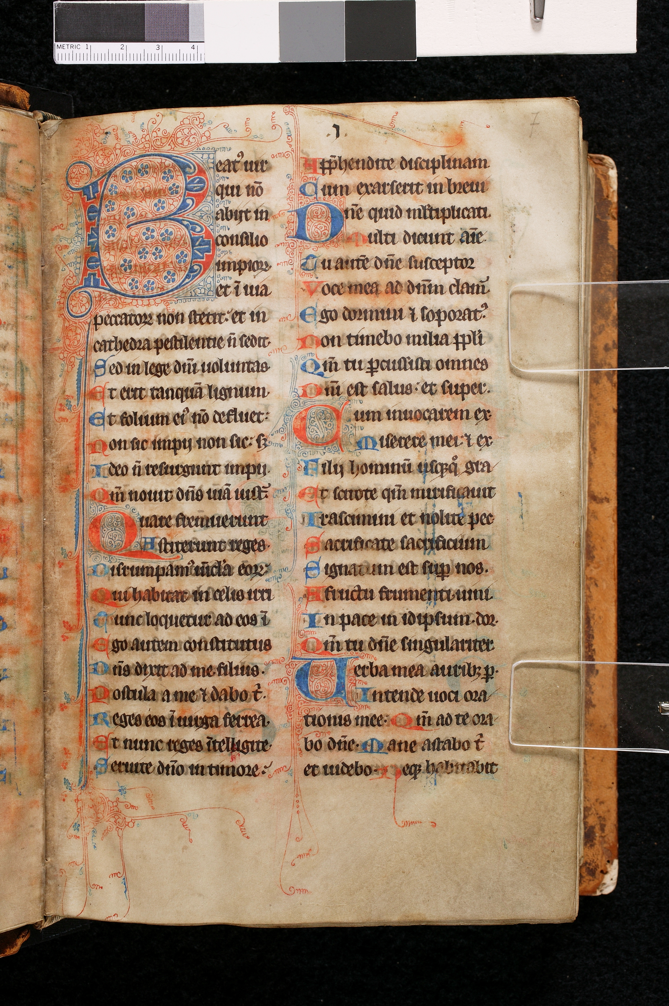
Transcribe the entire first column of this 12th-century manuscript.
1
2
3
4
5
6
7
8
9
10
11
12
13
14
15
16
17
18
19
20
21
22
23
24
25
26
27
28
29
30
Walters Art Museum, W.18, f. 11v. © 2011 Walters Art Museum, used under a CC BY-SA license.
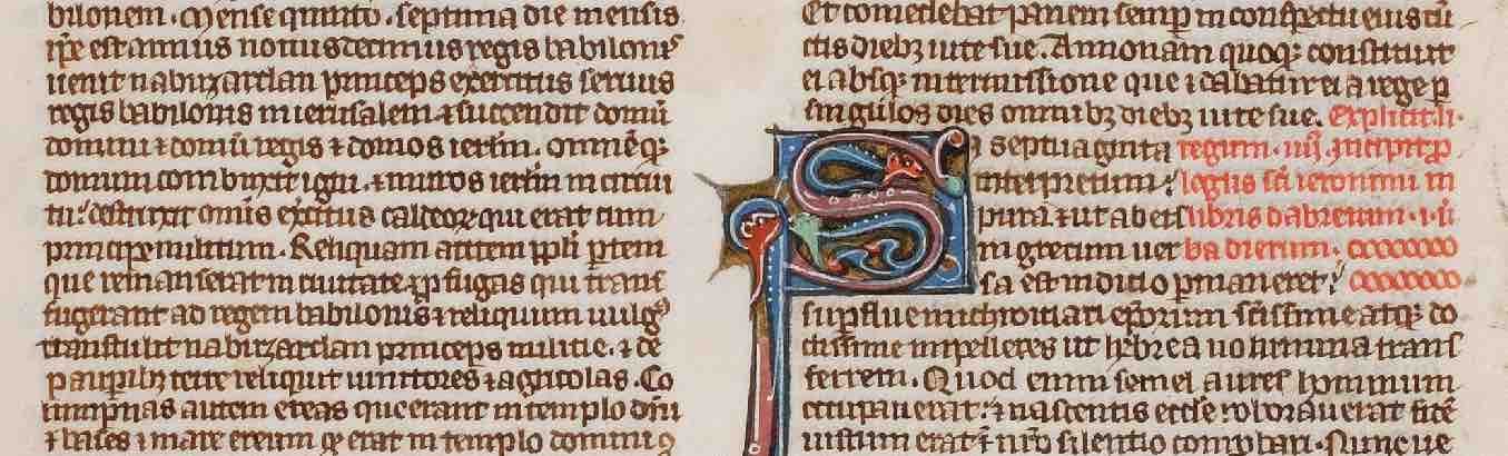
Transcribe the entire page.
Although this hand is very clear and careful, reading a script composed almost entirely of matching minims and hairline strokes takes some getting used to.
Abbreviations: You should be able to decipher most of the abbreviations here based on what you already know, but some look rather different because of the script. The end of line 11 reads:
(um) (et) c(etera)
First comes the 2-shaped r, which we discussed in this unit's scripts/paleography lesson, with a stroke—here a very elaborate stroke—through the last stroke of the r to stand for the omitted final -um. Then comes the 7-shaped Tironian et, here in the later Gothic style with a stroke through it, followed by a c with a flourishy mark of abbreviation for c(etera).
The end of line 7 in the second column has a superscript mark that looks a bit like an a and stands for an omitted ra.
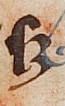
The last word on the page is an S followed by a stylized 3-like shape that signals an abbreviation by suspension. The word is S(ed). (That 3-like shape sometimes looks more like a semi-colon, and it can stand for various things in other contexts.)
1
2
3
4
5
6
7
8
9
10
11
12
Köln, Erzbischöfliche Diözesan- und Dombibliothek, MS 149, f. 50r.
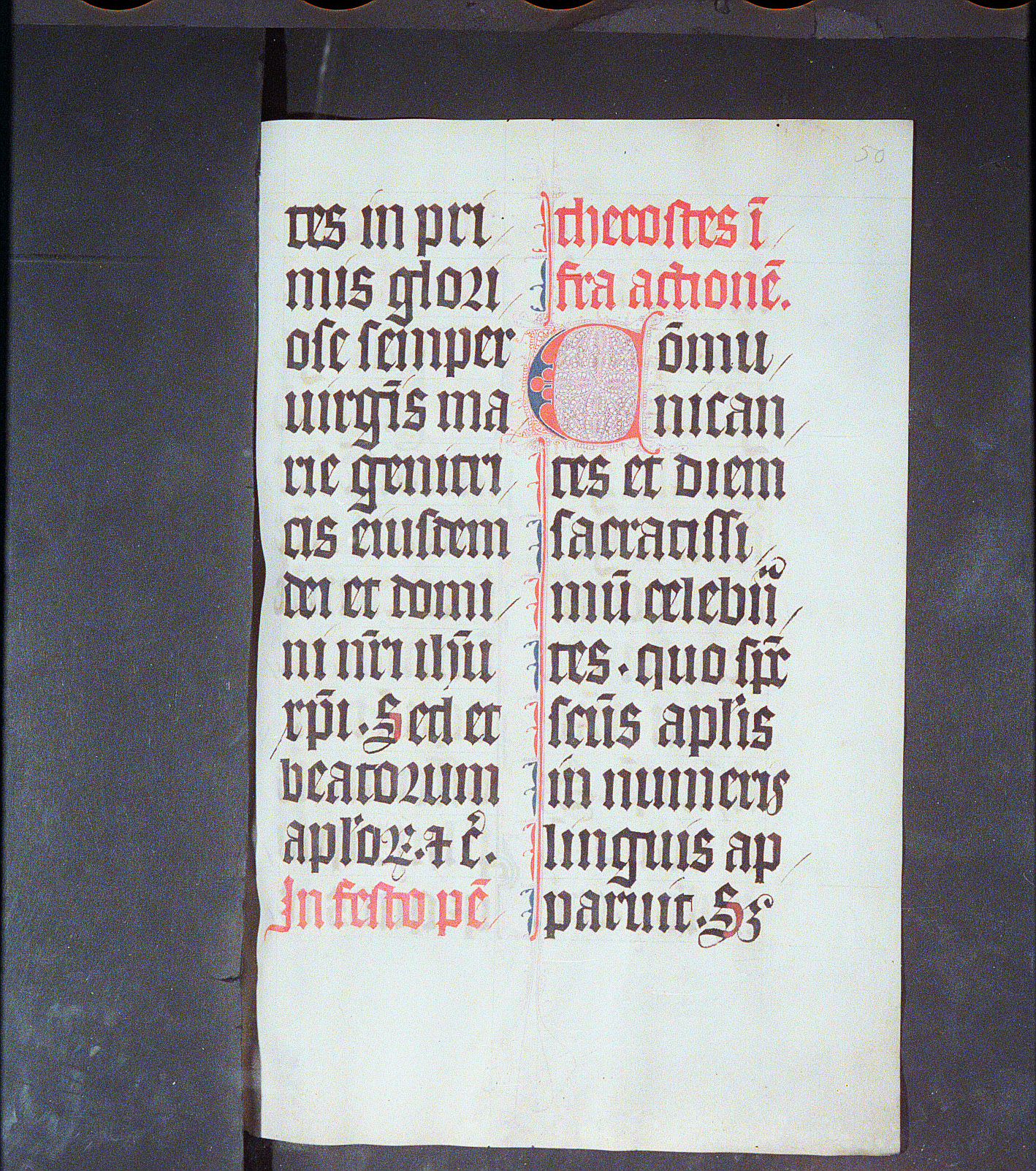
Please transcribe the first 14 lines from the left column from this breviary-missal from Northeast France (ca. 1290-1310). When this scribe writes two is next to each other, he writes ij, which is a device that emerges in the Gothic period to help distinguish a series of is from other groups of minims. You should transcribe ij as ii, since the j is just a variant form of i and does not represent the modern English letter j.
As in the last manuscript, you will encounter both the 2-shaped r after round letters, and the -rum abbreviation, which is the 2-shaped r with a stroke through the final stroke of the r. They look rather different in this hand than they did in the very angular hand of the last manuscript.

.jpg)
and this is the -rum abbreviation, in the genitive plural -orum:
This manuscript is your first time seeing the abbreviation for final -us, which looks like a superscript 9. It appears in the first word on this page, and also in line 11.
You will also see a form like a 3, which can represent various omitted final letters.
In line 14, the common mark of abbreviation is used four times: once over a nomen sacrum; once as usual to indicate omission of a final m; and twice to indicate simply that something has been omitted in abbreviation. The first word in that line is Q(uonia)m and the last word is iust(orum).