Protogothic, 12th century
-
Title
Pontificale Romano-Germanicum -
Text
Pontifical rites outside the liturgical year -
Language(s)
Latin -
Writing System
Roman -
Script(s)
Protogothic -
Country
Germany -
City
Cologne -
Repository
Erzbischöfliche Diözesan-und Dombibliothek -
Shelf Mark
MS 139, fol. 21r -
Common Name
Pontificale Coloniense -
Century
12th century -
Year Range
1100-1200 -
Place Of Origin
Germany, Diocese of Cologne
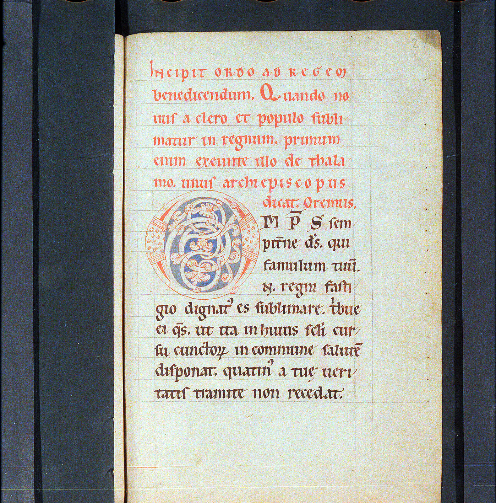
This manuscript is the first of two volumes that form a Pontifical, a book of liturgical offices performed by a bishop. This copy was prepared for the Archbishopric of Cologne. This volume contains offices involving the bishop that fall outside the regular round of the liturgical year, like ordinations, dedications of churches, consecration of cemeteries, and so on. The second volume, MS 140 in the same collection, covers the liturgical year.
The script and layout are an almost perfect illustration of the 12th-century transitional phase between Caroline Minuscule and Gothic Textualis. The large, egg-shaped letterforms are well on their way to evolving from the small minim-height of Caroline to the large minim-height and short ascenders of Textualis. The letterforms themselves are mainly Caroline – notably the upright d and the t. But there are signs of Gothic emphasis on rhythmic series of parallel minims with uniform treatment of their feet. The scribe alternates freely between the Caroline habit of using tall s at word end and the Gothic use of round s in the same position.
The relationship of writing to ruling is half Caroline and half Gothic. The scribe follows Carolingian practice in beginning the text above the top ruled line, but his habit of floating each line of text in the space between ruled lines, rather than having the letters sit on the ruled line, is a symptom of emerging Gothic layout practices.
The prickings that guided the ruling are clearly visible at the right edge of the page. There are no prickings at the left side of the page (in the gutter), because in accordance with Continental practice, the pages were ruled with the quire open, with prickings only at the outer edges of the leaves. The prickings that guided one of the pairs of vertical rules are also visible at the top right of the page.
Acknowledgements: Described by Carin Ruff
Transcription
1 INCIPIT ORDO AD REGEM
2 benedicendum. Quando no-
3 uus a clero et populo subli-
4 matur in regnum. primum
5 enim exeunte illo de thala-
6 mo. unus archiepiscopus
7 dicat Oremus
8 OM(NI)P(OTEN(S) sem-
9 pit(er)ne d(eu)s. qui
10 famulum tuu(m)
11 N(omen) regni fasti-
12 gio dignat(us) es sublimare. t(ri)bue
13 ei q(uaesumu)s. ut ita in huius s(ae)c(u)li cur-
14 su cunctor(um) in commune salute(m)
15 disponat. quatin(us) a tuȩ ueri-
16 tatis tramite non recedat.
Paleographic Features
1. Line 1: Headings are in a script that has something of the aspect of Rustic Capitals, in being tall and narrow, but is actually a mix of Capital, Uncial, and Caroline Minuscule forms rendered as a majuscule.
2. The first line of writing starts above the first ruled line: a feature of Carolingian layout. The writing floats well above the ruled line, rather than sitting on it: a Gothic feature.
3. Line 2 (the first minuscule line): Note the upright d, a Caroline minuscule form
4. Line 3, the third letter: Tall s at word end is a Caroline feature.
6. In the middle of line 3, et has a t whose upright stroke sticks up almost not at all above the cross-stroke. This is a Caroline feature.
7. The upticks at the feat of each minim of m, as at the end of line 4, is typical of 12th-century Protogothic.
8. Four lines from the bottom: The h in huius whose second stroke curves back around to the left and somewhat below the baseline; the regular rhythm of minims that are hard to parse into letters; and the round s at word-end are all typical Gothic features.
9. Note the prickings to guide the pair of vertical rules that are visible at the top of the page near the right margin, as well as the prickings for the horizontal rules that run down the right side of the page.