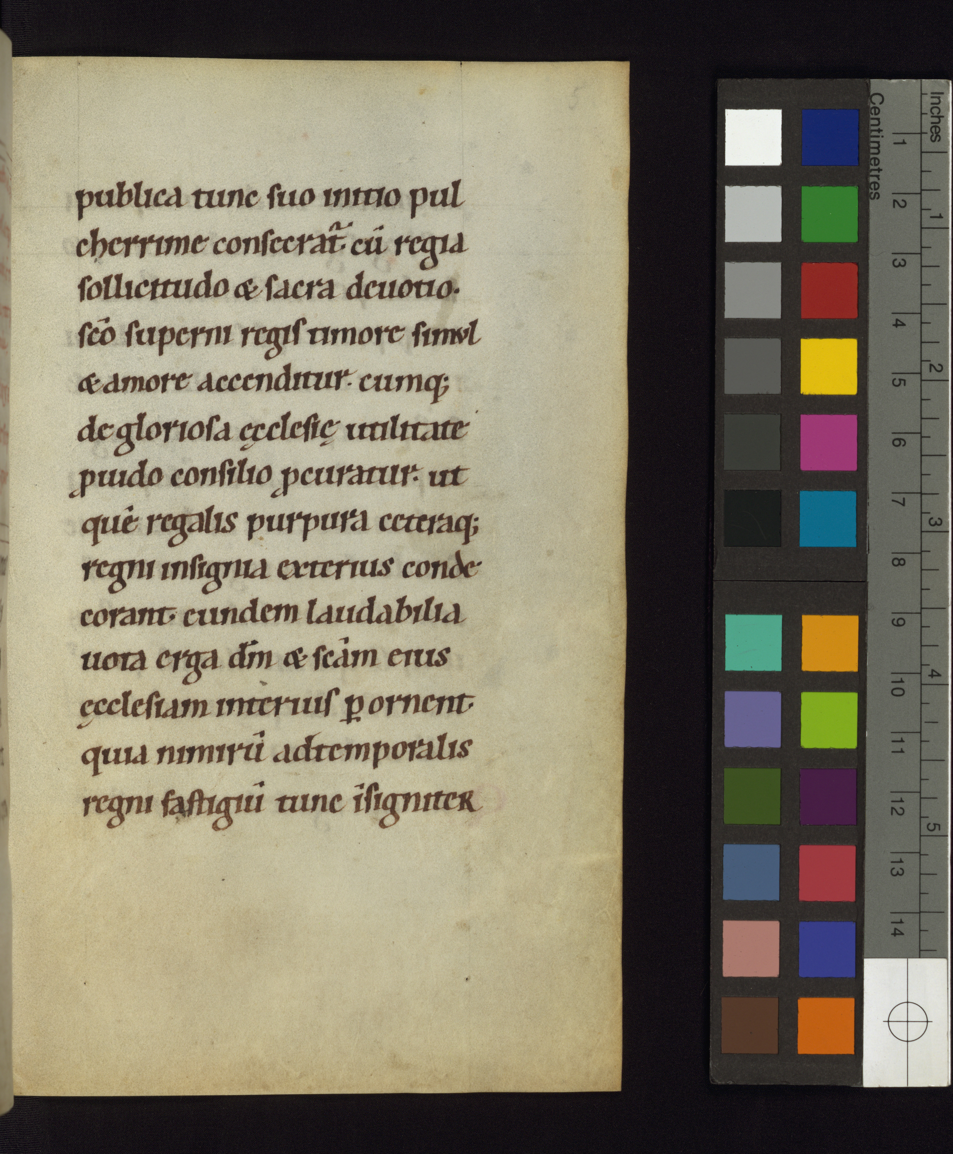
Protogothic, 12th century
-
Title
Sedulius Scottus, De rectoribus Christianis (On Christian Rulers) -
Text
Chapter 1 -
Language(s)
Latin -
Writing System
Roman -
Script(s)
Protogothic -
Country
United States of America -
City
Baltimore -
Repository
Walters Art Museum -
Shelf Mark
W.12, fol. 5r -
Century
12th century -
Year Range
1125-1175 -
Place Of Origin
Germany, Westphalia (?) -
Provenance
Gustav Ritter von Emmich sale, Vienna, March 15, 1906, no. I, pl. VIII; Gruel and Engelmann collection no. 609, Paris; Henry Walters, Baltimore, purchased from Gruel before 1931; Walters Art Museum, 1931, by Henry Walters bequest. -
Bibliography
Edward Doyle, The De Rectoribus Christianis and Poems of Sedulius Scottus (1982).
Sedulius Scottus, De rectoribus Christianis, edited by S. Hellmann (1906), p. 22, lines 3-8.
-
External Facsimile
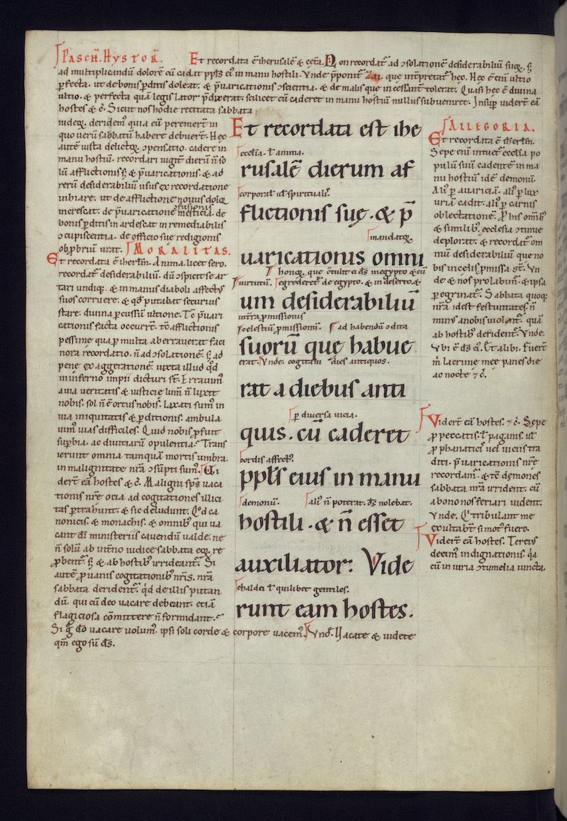
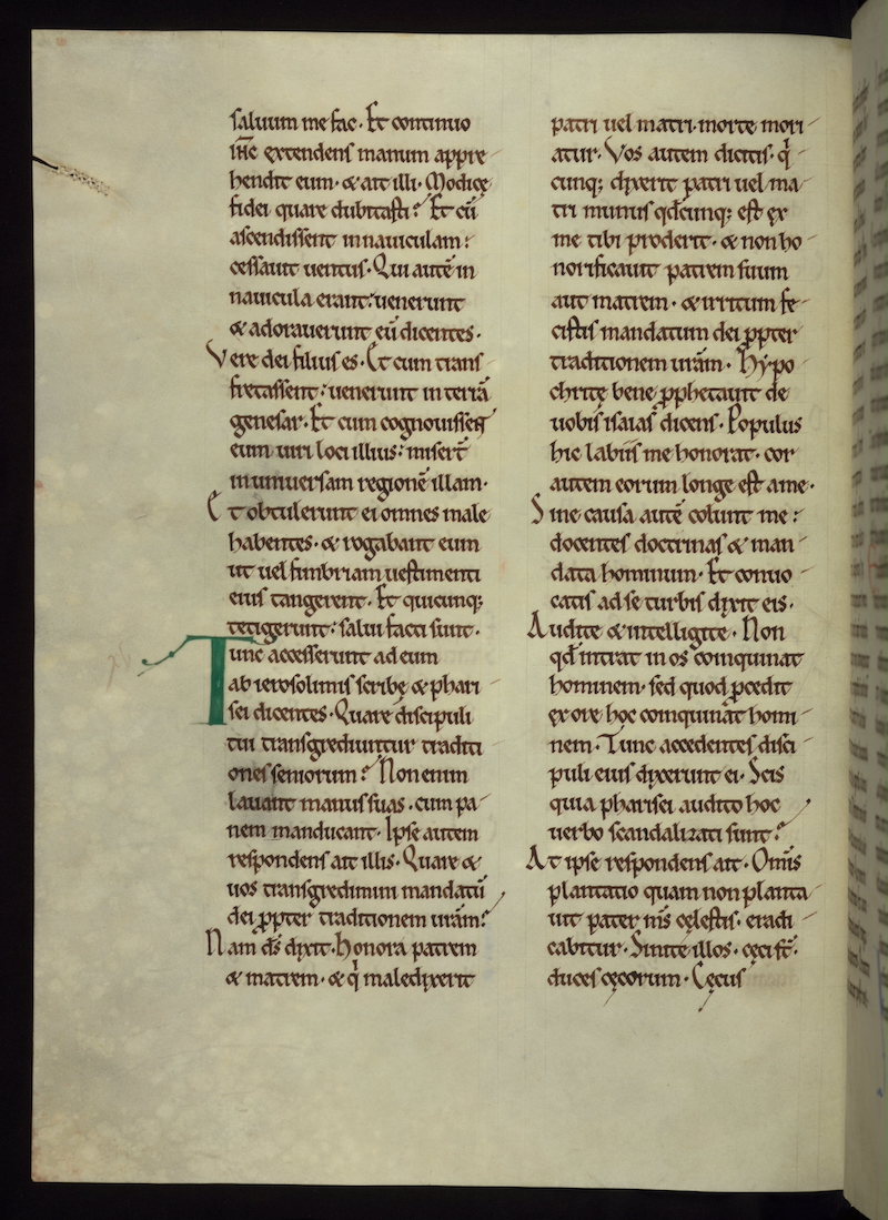
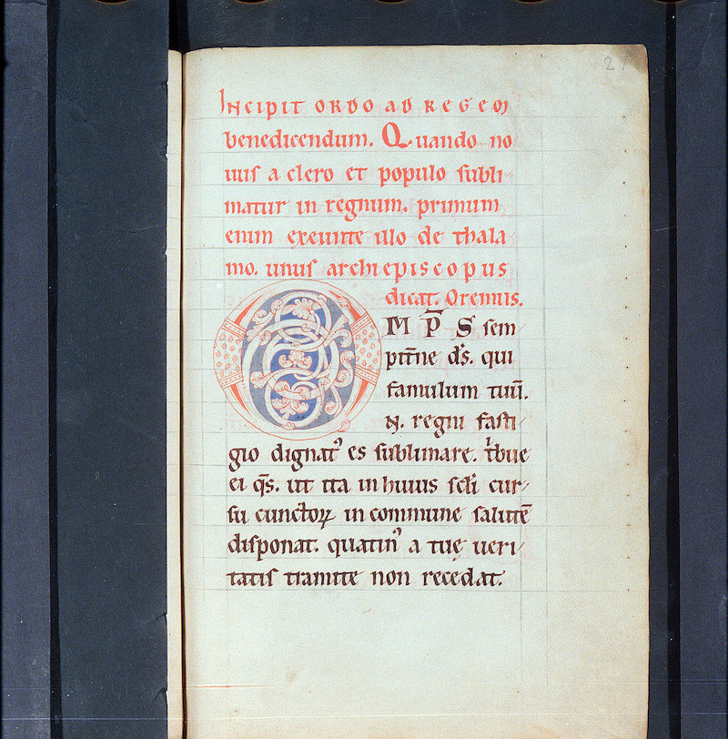
This twelfth-century manuscript shows many of the changes in Caroline Minuscule that herald the emergence of Gothic Textualis. While the letterforms are for the most part recognizably those of Caroline Minuscule, the proportions of the letters — egg-shaped, laterally compressed, with a comparatively large minim height and proportionately small ascenders — are typical of Praegothica, the twelfth-century phase of script development between Caroline and Gothic.
Specific letter-elements that look forward to Textualis are forked serifs on ascenders and, in some places, a regular rhythm of upward-slanting hairstrokes on the feet of minims. Most ds have the upright Caroline form, but one on this page has a rather vertical version of the Gothic form, which is based on Uncial d. The scribe uses both upright and round s at word end; the latter is a Gothic feature, the former characteristically Caroline. The Caroline ampersand is used for et.
The single-column, uncluttered page layout is still wholly Carolingian, except for the diminished space between lines created by the large minim-height of letters. The writing starts above the top ruled line and letters sit on the ruled line, rather than floating above it as in Gothic.
Acknowledgements: Described by Carin Ruff
Transcription
1 publica tunc suo initio pul(-)
2 cherrime consecrat(ur) cu(m) regia
3 sollicitudo et sacra deuotio ∙
4 s(an)c(t)o superni regis timore simvl
5 et amore accenditur ∙ eumq(ue)
6 de gloriosa ȩcclesiȩ utilitate
7 p(ro)uido consilio p(ro)curatur ∙ ut
8 que(m) regalis purpura ceteraq(ue)
9 regni insignia exterius conde(-)
10 corant eundem laudabilia
11 uota erga d(eu)m et s(an)c(t)am eius
12 ȩcclesiam interius p(er)ornent
13 quia nimiru(m) ad temporalis
14 regni fastigiu(m) tunc i(n)signiter
Paleographic Features
1. The top line of writing starts above the top ruled line, a Carolingian feature. Letters sit on the ruled line, rather than floating above them as will be the case in later Gothic manuscripts.
2. Forked treatment of ascenders, as on the b and l of publica in line 1, is a sign of emerging of Gothic Textualis.
3. Upward-slanting hairstrokes at the feet of many of minims creates a rhythm at the baseline, as in sollicitudo at the beginning of line 3. This treatment of feet is typical of Protogothic.
4. Tall s at word end, as in regis in the middle of line 4, is a Caroline feature. But compare round s, a Gothic feature, on eius at the end of line 11.
5. Upright d, a Caroline feature, is the normal form for this hand, but note the Uncial-style d in the last word in line 9.
