Lesson
Latin Scripts - Humanist
Description
The reformed scripts of Italian humanists of the 15th century, Humanist Minuscule and Humanist Cursive. Features of Humanist page layout compared to Carolingian and Gothic page design.
Overview
All the previous scripts we’ve studied grew organically from gradual stylistic evolution and the practice of many scribes in many centers. Even Caroline minuscule, which was shaped by the agenda of a particular movement for the reform of texts, language, and liturgy, built on decades of previous experimentation to achieve a clearer script, and emerged from several monastic and scholarly centers at around the same time.
Humanist scripts, by contrast, were the conscious creation of a handful of Florentine scholars.
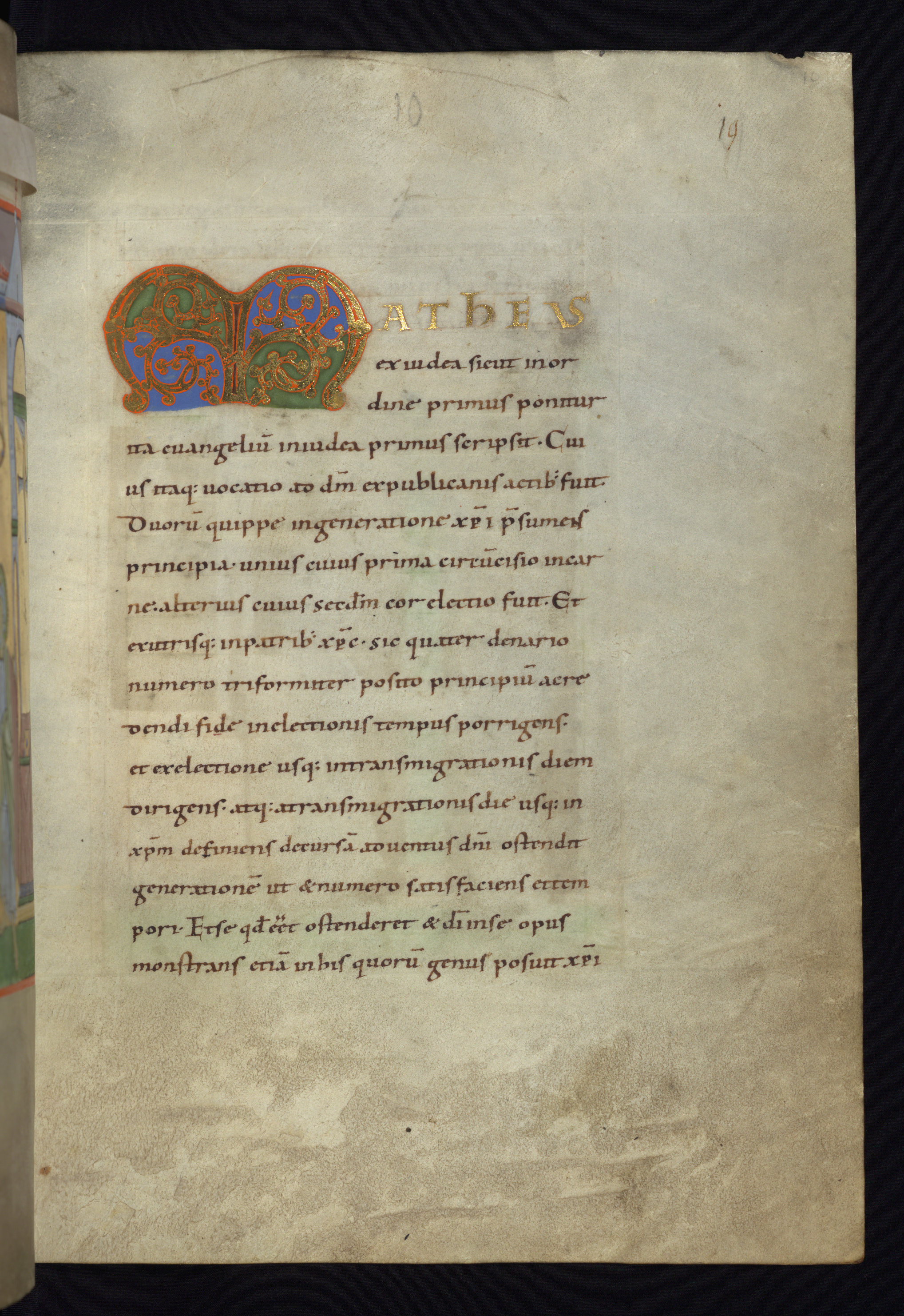
St. Gallen, Kantonsbibliothek, Vadianische Sammlung, VadSlg MS 298 (https://www.e-codices.unifr.ch/en)
Cologny, Fondation Martin Bodmer, Cod. Bodmer 137, f. 1r. (https://www.e-codices.unifr.ch/en)
HMML, MS. Lat. 4, f. 5r. Used under a CC BY-NC 4.0 license.
In the last years of the 14th century, Petrarch began experimenting with a new personal script. He was interested in creating a clearer alternative to the plethora of Gothic scripts familiar in his day. His friends Boccacio and Coluccio Salutati picked up on his experiments. These men were trained in Italian chancery scripts, which had some influence on their experiments, as did Southern Textualis (Rotunda). They were used to reading both the full range of Gothic scripts, which were what they wanted to avoid, as well as Caroline minuscule, which was the script in which the Classical texts they studied had reached the late Middle Ages.
Shortly after the year 1400, Salutati’s student Poggio Bracciolini created a new script in imitation of Caroline minuscule. It is Poggio’s script, as practiced by him and imitated by other scribes in the 15th century, that we know as Humanist minuscule. Within just a few years, another scholar in the same circle, Niccolo Niccolini, created a calligraphic cursive version of Humanist script, which became what we know today as Italic.
Humanist Minuscule
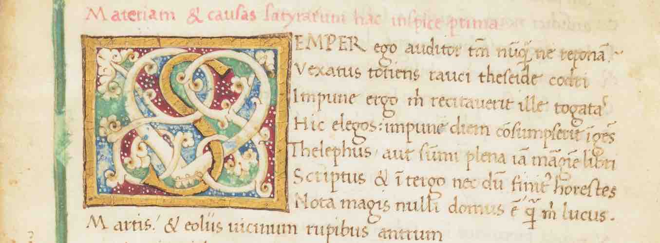
Poggio’s reformed script brought back the small minim-height and careful spacing of his Caroline models. The change in aspect and aesthetics from Gothic script is striking. This manuscript, written in Florence around the year 1410, was copied from one written by Poggio and closely imitates his handwriting:
St. Gallen, Kantonsbibliothek, Vadianische Sammlung, VadSlg MS 298 (https://www.e-codices.unifr.ch/en)
Letterforms
Poggio’s new script was systematically purged of Gothic scribal habits, both in spelling and in the choice of letterforms. The letterforms of Humanist minuscule are essentially those of Caroline minuscule. If you recall the changes in letterforms that mark the transition from Caroline to Gothic, you will have a sense of the changes that Poggio rolled back. The most important are:
- upright d replaced Uncial d
- tall s was reintroduced at word-end in place of round s
- the u form of u/v replaced v, which had become normal in Gothic cursives at the beginning of words.
All these changes are seen in these details from the manuscript above:
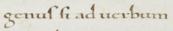
genus si ad uerbum
In addition, the ampersand (e-t ligature) replaced the Tironian et, which had taken over in all Gothic scripts by the 13th century.
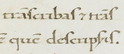
However, purging a script of the training of a lifetime and of scribal habits that are all around in the culture is as difficult as eliminating anachronisms from the language of a historical novel. Even in very careful imitations of Poggio’s new script, Gothic habits slip in. These details from the same manuscript show an Uncial d and a Tironian et, plus an Italian Gothic form of the con- abbreviation, slipped in among careful uses of final tall s and other reformed features (St. Gallen, Kantonsbibliothek, Vadianische Sammlung, VadSlg Ms. 298, f.2r.):
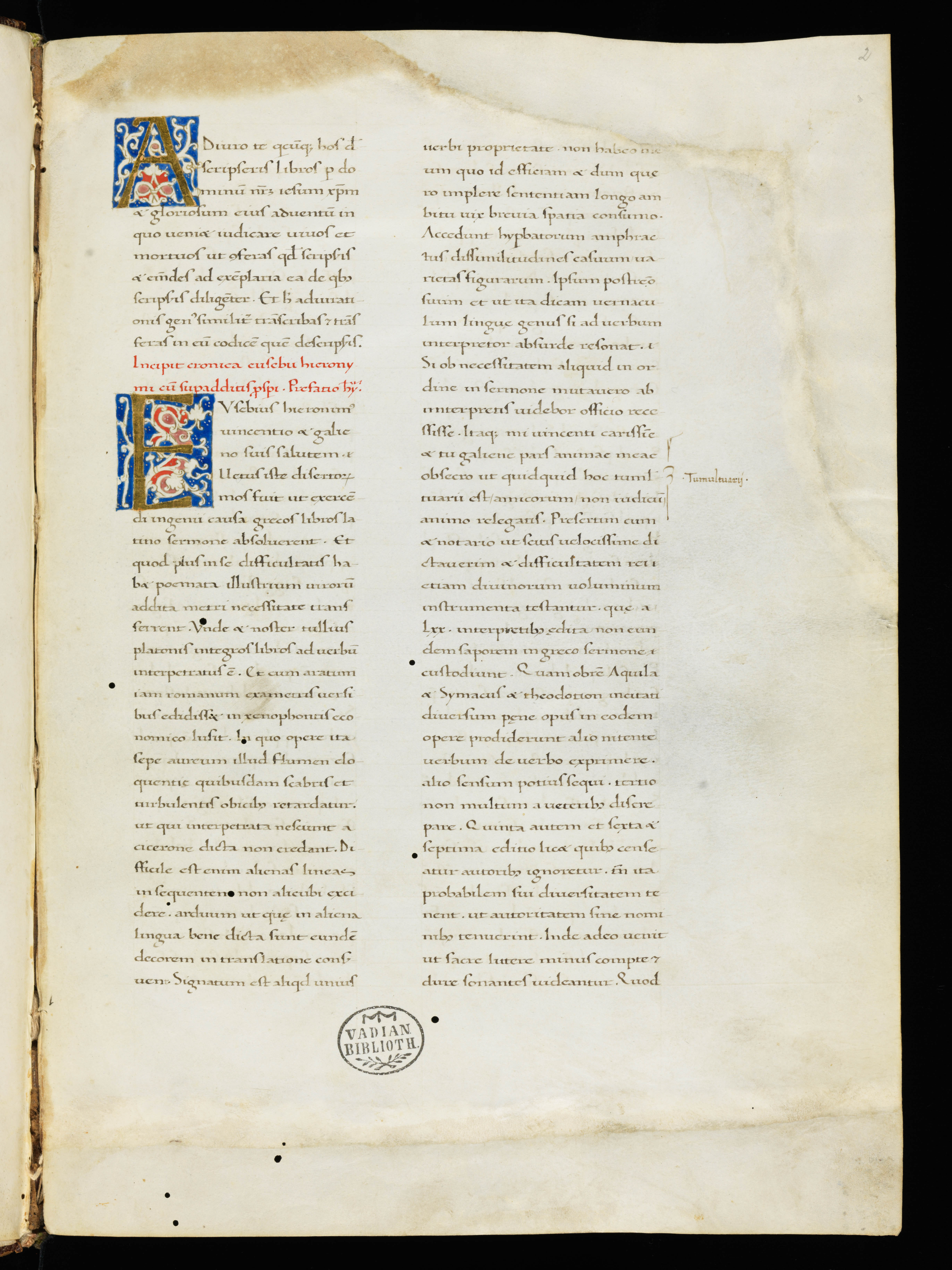
Another early-15th-century Humanist manuscript by a scribe from the north of Italy shows round ss and hints of biting where the round parts of h and e meet — both Gothic features, which, strictly speaking, should not be there:
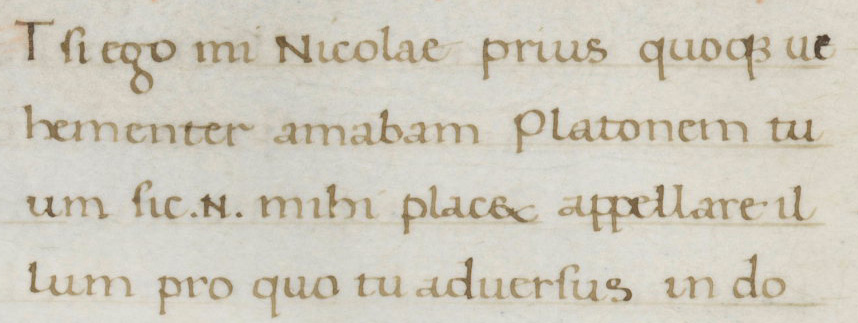
Cologny, Fondation Martin Bodmer, Cod. Bodmer 137, f. 1r.
If you are ever in doubt about whether you are looking at a Carolingian manuscript or a Humanist imitation of Caroline, look for this telltale Gothic slip-up.
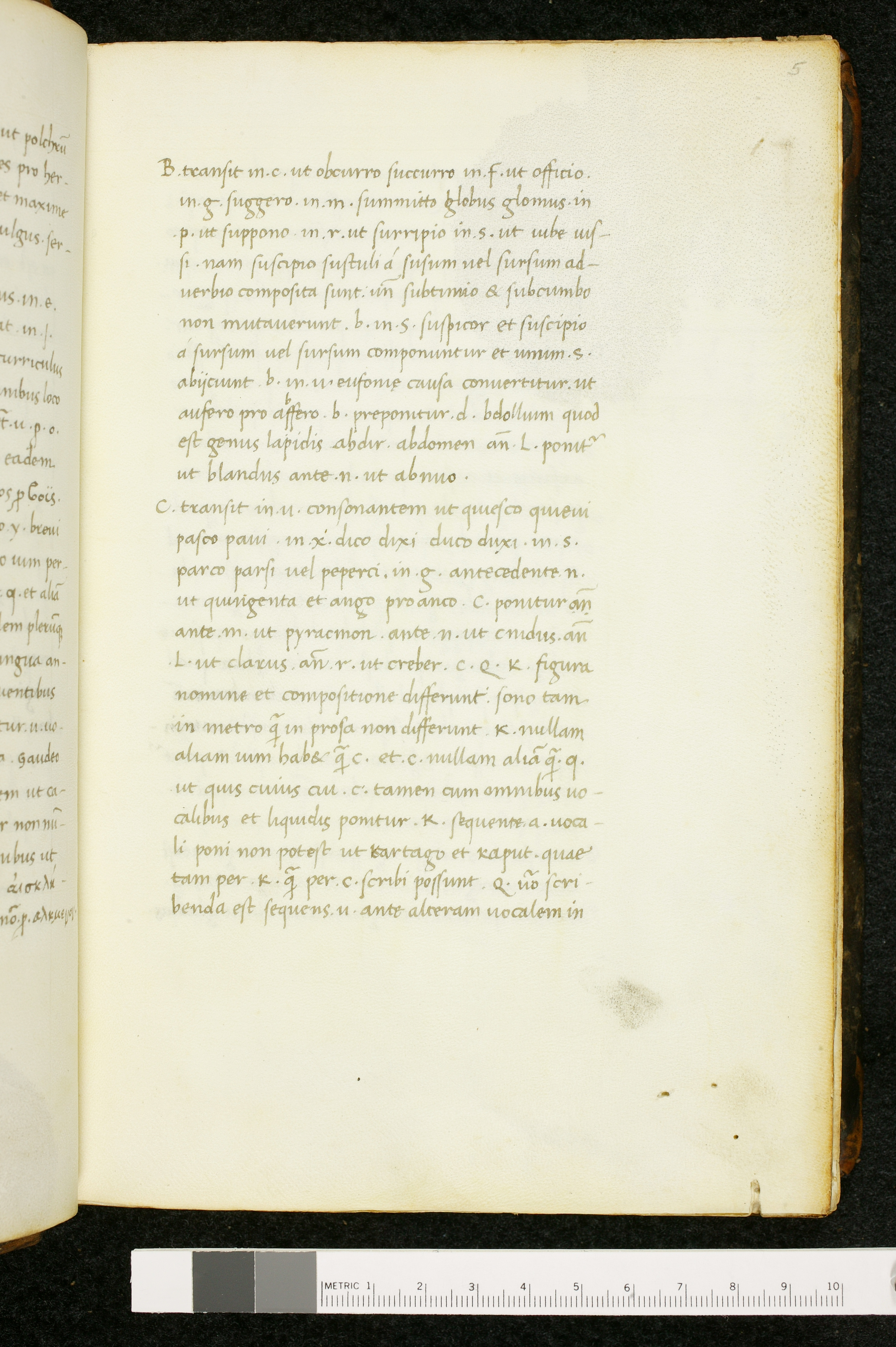
Humanist Cursive
Humanist Cursive, which is essentially the script we know as Italic, is cursive in the sense that it is written with fewer lifts of the pen than Humanist Minuscule. It would not qualify as a cursive within the typology of Gothic scripts we studied in the last lesson, because it has no loops on its ascenders.
The letterforms are essentially those of Humanist Minuscule, but slanted, and with descenders on f and s. Note that Humanist Cursive preserves the Gothic convention of using round s at word end and tall s in initial and medial position. The script presents minimal problems to the modern reader, and should present none at all to the student who has finished this course and is familiar with tall/long s and with basic abbreviations.
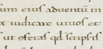
HMML, MS. Lat. 4, f. 5r. Used under a CC BY-NC 4.0 license.
Layout and Decoration in Humanist Manuscripts
Humanist manuscripts share the plain-page aesthetic of Carolingian manuscripts. Note the lightness and spaciousness of the way the text is presented in these Humanist manuscripts, whether in two columns or one:
St. Gallen, Kantonsbibliothek, Vadianische Sammlung, VadSlg MS 298 (https://www.e-codices.unifr.ch/en)
Cologny, Fondation Martin Bodmer, Cod. Bodmer 137, f. 1r. (https://www.e-codices.unifr.ch/en)
Compare the manuscripts above to one of the Carolingian manuscript we saw earlier, The Reichenau Gospels, mid-11th century. The Carolingian manuscript is at left and the Humanist one is at right:
Walters Art Museum, W.7, f. 10r. © 2011 Walters Art Museum, used under a CC BY-SA license.
Cologny, Fondation Martin Bodmer, Cod. Bodmer 137, f. 1r. (https://www.e-codices.unifr.ch/en)
This is in part a result of the small minim-height and generous line spacing used in Humanist scripts, as in Caroline minuscule, and in part the result of a conscious aesthetic decision about the presentation of script on the page. In many Humanist manuscripts, the ruling is essentially invisible — a return to the dry-point ruling of the pre-Gothic period. Such ruling may be all but impossible to detect in a digitized image.
Some Humanist manuscripts, however, even though they do not use dark ink for ruling, show that the person who prepared the parchment was trained in typical late-medieval ruling patterns. In this manuscript, you can see that the writing starts below the top ruled line, where a Carolingian manuscript would have the writing start above the top ruled line:
This detail does not disturb the overall spaciousness and lightness of the page, but it does remind us that these manuscripts were made by people who practiced many different scripts and were trained in the manuscript production modes of their own day. This is the same manuscript we noted above that contains the round s at word end and other traces of Gothic script features.
Decoration
Humanist manuscripts borrow their page aesthetics from Carolingian models and, like those Carolingian models, employ decorative schemes that consciously echo antiquity. However, they use a 15th-century version of Classicism, not a 9th- to-11th-century version. Humanist manuscripts have their own decorative vocabulary, in which you may recognize Renaissance naturalistic painting. The most widely-used and easy-to-spot decorative feature is the white vine-scroll. If you see initials or borders with white vine-scrolls, you are definitely looking at a Humanist manuscript, not a Carolingian one.
St. Gallen, Kantonsbibliothek, Vadianische Sammlung, VadSlg MS 298 (https://www.e-codices.unifr.ch/en)
What Happens Next to These Scripts?
The Humanist scripts joined the whole late-medieval and Renaissance inventory of scripts, including Textualis and the many regional varieties of Cursiva. Just as these scripts were invented by men already proficient in several chancery scripts and book scripts of their day, they were used by professional scribes in books for which their particular aesthetics and resonance was suited – above all, luxury copies of Classical texts.
Both Humanist Minuscule and Humanist Cursive were taken up by late-fifteenth and early-sixteenth-century printers, which is how their use has been perpetuated to this day.
A "Roman" typeface – based on Humanist Minuscule – was used first by the printers Sweynheym and Pannartz in 1465. Sweynheym and Pannartz were Germans working at Subiaco in Italy. Their typeface owes much to Humanist Minuscule, but has something of the proportions of a Southern Textualis, with a larger x-height (minim-height) than is typical of Humanist Minuscule. The 1470 version by Nicholas Jensen is recognized as a particularly beautiful typographic interpretation of the script, and was the model for numerous Roman types in the 16th century and beyond.
Aldus’s portable editions of the classics, printed beginning in 1501, used a typeface designed by Francesco Griffo that appears to be based on Humanist Cursive, though Aldus apparently thought of it as a version of cancellaresca, the Italian chancery cursive. The success of these handy editions helped popularize the new "italic" type.
The typefaces based on Humanist scripts were used alongside those based on Gothic scripts for decades – indeed, centuries – following the invention of printing, and eventually won out over types based on Textualis, becoming the standard typefaces in the West.
This concludes our survey of Latin scripts. If you read Latin and would like to try transcribing Humanist Minuscule, go to the Humanist Minuscule Transcription lesson.
Ready to transcribe?
Try your hand at transcribing Humanist scripts