Insular Half-Uncial; Anglo-Saxon Minuscule, 8th century
-
Title
Gospels -
Text
Matthew 4:24-5:10 -
Language(s)
Latin -
Writing System
Roman -
Script(s)
Insular Half-Uncial; Anglo-Saxon Minuscule -
Country
Great Britain -
City
London -
Repository
British Library -
Shelf Mark
Cotton Nero D IV, fol. 34r -
Common Name
The Lindisfarne Gospels -
Century
8th century -
Year Range
698-721 -
Place Of Origin
England, Lindisfarne, Northumbria -
Provenance
Probably to Chester-le-Street and Durham with the monks exiled from Lindisfarne after the Viking attacks. In the 17th century it was owned by Robert Bowyer and then Sir Robert Cotton, from whose collection it went to the British Museum in the mid-18th century. -
Bibliography
Janet Backhouse, The Lindisfarne Gospels: A Masterpiece of Book Painting (1995)
Janet Backhouse, The Lindisfarne Gospels (1981)
Michelle P. Brown, Painted Labyrinth: The World of the Lindisfarne Gospels (2003)
-
External Facsimile
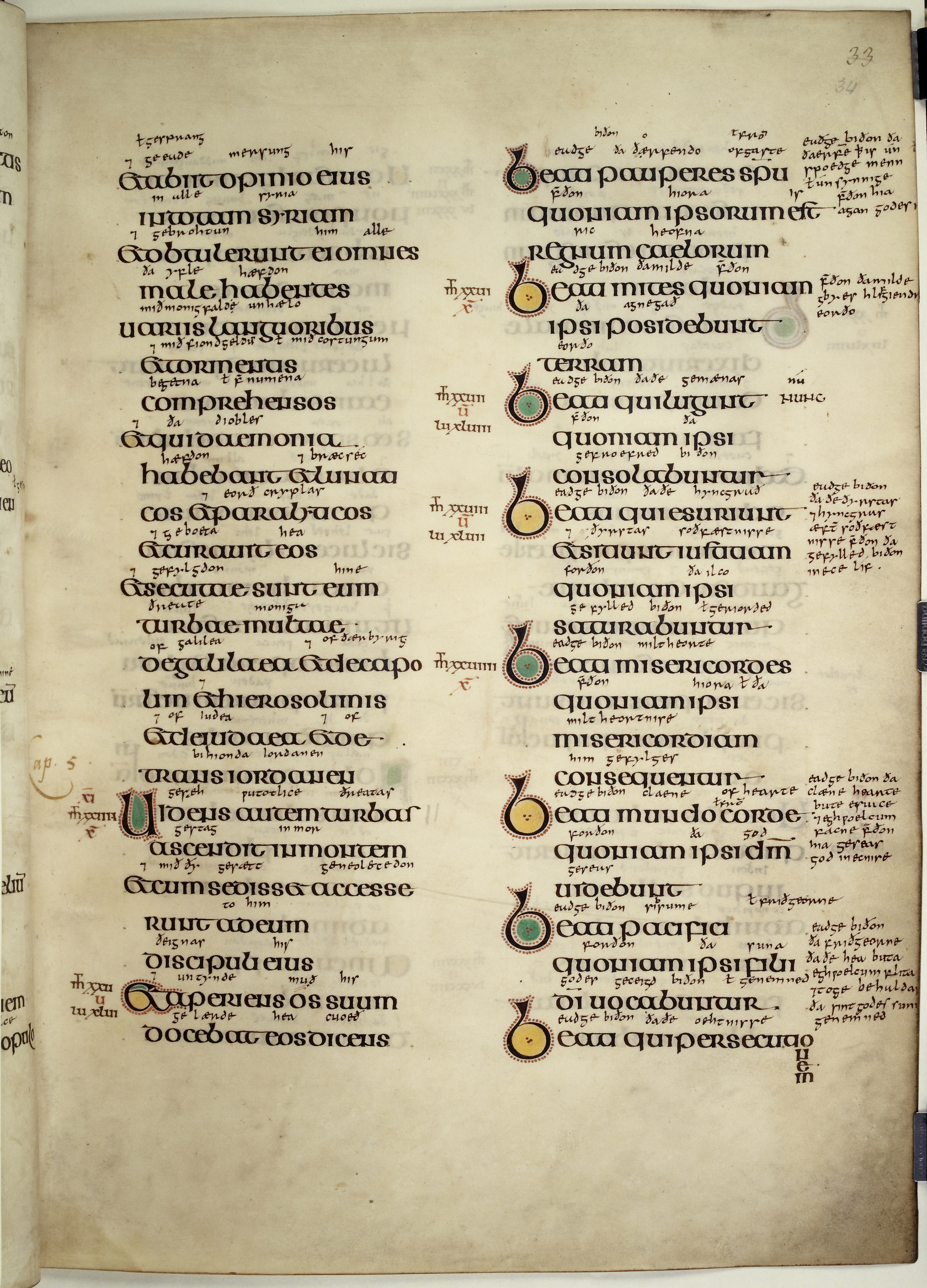
The famous Lindisfarne Gospels was written by Eadfrith, who was Bishop of Lindisfarne from 698-721. The isle of Lindisfarne, off the east coast of Northumbria, was an important center of learning and religious life at the turn of the 8th century. The text of the Gospels in this manuscripts reflects imported Roman manuscripts and the latest textual scholarship of the day. The script and decoration of the Lindisfarne Gospels are products of the hybrid Irish and Germanic culture that flourished in the north of England in the early Middle Ages, which we call "Insular".
The large, round, beautifully-executed script of the main text is Insular Half-Uncial. This script has its origins in the Half-Uncial minuscule script of books imported to Ireland at its conversion to Christianity. In the 7th century, Insular scribes inflated the minuscule Half-Uncial into a majuscule script as rounded and calligraphic as the Uncial scripts also practiced in Anglo-Saxon monasteries of the same period. Insular Half-Uncial thus has much of the aspect of Uncial: letters as round as they are high, and an emphasis on curves rather than angles. Cross-strokes that join letters along the headline and wedge-shaped serifs at the headline help create a strong horizontal emphasis, and reinforce the majuscule character of this script, with most letters the same height as each other.
The letterforms are mostly those of Half-Uncial – notably b, d, g, m, n, r, and s, though variant Uncial forms of some of those letters are also used. The g – an open curve with cross-stroke at the headline – and the f with low hasta are the same forms as those of the Insular minuscules, which also derive from Half-Uncial. The distinctive b of this script, which takes the appearance of a single, sinuous curve, is seen clearly in the colored initial bs of the Beatitudes in the second column, as well as in the body of the text. The form in this script most likely to cause confusion for the reader is the et ligature, in which the tongue of e curves down to become the lower stroke of the t. The result can look very much like ex instead of et.
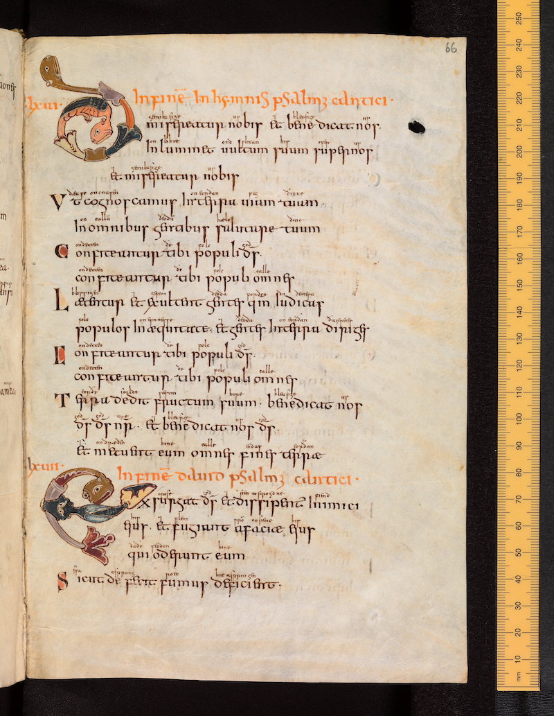
The text is abbreviated almost not at all, except for nomina sacra. Word separation is generally excellent. The text is laid out per cola et commata, with each sense unit starting on a new line, which is typical of late antique and early medieval bibles. Initials are color-washed and surrounded by dots as decoration, an Irish-influenced decorative feature. To the left of each column are Eusebian sections and canon numbers, which refer the reader to tables at the beginning of the manuscript showing which passages in this Gospel correspond to passages in the other Gospels.
Between the lines and in the margins is a continuous gloss in Old English. This was written around 950 by a scribe named Aldred. The script of the Old English gloss is Anglo-Saxon pointed minuscule. The continuous gloss is just one of many examples of vernacular glossing in Anglo-Saxon luxury manuscripts. (See also the Bodleian Library MS Junius 27, the Junius Psalter, in this collection.)
Transcription
(Latin text only)
Column 1
1 et abiit opinio eius
2 in totam syriam
3 et obtulerunt ei omnes
4 male habentes
5 uariis languoribus
6 et tormentis
7 comprehensos
8 et qui daemonia
9 habebant et lunati(-)
10 cos et paralyticos
11 et curauit eos
12 et secutae sunt eum
13 turbae multae
14 de galilaea et decap/o\(-)
15 lim et hiersolimis
16 et de iudaea et de
17 trans iordanen
18 Uidens autem turbas
19 ascendit in montem
20 et cum sedisset accesse(-)
21 runt ad eum
22 discipuli eius
23 Et aperiens os suum
24 docebat eos dicens
Column 2
1 Beati pauperes sp(irit)u
2 quoniam ipsorum est
3 regnum caelorum
4 Beati mites quoniam
5 ipsi posidebunt
6 terram
7 Beati qui lugunt
8 quoniam ipsi
9 consolabuntur
10 Beati qui esuriunt
11 et situnt iustitiam
12 quoniam ipsi
13 saturabuntur
14 Beati misericordes
15 quoniam ipsi
16 misericordiam
17 consequentur
18 Beati mundo corde
19 quoniam ipsi d(eu)m
20 uidebunt
21 Beati pacifici
22 quoniam ipsi filii
23 d(e)i uocabuntur
24 Beati qui persecutionem
Paleographic Features
Line numbers below refer to the main text — the larger script in Latin, not the Old English glossing hand.
1. The first line of the main text in column 1 is the et ligature. Note how the tongue of e curves down to become the lower stroke of t.
2. The curvy b with wedge-shaped serif appears in abiit in line 1 of the main text.
3. Line 2 of col. 1: Wedge-shaped tops of minims plus the long cross-stroke of t in totam combine for a strong horizontal emphasis along the headline.
4. In languoribus in col. 1, line 5, you can see the g – Half-Uncial in origin – that is characteristic of all the Insular scripts. Note that its form is essentially the same in the Insular Half-Uncial of the main text and the Anglo-Saxon minuscule written 250 years later.
5. Col. 1, lines 7 and 8 contain Uncial s and d: two of the forms borrowed from Uncial and added to the Half-Uncial forms that form the core of this script. Compare the upright Half-Uncial d that appears in col. 1, line 16, immediately after the et ligature at the beginning of the line. (The remaining ds in line 16 are Uncial-style.)
6. The marginal Roman numeral annotations are Eusebian canon and section numbers. The brown letters tell the reader that a parallel passage occurs in Matthew (the present Gospel) and Luke. For example, near the bottom of the left column, the siglum for Matthew is an m with a t growing out of it, and Luke is abbreviated lu. The red u refers the reader to canon table 5 (V) at the beginning of the manuscript, where all the passages common just to Matthew and Luke are set out.
7. In the right column, the bs that begin the Beatitudes are decorated versions of the bs in the main text. The word that begins each verse is beati – note the t and i touching each other, which can be hard to distinguish as separate letters.
8. Four lines from the bottom of the right column, the text Beati pacifici shows the typical Insular f with long horizontal stroke at the baseline.