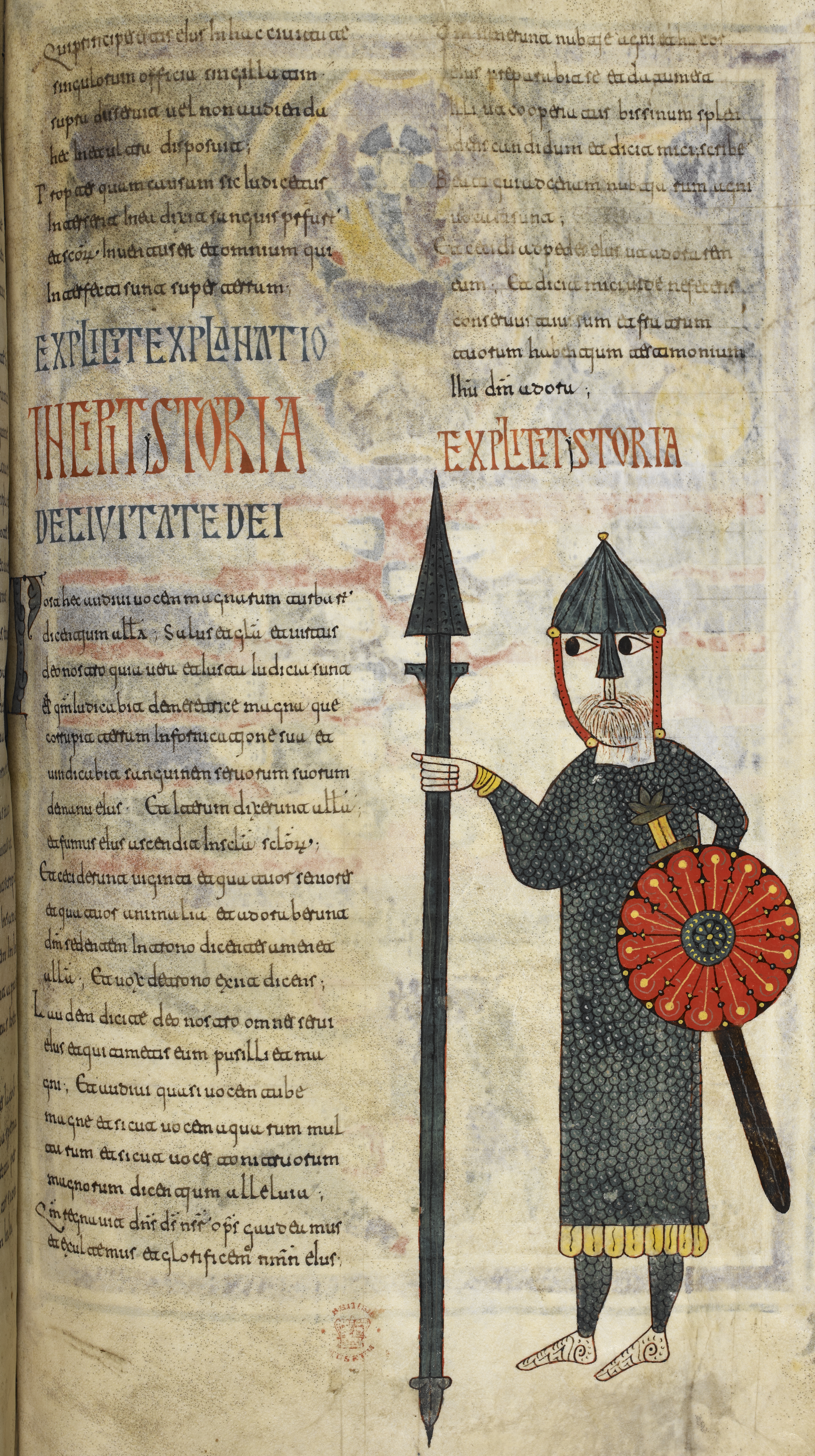
Visigothic, 11th-12th century
-
Title
Beatus of Liébana, Commentary on the Apocalypse -
Text
Commentary on the Apocalypse, 10.2.11-10.3 -
Language(s)
Latin -
Writing System
Roman -
Script(s)
Visigothic -
Country
Great Britain -
City
London -
Repository
British Library -
Shelf Mark
Add. 11695, fol. 194r -
Common Name
The Silos Apocalypse -
Century
11th-12th century -
Year Range
1091-1109 -
Place Of Origin
Spain, Santo Domingo de Silos -
Provenance
Probably at Santo Domingo de Silos until the end of the Middle Ages; in various Spanish collections until the early 19th century; bought by the British Museum in 1840 from Joseph Bonaparte, who had briefly been King of Spain under his brother Napoleon. -
Bibliography
M. C. Díaz y Díaz, Códices visigóticos en la monarquía leonesa (1983).
John Williams, Early Spanish Manuscript Illumination (1977).
John Williams, The Illustrated Beatus: A Corpus of the Illustrations of the Commentary on the Apocalypse, 5 vols (1994-2002).
-
External Facsimile
The Silos Apocalypse is one of a number of spectacularly-decorated copies of Beatus of Liébana's 8th-century commentary on the Book of Revelation, and is one of the best-known examples of Visigothic script. The manuscript dates to the greatest period of the Silos scriptorium.
Visigothic, of which there are several varieties, was the script of the Iberian peninsula from approximately the 8th century to the 13th. It is called "Visigothic" because it was used in what had been the Visigothic Kingdom of Spain, but the script as a distinct type postdates the Visigoths. Like the other "national hands," it was a post-Roman, local development of Later Roman Cursive, with some influence from Half-Uncial and Uncial. The form seen here, Visigothic Minuscule, is the most recognizable form of this class of scripts. Visigothic Minuscule is a calligraphic form developed for use as a book script.
Visigothic script is distinguished by a very upright aspect with long ascenders and descenders. It may lean a little to the left. It is typically written with a narrow pen, which contributes to its thin, elegant appearance. Although Visigothic was written in Spain in this period in preference to Caroline Minuscule, the influence of Caroline is apparent in the script's aspect.
The telltale letter that distinguishes Visigothic minuscule from all the other early medieval minuscules is the g, which looks like a c with a very long tail. Like a c, it is open at the right. The form resembles the Uncial g in ductus, but the aspect of the letter is entirely different because of the long descender.
The a and u in this script, as in many of the early medieval minuscules, are very easy to mistake for one another. The first stroke of a curves in slightly towards the right, whereas the first stroke of u is more upright.
Visigothic includes many ligatures, which can make it tricky for a modern reader to distinguish letterforms even though the script is very carefully executed. Ligatures with t are the most noticeable. T can join with preceding or following letters, and can take several different forms depending on the ligature. It is easy to mistake t for a or c or e, depending on context.
The script also makes several distinctions in the way letters represent sounds that are not used in northern European scripts. From around the year 900, scribes writing Visigothic use two forms of t-i ligature: ti with an i that stands on the line represents "hard" t + i, whereas tj, with an elongated, j-like i is used where the t is assibilated – where it has the sound "ts-". Visigothic also uses a tall i (i-longa), which stands on the baseline and looks like it could be a lowercase l. I-longa is used at the beginnings of words (unless anther tall letter immediately follows it) and also between vowels where it represents consonantal i (the "y" sound), as in eIus (eius).
The characteristic display script of manuscripts in Visigothic script is based on Rustic Capitals but is very angular, with wedge-shaped decorative elements.
Acknowledgements: Described by Carin Ruff
Transcription
Column 1
1 Qui principes estis eius in hac ciuitate
2 singulorum officia singillatim
3 supra disseruit uel non audienda
4 hec in ea ultra disposuit;
5 Propter quam causam sic iudicetur
6 interserit in ea dixit sanguis pr(o)f(et)ar(um)
7 et s(an)c(t)or(um) inuentus est et omnium qui
8 interfecti sunt super terram;
9 EXPLICIT EXPLANATIO
10 INCIPIT /Y\STORIA
11 DE CIVITATE DEI
12 Post hec audiui uocem magnarum turbar(um)
13 dicentium all(elui)a; Salus et gl(ori)a et uirtus
14 deo nostro quia uera et iusta iudicia sunt
15 ei(us) q(uonia)m iudicabit de metretrice magna que
16 corrupit terram in fornicatione sua et
17 uindicabit sanguinem seruorum suorum
18 de manu eius∙ Et iterum dixerunt all(elui)a;
19 et fumus eius ascendit in s(ae)c(u)la s(ae)c(u)lor(um);
20 Et ceciderunt uiginti et quatuor seniores
21 et quatuor animalia et adoraberunt
22 d(eu)m sedentem in trono dicentes amen et
23 all(elui)a; Et uox de trono exiit dicens;
24 Laudem dicite deo nostro omnes serui
25 eius et qui timetis eum pusilli et ma(-)
26 gni; Et audiui quasi uocem tube
27 magne et sicut uocem aquarum mul(-)
28 tarum et sicut uoces tonitruorum
29 magnorum dicentium alleluia;
30 Q(uonia)m regnauit d(omi)n(u)s d(eu)s n(o)s(te)r o(mni)p(oten)s gaudeamus
31 et exultemus et glorificem(us) n(o)m(e)n eius;
Column 2
1 Q(uonia)m [**]nerunt nubtie agni et huxor
2 eius preparabit se et datum est
3 illi ut cooperiatur bissinum splen(-)
4 dens candidum et dicit mici scribe
5 Beati qui ad cenam nubtiarum agni
6 uocati sunt;
7 Et cecidi ad pedes eius ut adorarem
8 eum; Et dicit mici uide ne feceris
9 conseruus tuus sum et fratrum
10 tuorum habentium testimonium
11 Ie(s)u d(eu)m adora;
12 EXPLICIT /Y\STORIA
Paleographic Features
(Annotations 1-10 refer to the lower left quadrant of the page, below DE CIVITATE DEI.)
1. e in this script is tall and tends to join the following letter in ligature. In the first line of minuscule col. 1, below DE CIVITATE DEI, the second word is hec, which shows the tall e linked to c.
2. In the same line, the characteristic g of Visigothic appears in magnarum.
3. The first word in the line below is dicentium. Note the en ligature and the ti ligature – here with the j-shaped i because the t is assibilated.
4. In the same line as dicentium, the word Salus gives a good chance to compare a and u.
5. The word suorum is at the end of a line directly opposite the knight's hand. Note the very subtle difference between s and r. The latter comes to a point at the top.
6. In the line below is an eius with i-longa
7. Two words after that eius is iterum beginning with an i-longa. Note the way t, e, and t are all connected.
8. In line 9 of the lower left quadrant of the page, you can see an unassibiliated t-i ligature, with an i that doesn't descend, at the end of uiginti, in the middle of the line.
9. In the next line, the b in adoraberunt is one of numerous places where the scribe uses b where Latin requires a u (v), and vice-versa. This is typical of Spanish usage.
10. Six lines from the bottom of the left column, audiui and quasi both give a good chance to compare a and u.
11. In the red capital incipit and explicit, a corrector has added a y before storia (i.e., historia). It is characteristic of Spanish scribes both to leave off a leading vowel or h plus vowel before s, and to supply one where it's not required. Both reflect the influence of Spanish pronunciation on Latin.
