Caroline Minuscule, 11th century
-
Title
Gospels -
Text
Prologue to the Gospel of Matthew -
Language(s)
Latin -
Writing System
Roman -
Script(s)
Caroline Minuscule -
Country
United States of America -
City
Baltimore -
Repository
Walters Art Museum -
Shelf Mark
W.7, fol. 10r -
Common Name
Reichenau Gospels -
Century
11th century -
Year Range
1025-1075 -
Place Of Origin
Germany, Reichenau -
Provenance
A German library, nineteenth century (front flyleaf contains a German inscription written in a nineteenth-century hand that assigns the manuscript the number 203); Sir Thomas Brooke, Armitage Bridge House near Huddersfield, Yorkshire; acquired from the dealer G. I. Ellis after 1854; Ingraham Brooke, Sotheby's March 7, 1913, lot 8; Leon Gruel, after 1913 (bookplate on front pastedown); Henry Walters, Baltimore, purchased from Gruel before 1931. -
Bibliography
Dorothy E. Miner, "A Late Reichenau Evangeliary in the Walters Gallery Library," Art Bulletin 18 (1936): 168-185.
-
External Facsimile
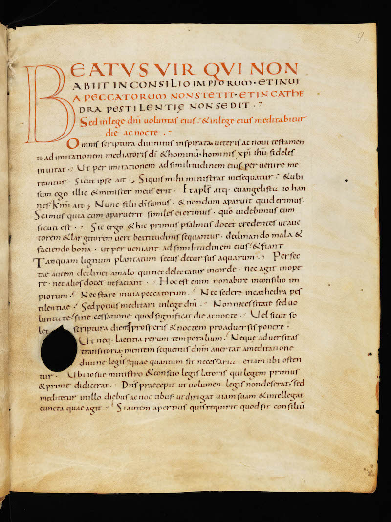
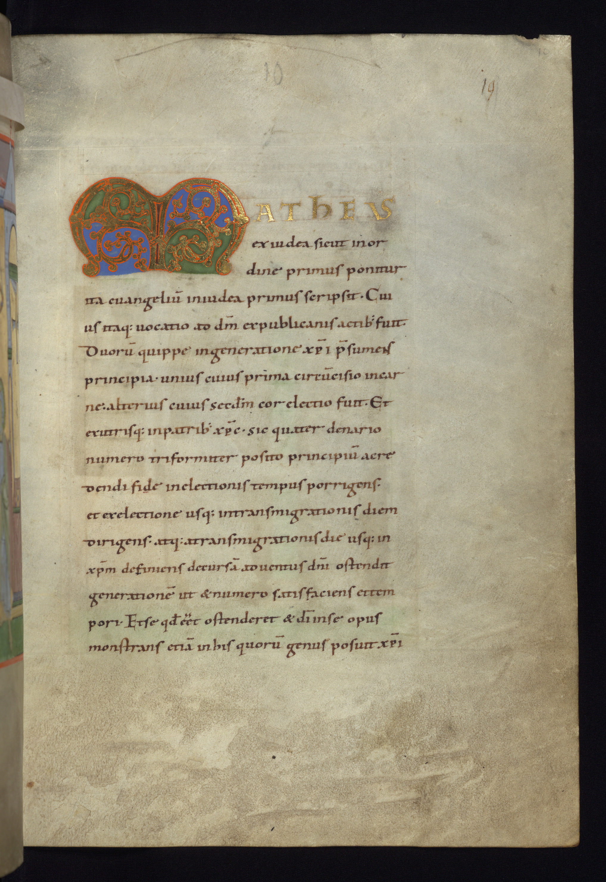
This manuscript is one of the monuments of the Luithar School of manuscript illumination of 11th-century Reichenau. As an example of late Caroline minuscule script and book production, it is an interesting case. The proportions and aesthetics of the page are wholly Carolingian: single-column layout, ample space between lines, ample margins around the written space, and a horizontal emphasis to the writing. The letterforms used by the scribe are almost entirely orthodox Caroline minuscule forms, except for a small but exaggerated Uncial d that alternates with upright Caroline d throughout.
On close inspection, however, the scribe emphasizes that horizontal character with techniques that anticipate the Gothic script that will begin to emerge in the following century. Most notably, series of minims that all have identical slanting serifs at their feet can make it hard to distinguish i and u and, in some cases, n. Many letters also reach out to join the letters that follow at the headline, which strengthens the horizontal momentum of the writing but can compound the difficulty in distinguishing adjacent letters. These features appear in other 11th-century manuscripts from Reichenau and associated monasteries.
The dry-point (hard-point) ruling is clearly visible in this image.
Acknowledgements: Described by Carin Ruff
Transcription
1 MATHEUS
2 ex iudea sicut in or(-)
3 dine primus ponitur
4 ita euangeliu(m) in iudea primus scripsit. Cui(-)
5 us itaq(ue) uocatio ad d(eu)m ex publicanis actib(us) fuit.
6 Duoru(m) quippe in generatione chr(ist(i p(rae)sumens
7 principia∙ unius cuius prima circu(m)cisio in car(-)
8 ne∙ alterius cuius sec(un)d(u)m cor electio fuit. Et
9 ex utrisq(ue) in patrib(us) chr(istu)s∙ sic quater denario
10 numero triformiter posito principiu(m) a cre(-)
11 dendi fide in electionis tempus porrigens∙
12 et ex electione usq(ue) in transmigrationis diem
13 dirigens∙ atq(ue) a transmigrationis die usq(ue) in
14 chr(istu)m definiens decursa(m) aduentus d(omi)ni ostendit
15 generatione(m) ut et numero satisfaciens et tem(-)
16 pori∙ Et se qu(o)d e(ss)et ostenderet et d(e)i in se opus
17 monstrans etia(m) in his quoru(m) genus posuit chr(ist)i
Paleographic Features
1. The dry-point ruling is most clearly visible above the top of the written area.
2. The gold initials, with illuminated Uncial M and capitals of mixed Uncial and Square Capital style, are typical of illumination from Reichenau in this period.
3. The iu in iu in the words euangeliu(m) in iudea in line 4 below the illuminated M show how a series of almost identical minims, whose diagonal feet often join one letter to the next, can create legibility issues. This regular pattern of parallel minims, and the associated confusion, presage Gothic aesthetics.
4. ponitur at the end of line 3 shows how letters joining up at the headline in this hand strengthen the general horizontal emphasis of Carolingian writing.
5. The exaggerated Uncial d at the beginning of line 6 is used as littera notabilior, but it also appears at the beginnings of lines 11 and 13 in the same size as the minuscule text script as well as in ad in the line above this one.