Overview
Manuscripts of the 9th and 10th centuries
The manuscripts for this lesson are all from Saint Catherine's Monastery, Sinai. The Library of Congress sponsored a microfilming expedition to Saint Catherine's in 1950, photographing about half of the collection. The other half were microfilmed by the Jewish National Library (now the National Library of Israel). Scans of all of these microfilms are being made available online. Bitonal microfilm offers challenges in reading that we will not meet in the full color images used for the rest of this course. For example, it is difficult to distinguish black ink from red. Fortunately, the letter-shapes are generally clear.
These codices are among the oldest Arabic books that survive. They offer a mix of “Kufic” features alongside what is usual for Naskh. The line is quite horizontal; that is, we see little of the down-and-up shapes found in later types of writing. The letters are generally more angular and less rounded than in later scripts, though the angularity varies in degree. For example, Sin. ar. 2 and 4, both perhaps of the tenth century, are not quite as angular as Sin. ar. 1. This angularity is especially notable in the letters kāf, dāl/ḏāl, mīm, and in the lām-alif ligature, which may be sharply angled on both sides at the bottom. The final yāʾ in the prepositions ilá, fī, and (not as commonly) ʿalá has a distinctive shape: flat and sitting on the line, with its bottom stroke pointing against the direction of the text. The cluster ṣād/ḍād/ṭāʾ/ẓāʾ has on the right side more of a squat, rectangular box than a loop.
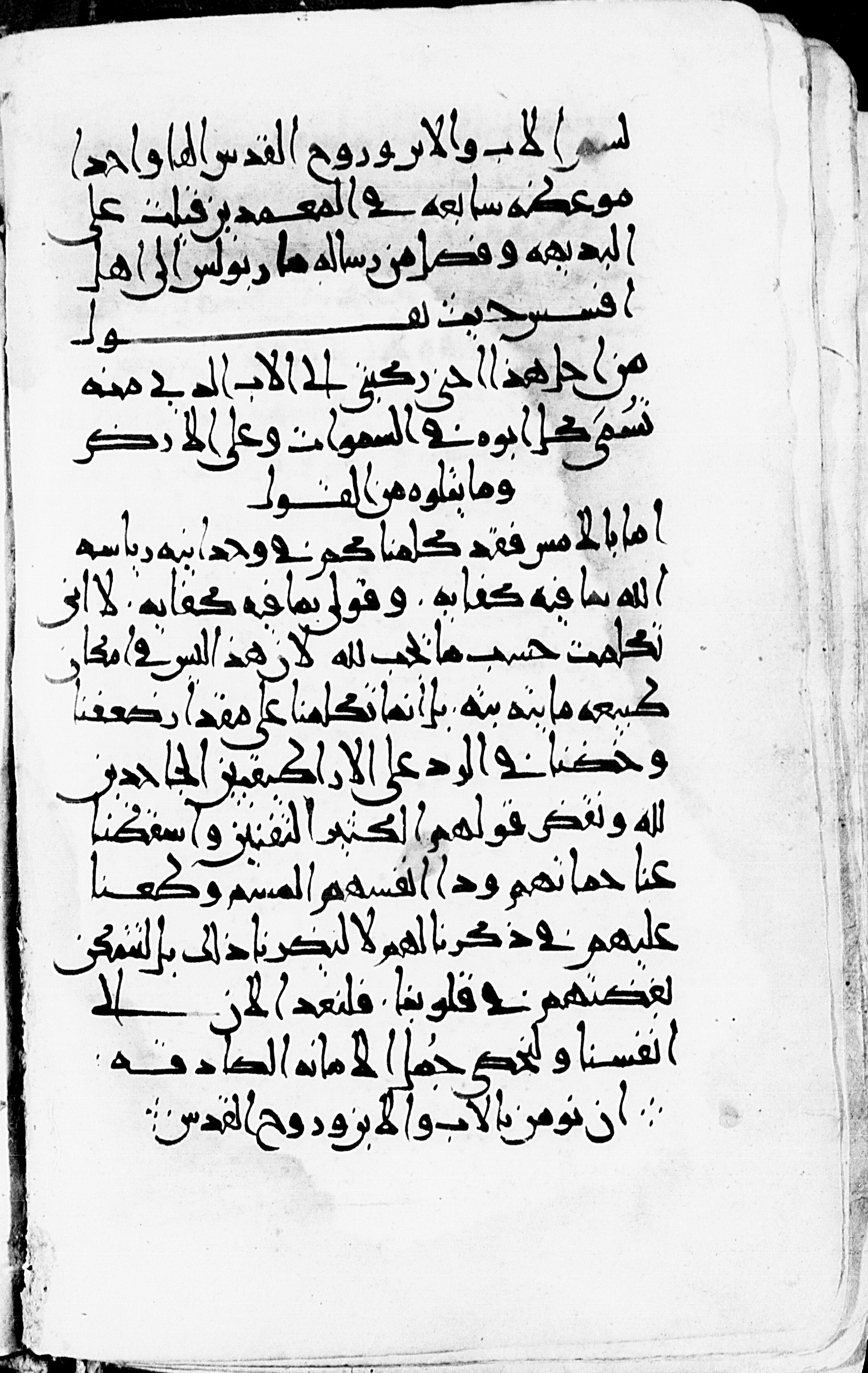
Example 1
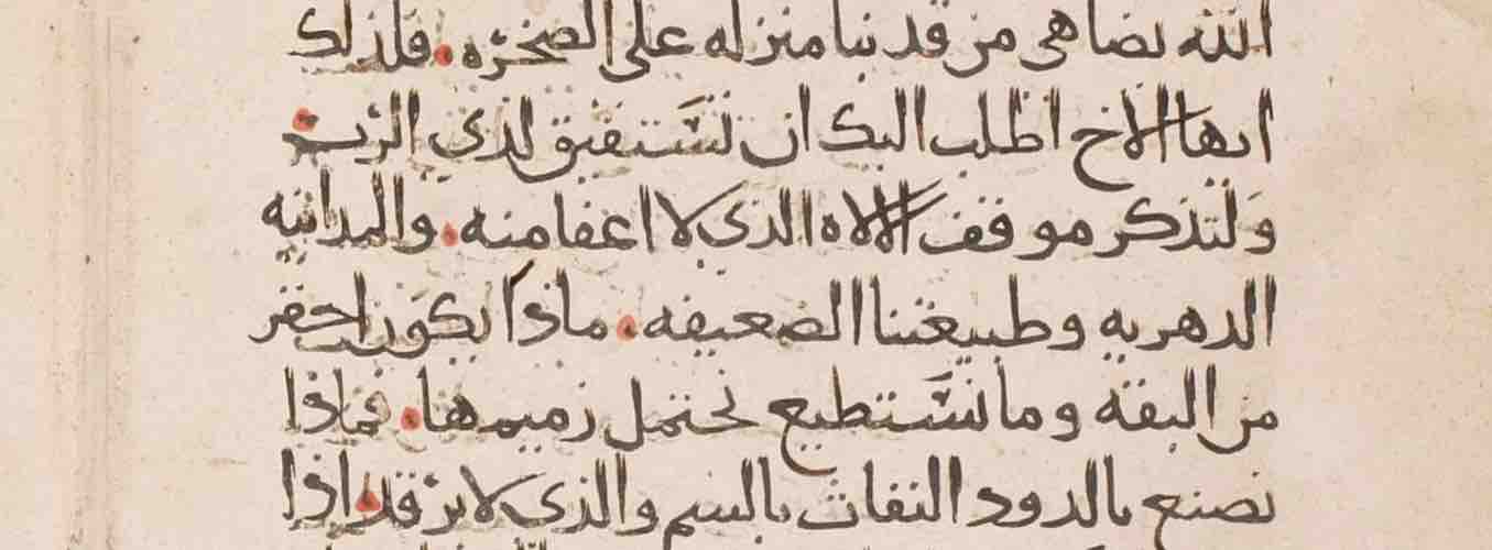
Sinai, Saint Catherine’s Monastery, Sin. ar. 1, f. 12r, 9th century (?)
Old Testament (Job, Daniel, Jeremiah, and Ezekiel)
Sinai, Saint Catherine’s Monastery, Sin. ar. 1, f. 12r. Image courtesy of the Library of Congress.
| The kāf has the same shape in all positions, and is very angular. See, for example, in line 1 al-kaldānīyīn and al-malik, and fa-kāna in line 3. The arm of the letter may, however, be quite short, as in kull (line 1) and yaʾkula (line 7). |
| The mīm is very close to the following letter, as in min and al-ḫamr (both line 2). |
| The final yāʾ in prepositions has a distinctive short backwards pointing shape (see fī in line 7). In line 2, the shape of this letter in allaḏī is even more distinctive. |
| The right loop of the ṣād/ḍād/ṭāʾ/ẓāʾ shape is in this script more of an elongated rectangle with very short height than a round loop: note ṭaʿāmihi (line 2) and ʿaẓīm (line 11). |
Example 2
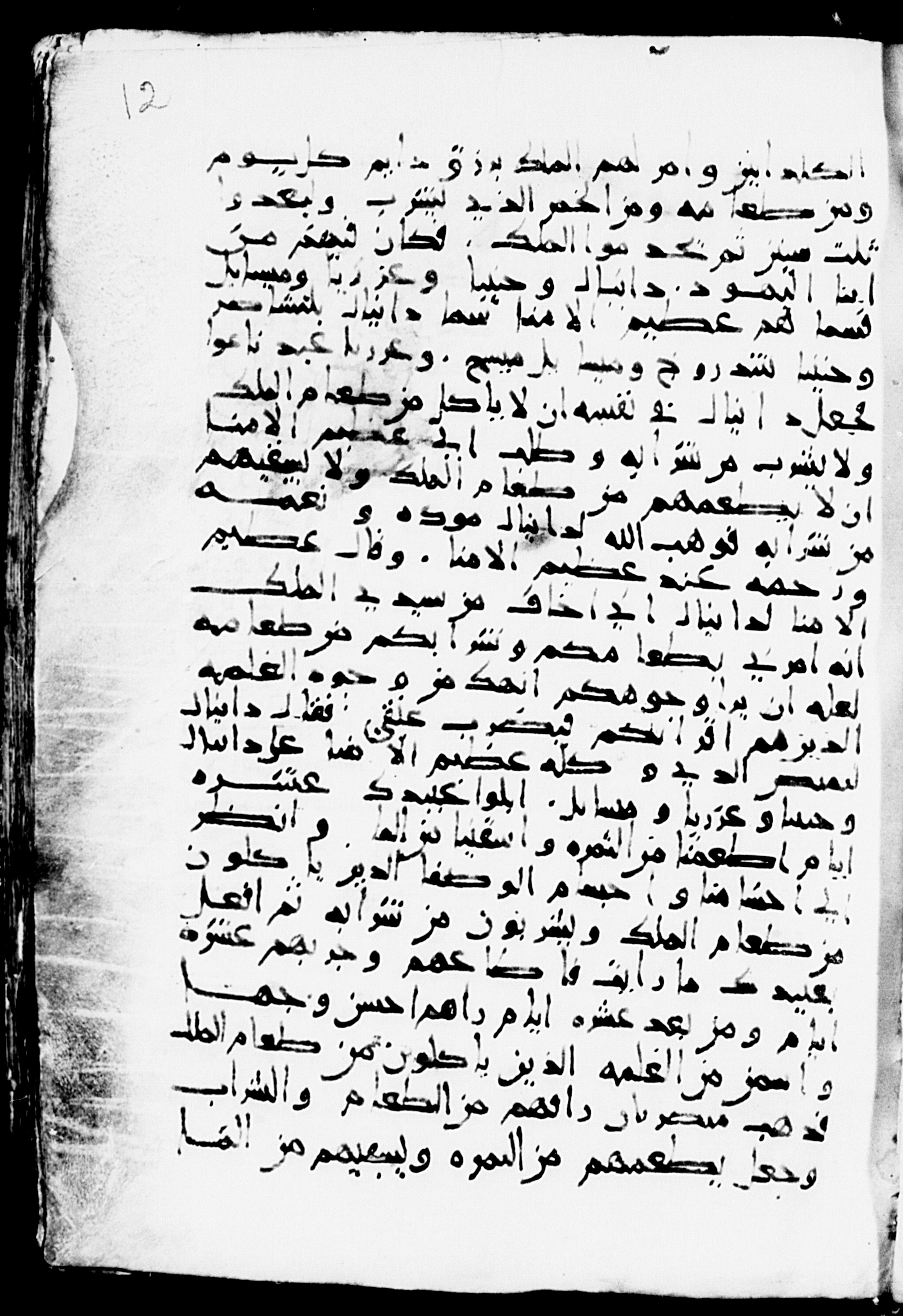
Sinai, Saint Catherine’s Monastery, Sin. ar. 151, f. 44v, 867 CE
Epistles and Acts
Sinai, Saint Catherine’s Monastery, Sin. ar. 151, f. 44v. Image courtesy of the Library of Congress.
| The letters shapes are less angular and at least in some words there is variation in relation to the line, with the writing of the word going up or down, as with li-l-masīḥ (line 1) and li-l-malāʾikihi (two lines from bottom). |
| At least two letter shapes are similar to the angular type of Sin. ar. 1, namely the kāf, as in fa-kull in line 1, and the final yāʾ, as in fī in lines 3 and 5. (The kāf may have a more conventional shape, too.) The other letters are generally of the standard shape found in Naskh manuscripts. |
| The final medial mīm in fī l-ẓulmati (line 7), which drops well below the rest of the word. See the same letter in initial position joining with the next letter in maktūb (line 10). |
Example 3
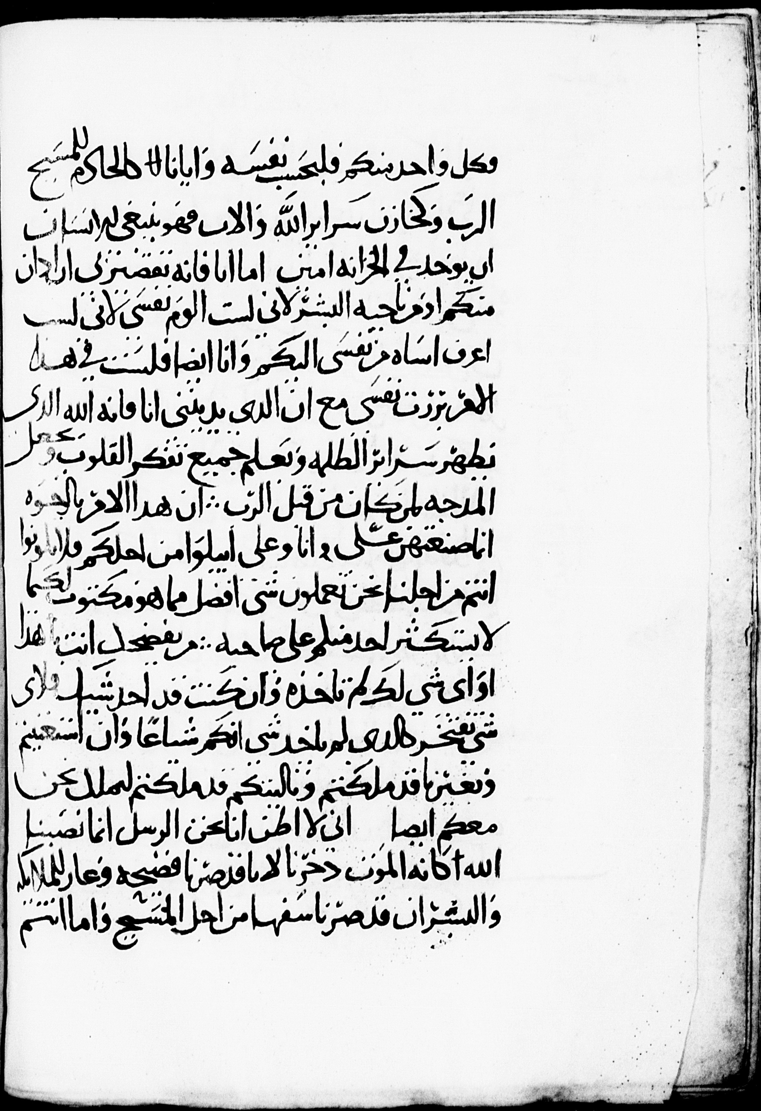
Sinai, Saint Catherine’s Monastery, Sin. ar. 154, f. 101r, 9th century (?)
This manuscript again has writing with notable angularity. As with other Christian manuscripts of this and subsequent periods, hamzas are not indicated.
Apophthegmata
Sinai, Saint Catherine’s Monastery, Sin. ar. 154, f. 101r. Image courtesy of the Library of Congress.
| The rāʾ (as in raǧulun, line 2) sits on or just below the line. |
| The šīn of šahwa (line 3) in the first saying lacks dots, but this is probably just a mistake: when the word appears in the third saying (pl, line 13), it has dots. |
| The top of the kāf (as in kaṯrati, line 4) is very angular. The lām-alif ligature is very angular on both sides at the bottom, as in al-ābā (line 2). |
| The joined mīm (e.g. in kamā, line 11) is more angular than round. The left side of the final nūn does not reach very high, as in ḥīn (line 7). |
| Final yāʾ very flat and on the line, as in fī (line 6). |
| The letters with three dots have the three dots not in a pyramid shape, as generally, but in a line: see the ṯāʾ of kaṯrati (line 4) and the šīn of wa-šġal (line 7). |
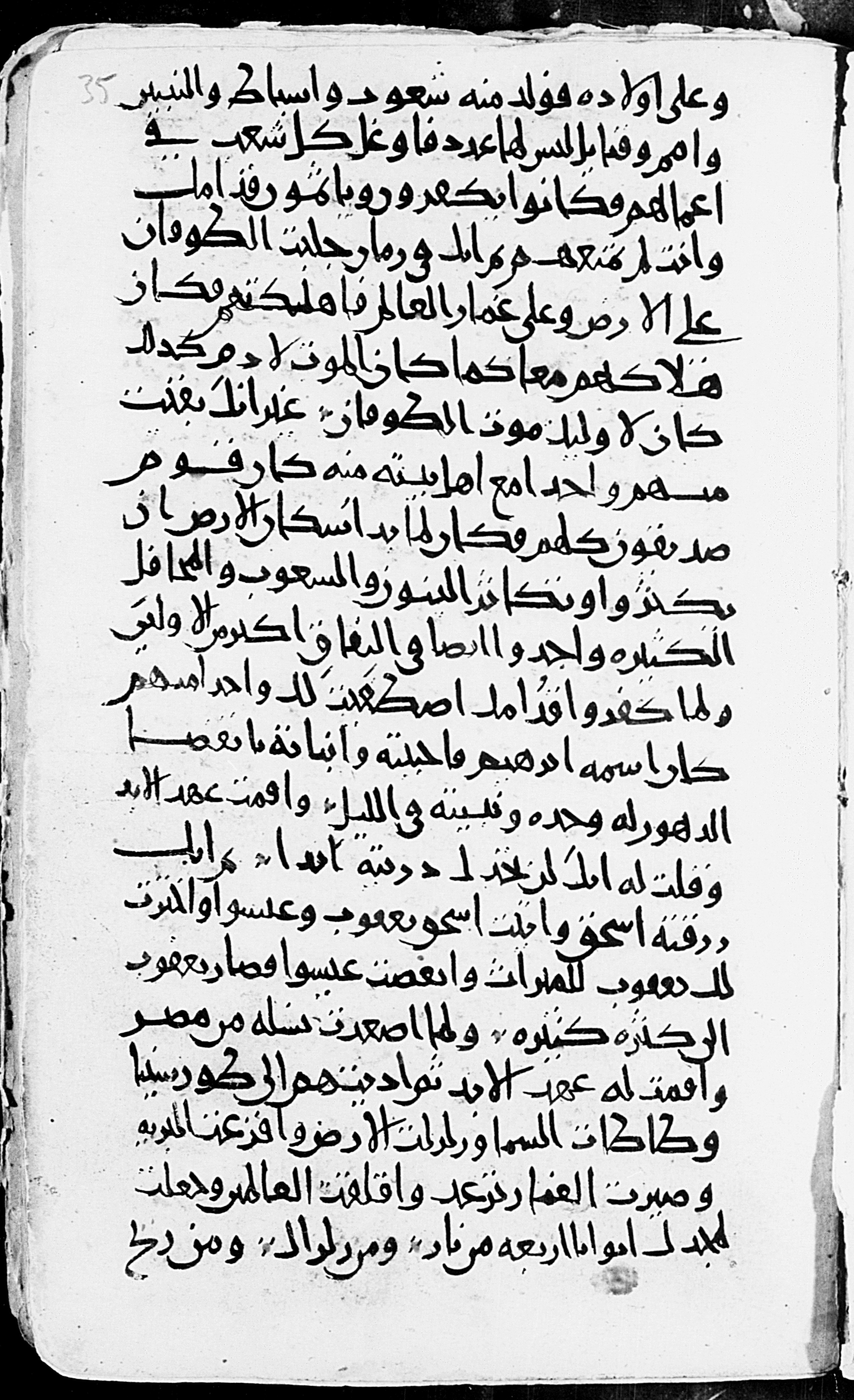
Example 4
Sinai, Saint Catherine’s Monastery, Sin. ar. 309, f. 48v, 909 CE
This tenth-century manuscript also shows the angularity especially characteristic of this early period, but there are places where curves are prominent.
Homilies
Sinai, Saint Catherine’s Monastery, Sin. ar. 309, f. 48v. Image courtesy of the Library of Congress.
| The lām-alif ligature is sharply angled at the bottom, as in al-ab wa-libn (line 1). |
| Letters are not always dotted, as the bāʾ in bi-smi and wa-libn (both line 1). The tāʾ marbūṭa is not dotted, e.g. in mawʿiẓa sābiʿa (line 2). |
| The shape of dāl as a sharp, open angle: al-quds and wāḥidan (both line 1). |
| The loop of the ṣād/ḍād/ṭāʾ/ẓāʾ shape is a sharp elongated rectangle that does not rise much above the line. See the ẓāʾ of mawʿiẓa (line 2) and the ṣād of faṣl (line 3). |
| Final yāʾ is very flat and on the line, as in fī (line 2) and ilá (line 5). |
| The lone alif may be wavy (not unlike a lone ālap in Serto Syriac script). There are examples in every line. |
| The kāf has the characteristic sharp shape of this period, as in ḏikr (4 lines from bottom). |
| The circle of the mīm (final and not) is more triangular than round: see wa-mā and wa-min (both line 7), ʿalayhim (4 lines from bottom). |
Example 5
Sinai, Saint Catherine’s Monastery, Sin. ar. 589, f. 35r, 10th century (?)
Although this manuscript also displays the sharpness of writing in the early period of Arabic writing in codices, here the script is not as sharp and angled as in some other manuscripts. The lām-alif (see awlādihi in line 1), for example, is round, as is usual for later hands. The kāf and the final yāʾ in prepositions look exactly as one would expect.
Old Testament (Baruch, 4 Ezra)
Sinai, Saint Catherine’s Monastery, Sin. ar. 589, f. 35r. Image courtesy of the Library of Congress.
| The bāʾ (and similar shapes) may be sharp on the right, where the vertical line joins the horizontal, as in šuʿūb (line 1). |
| The ṣād/ḍād/ṭāʾ/ẓāʾ shape is not as uniform in many other scripts (and in typefaces). Rather ṣād and ḍād have one shape, ṭāʾ and ẓāʾ another. Contrast miṣr (line 16) and al-arḍ (line 18) with ṭūr-sīnā (line 17) and ṭaʾṭaʾta (line 18). |
| The ascender of the ṭāʾ/ẓāʾ shape has a serif, as in wa-asbāṭ (line 1) and wa-l-ṭūfān (line 4). |
| As elsewhere in these early codices, the initial ʿayn/i shape is rather tall and open: see wa-ʿalá ġimār (line 5). |
| The rāʾ does not always hang below the line: see kafarū (line 12). |
| The left side of the final nūn generally does not come all the way back up to the line, and is also not always dotted, as in kāna (line 13, and elsewhere) and min (line 18). |
| Dots to distinguish letters are not always present, as with the bāʾ in ibrāhīm (line 13). |
| Letters occasionally may sit higher than others in relation to the line, as in the sīn of isḥāq (twice in line 16). |