Lesson
Arabic Scripts - 19th-20th centuries
Description
A mix of informal and formal scripts, with many colophons and notes.
19th Century
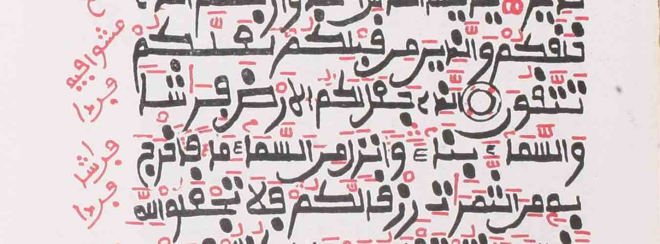
Mardin, Chaldean Cathedral, CCM 23, f. 5v, 18th/19th century (?)
This late hand is neither careful nor aesthetically appealing, but is nevertheless relatively uniform.
Fragments of the Miracles of Mary
Mardin, Chaldean Cathedral, CCM 23, f. 5v. Image provided by HMML.
| Many, but not all of the alifs and lāms have a right-pointing serif at the top. See the examples in line 1. |
| The combination tāʾ-ḥāʾ in yanfataḥūna/ (line 2), yāʾ-ḥāʾ in fa-yaḥtariqu in the same line, and an atītum in the next line. |
| The ḍād of ayḍan (line 5) has an especially high tooth on the left. |
| The shape of the final mīm in maʿahum (line 6). |
| The strange shape of kullu, with the kāf seemingly bisecting the final lām at the bottom (line 9 and line 3 from bottom). |
| The connector before the final yāʾ of maḍá (line 9) is very high. |
| The overall shape of line-final yumaǧǧidūna (line 10) goes down and then up rather than sitting directly on the line, as with the line-final yaʿmalūna 5 lines from bottom. |
Mardin, Chaldean Cathedral, CCM 379, p. 1, 18th/19th century
This page opens with more ornate lettering for the basmala and section title, but then turns to a kind of ruqʿa script. Generally, two dots on a letter are written as a line.
An Eisagoge (introduction to logic)
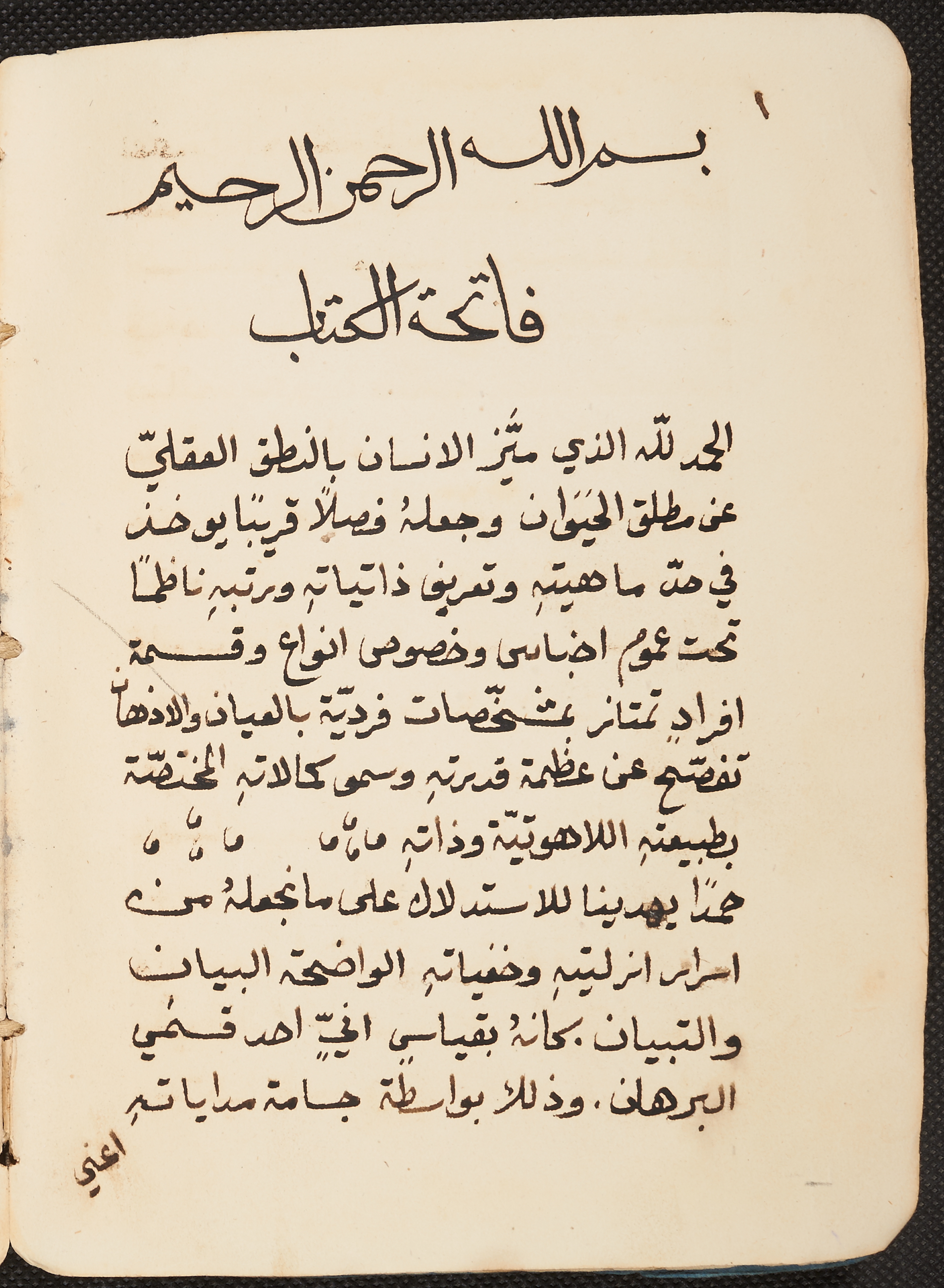
Mardin, Chaldean Cathedral, CCM 379, p. 1. Image provided by HMML.
| The article and the first letter of al-ḥamdu (line 3) sit higher than the last two letters. |
| The sīn is generally a long horizontal line, as in al-insān (line 3). |
| The ṭāʾ of bi-l-naṭq (line 3) sits above the connector of the nūn. |
| The minimal final hāʾ in wa-ǧaʿalahu (line 4, also in li-llāh in line 3, and elsewhere). |
| The down-and-up overall shape of ʿumūm (line 6). |
| In line-final wa-l-aḏhān (line 7), the last letter sits higher than the rest of the word. |
| In the next-to-last line, note the very minimal shape of the dāl in aḥad. |
Jerusalem, Saint Mark's Monastery, SMMJ 235, title page, 19th century
The script here is not that of a practiced hand, but it is nevertheless fairly clear. As elsewhere in more casual writing, the two dots of some letters are written as a straight line. [nb: the image is a clip from the page]
Curse + waqf-note in Arabic script on title page
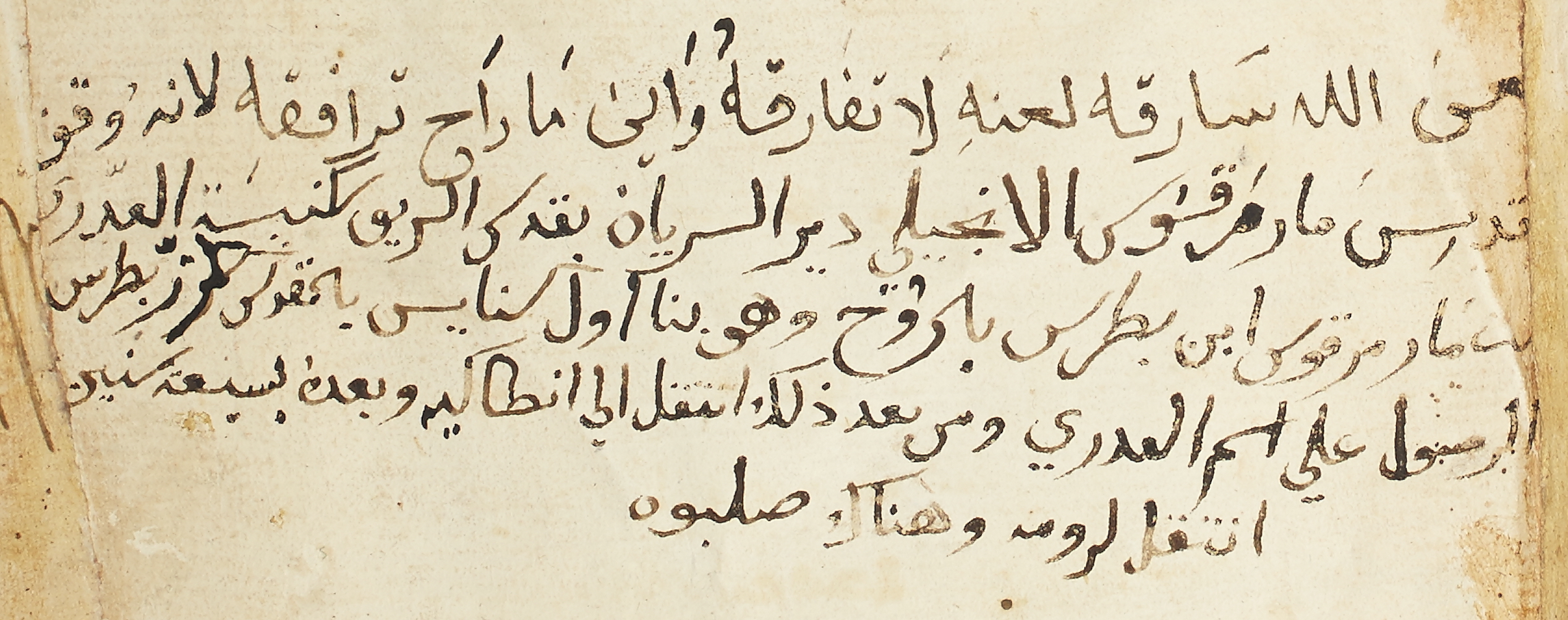
Jerusalem, Saint Mark's Monastery, SMMJ 235, title page. Image provided by HMML.
| The straight, descending line before the hoop of the final sīn in marqūs (line 2, of the Arabic text; similarly in bi-quds in the same line). The non-final sīn of al-suryān in the same line also has the simple horizontal line, without any teeth. |
| The šīn of al-šarīf (line 2) is lacking the expected three dots. |
| The lām of the article is written almost as an angled connector to the rāʾ in bi-l-rūḫ (line 3). |
Jerusalem, Saint Mark's Monastery, SMMJ 235, fol. 1r, 19th century
From the same manuscript as the previous page, this marginal note is written in a more ornate script. [nb: the image is a clip from the page]
Here is a transcription:
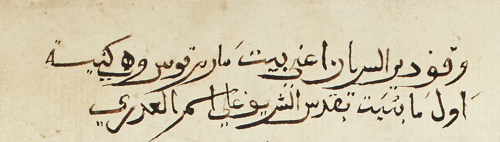
waqf dayr al-suryān aʿnī bayt mār marqūs wa-hiya kanīsa
awwal mā buniyat bi-quds al-šarīf ʿalá ism al-ʿadrá [sic]
Notable are the long, flowing descenders of rāʾ, final sīn, and final mīm.
Marginal waqf-note
Jerusalem, Saint Mark's Monastery, SMMJ 235, fol. 1r. Image provided by HMML.
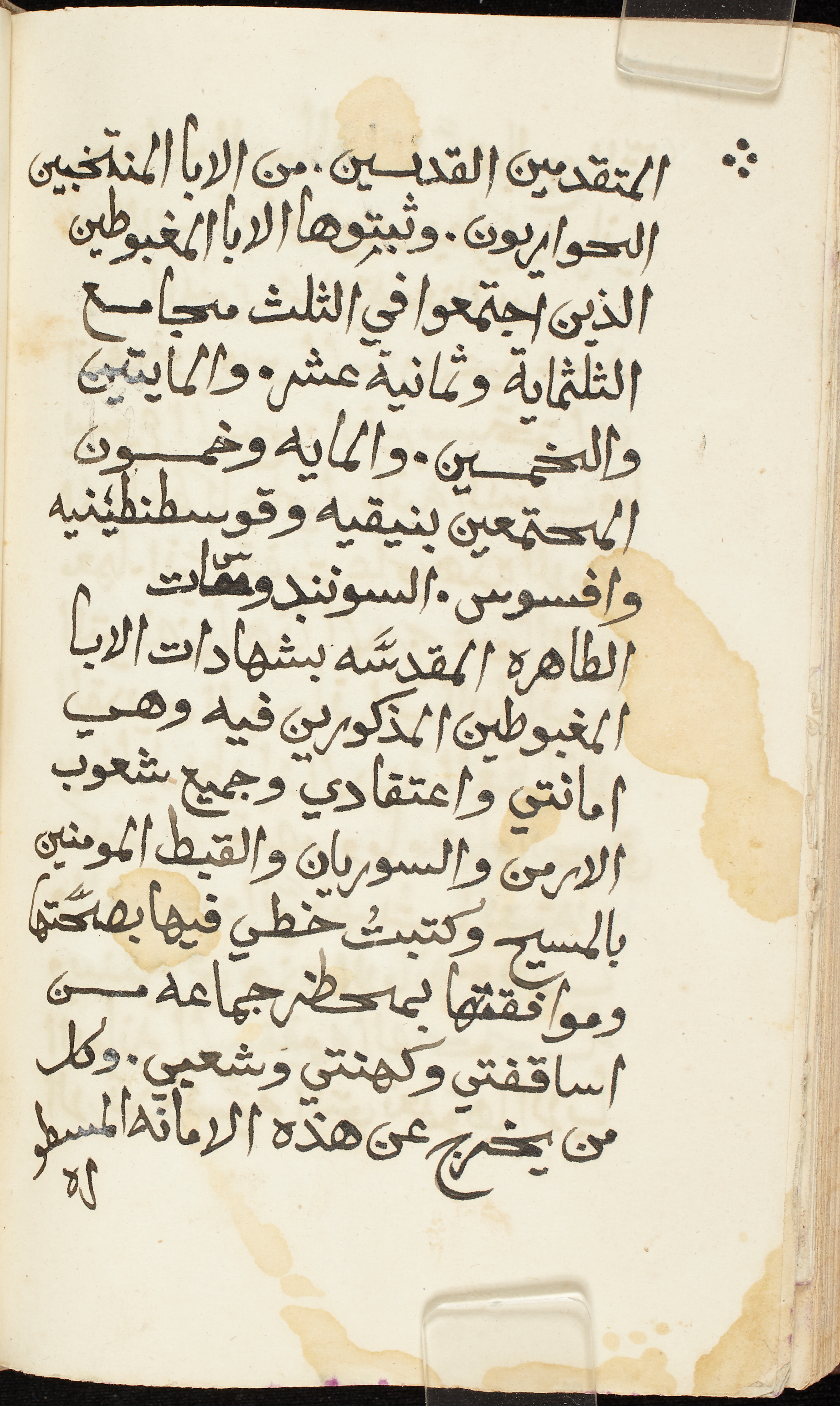
Jerusalem, Saint Mark's Monastery, SMMJ 134, fol. 179v, 1880
This distinctive script is thick, slightly angled, and shaky.
The Response of Gregory, Patriarch of Armenia, to Michael, Patriarch of Alexandria
Jerusalem, Saint Mark's Monastery, SMMJ 134, fol. 179v. Image provided by HMML.
| The alifs have a right-pointing serif, as seen throughout the page. |
| The letters within a word are often not on the same level, as in al-mutaqaddas (line 1), with the sīn sitting high, iǧtamaʿū (line 3), wa-l-ḫamsīn (line 5), and wa-l-ǧamīʿ (line 10). |
| The last word of the page, al-masṭūra, with the last two letters written below, is actually a catchword, even though not in the typical place for a catchword. |
Aleppo, Syriac Catholic Archdiocese of Aleppo, SCAA 7, f. 1v, 19th century
After a decorative basmala and rubricated title, there is a straightforward late Naskh script that illustrates how similar handwritten and printed Arabic script can be.
Eisagoge (Introduction to logic)
_003_r_002_v_crop.jpeg)
Aleppo, Syriac Catholic Archdiocese of Aleppo, SCAA 7 113, f. 1v. Image provided by HMML.
| The kāf-alif combination has the kāf completely touching the alif (line 1 of main text). |
| The lām of the article in al-ḥāǧa descends at an angle into the ḥāʾ (line 5). |
20th Century
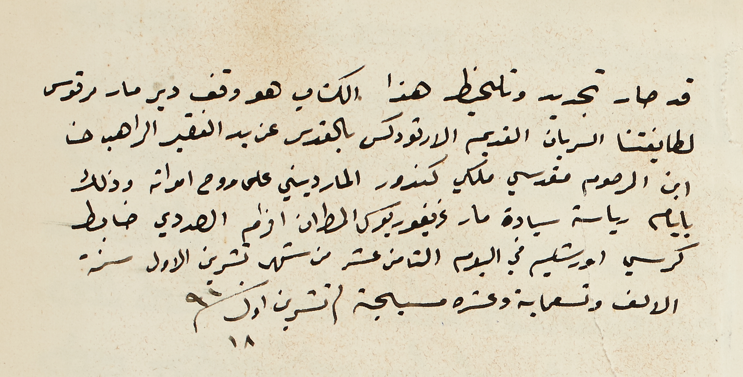
Jerusalem, Saint Mark's Monastery, SMMJ 32, f. 1r, 1910
This note offers a good example of ruqʿa script. When multiple dots mark the letters, they are simply a line for two dots (e.g. waqf in line 1), and a curved line for three (e.g. ūršalīm in line 5).
Arabic note in a Syriac Gospel Lectionary
Jerusalem, Saint Mark's Monastery, SMMJ 32, f. 1r. Image provided by HMML.
| The dāl has a very short head, as seen in qad and taǧdīd (line 1). We see attached dāl and unattached dāl side-by-side in the adjective al-ṣadadī (line 4). |
| The ṣād does not have the tooth on the right: see ṣāra in line 1, which also shows the essentially horizontal, non-sublinear shape of the rāʾ (see also riyāsa in line 4). |
| The alif may be very short, as in al-kitāb and mār (both in line 1). |
| The top of the non-final kāf is unattached, as in al-kitāb (line 1) and al-urṯūduks (line 2). |
| The sīn and šin, final and otherwise, are simply lines with no teeth: see al-suryān and bi-l-quds (both line 2) and ūršalīm (line 5). |
| Note the combination of yāʾ with the final mīm in al-qadīm (line 2). |
| The final mīm sits on top of the alif in bi-l-ayyām (line 4). |
| The name ġrīġūriyūs (line 4) shows how individual words can be written at a downward slant even as the overall line remains level. |
| The word ḍābiṭ (line 4) shows the short alif mentioned above, as well as a distinctive shape for the ṭāʾ (cf. al-muṭrān earlier in the same line). |
| The word sana at the end of line 5 is simply a wavy line with dots to mark the nūn and tāʾ marbūṭa. |
| Letters with loops are written very tightly, as in the wāw of al-yawm (line 5). |
| Note the shape of the lām-alif in al-alf (line 6). |
| The mīm is barely visible in tisʿamiʾa (line 6). |
Ready to transcribe?
Try your hand at transcribing 19th-20th centuries scripts