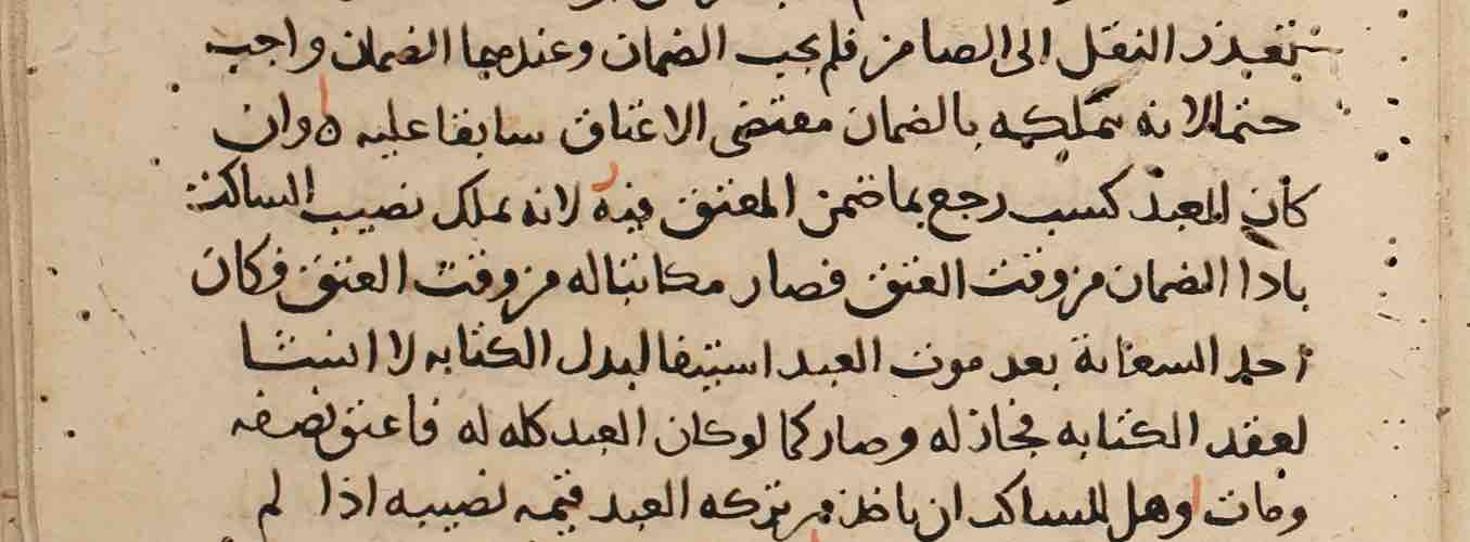
Example 1
Sinai, Saint Catherine’s Monastery, Sin. ar. 32, f. 2r, 11th century (?)
The script here is a relatively straightforward Naskh, but word and the line are often not absolutely horizontal. In general, the sharp angularity that characterized most of the examples in the previous section is gone.
Psalter and Odes
Sinai, Saint Catherine’s Monastery, Sin. ar. 32, f. 2r. Image courtesy of the Library of Congress.
| The ḥāʾ of wāḥid (line 1) is reduced to a mere circle. |
| Many letters have no dots, such as the qāf of al-quds (line 1), the zāʾ and yāʾ of al-mazāmīr (line 2), the ǧīm of li-l-raǧuli (line 4), and the ǧīm (and tāʾ marbūṭa) of al-šaǧara (line 7). |
| The final hāʾ of ilāh (line 1) is the simple wavy line found in later manuscripts as well. |
| Short letters followed by alif may be written very small, almost unnoticeably, as with the bāʾ of ṭūbā (sic, line 4) and the nūn of nāmūs (line 6). |
| The bottom two dots of the ṯāʾ of miṯla (line 7) are represented with a line. Similarly, the yāʾ of tuḏarrīhu (line 10) has its two dots represented simply as a line; note that the ḏāl is written without a dot. |
| The final alif of kull(u)-mā (line 8) has a long tail streaming from its top, presumably because it is at line-end. |
| The mīm of yaʿmalu (line 9) is especially small. |
| The letters of yanǧaḥu (line 9) are remarkably stacked on top of one another. |
| The preposition fī is written in two ways in the last line: first in a way similar to the older style where the final yāʾ points backwards, and second in a way that looks close to regular Naskh (and printed Arabic). |
Example 2
Sinai, Saint Catherine’s Monastery, Sin. ar. 312, f. 19v, 11th century (?)
This two-column manuscript with a very clear Naskh shows how early a seemingly standardized form of presentation had developed. The dots to distinguish letters are clear. There are a few vowels and extra diacritical marks. The lām-alif is a bit more rounded on the bottom than the earlier type with its sharp angles, but in general no letter shape or combination of letters is surprising. The lines are straight, both word-internally and line-internally. Only the kāf (e.g. col. a, line 5) evokes a memory of the earlier angular shape of writing.
Homilies of Ephrem
Sinai, Saint Catherine’s Monastery, Sin. ar. 312, f. 19v. Image courtesy of the Library of Congress.
Example 3
Diyarbakir, Meryem Ana Kilisesi, DIYR 133, fol. 303v, 1239 CE
This two-column manuscript with a very clear Naskh shows how early a seemingly standardized form of presentation had developed. The dots to distinguish letters are clear. There are a few vowels and extra diacritical marks. The lām-alif is a bit more rounded on the bottom than the earlier type with its sharp angles, but in general no letter shape or combination of letters is surprising. The lines are straight, both word-internally and line-internally. Only the kāf (e.g. col. a, line 5) evokes a memory of the earlier angular shape of writing.
Praxapostolos. Rum Orthodox
Diyarbakir, Meryem Ana Kilisesi, DIYR 133, fol. 303v. Image provided by HMML.
| The teeth of the letters (e.g. in sīn) are quite short. |
| The bāʾ of ʾbʾfrwdyṭw (Epaphroditus) in the subscription to Philippians is undotted. |
| Final lām can sit almost on the line (last line: al-rasūl) or hang below (last line: ahl). The lāms in li-llāh (e.g., line 5, last word) are very short. |
| The backward shape of the final yāʾ in ʿalá and ilá (e.g. in the subscription to Philippians, and in the last line of the page). |
| The two types of lām-alif in the basmala three lines from the bottom. The first one has the lām leaning far to the right (as in ilāh near the end of the same line); the second is the expected shape. |
| In the same line, the unattached ḥāʾ of rūḥ sits rather high above the line. |
Example 4
Mardin, Church of the Forty Martyrs, CFMM 346, fol. 182r, 1266 October 23 CE
The script here shows very little difference in thickness. Fading and water damage, commonly found, makes some of it not readily legible.
Homily by Theodore the Studite
Mardin, Church of the Forty Martyrs, CFMM 346, fol. 182r. Image provided by HMML.
| The loose, dangling shape of the rāʾ in naʿraf (line 3) and muṭrān (last line). |
| Final mīm in bi-sm and al-qadīm (line 1). |
| The shape of the final yāʾ, as in al-azalī (line 1), as well as in fī (e.g., line 3 and third line from the bottom). Compare to these the backwards-pointing final yāʾ in line 5 from the bottom. |
| The final hāʾ in bi-hi (line 1) and ʿiẓa, ḫāmisa (line 2) is again the simple wavy line. |
| The last two letters of al-qiyāma at the end of line 4 floating above the previous letters. |
Example 5
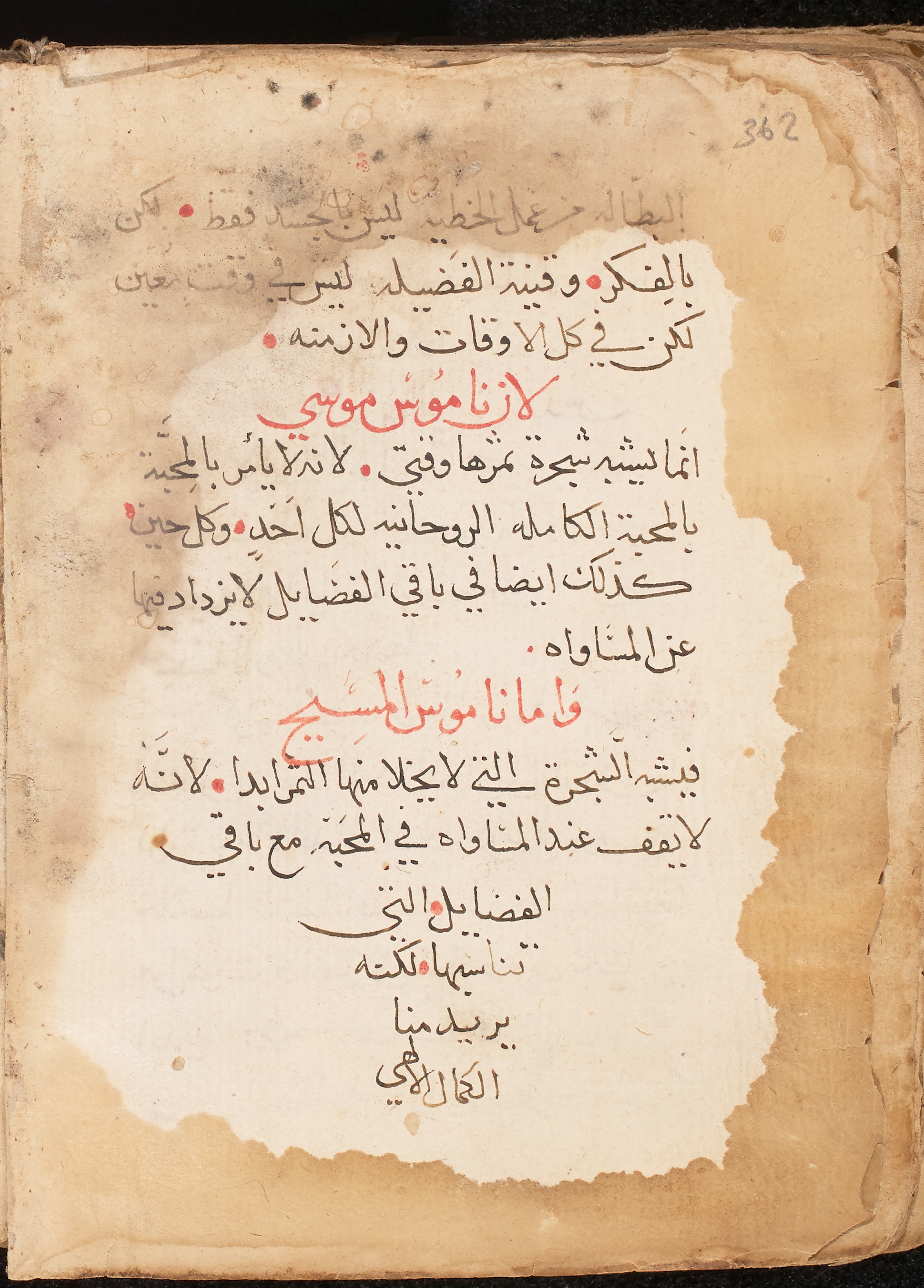
Mardin, Church of the Forty Martyrs, CFMM 389, fol. 108r, 1294 CE
Vowels and šadda are occasionally indicated. The letter-positions vary a bit in relation to the line, as in al-sayyid yasūʿ (line 6), fa-l-sayyid al-masīḥ (line 8), and ʿišrīn (3 lines from bottom). There is no word division in mart maryam in lines 4 and 5.
Extracts from the Fathers on Various Theological Themes
Mardin, Church of the Forty Martyrs, CFMM 389, fol. 108r. Image provided by HMML.
| yāʾ-mīm in maryam (line 1). |
| lām-ḥāʾ-mīm in (bayt) laḥm (line 1). |
| ǧīm-hāʾ-mīm in ḫurūǧihim (3 lines from bottom). |
| lām-mīm in lam (last line). |
Example 6
Jerusalem, Saint Mark's Monastery, SMMJ 261, fol. 61v, 13th century CE
Vowels and diacritics (šadda, sukūn) are often indicated. The script is generally crisp and clear.
Gospels
Jerusalem, Saint Mark's Monastery, SMMJ 261, fol. 61v. Image provided by HMML.
| Backwards-pointing final yāʾ, as in fī in line 1. |
| The top line of non-final kāf may be disjointed but it not always so: see both kinds in the last line. |
| The alif of lām-alif/ leans far to the right. |
| The final letter of yaʿqūb at the end of line 2 is floating above the rest of the word, rather than sitting on the line. |